Add and Replace Icons
- 8 minutes to read
XAF applications can display icons next to Actions, navigation items, Detail View captions, and business class names. You can add custom icons to your application, replace built-in XAF icons, and configure which UI elements display icons.
This help topic shows you how to:
- Add custom icons to your XAF application
- Replace built-in icons with custom alternatives
- Set icons for business classes, actions, and navigation items
- Configure image file formats and naming conventions
Understanding Image Sources in XAF
XAF uses image sources to locate and load application icons. Understanding how image sources work helps you control which icons appear in the UI and troubleshoot display issues.
Types of Image Sources
| Image Source | Description | Requirements |
|---|---|---|
| File Image Source | References icons stored in a folder on disk. Images are copied to the output directory at build time. | Set each image file’s Copy to Output Directory to Copy always. |
| DevExpress.Images.v25.2 Assembly Resource Image Source | Contains all built-in XAF icons. Default image source. | None. |
View Available Image Sources in Your Application
To view the available image sources in your application:
- Open the Model Editor for your application project (for example, MySolution.Win or MySolution.Blazor.Server).
- Navigate to the ImageSources node.
Review child nodes. Each node corresponds to an image source.

A typical XAF application includes the following autogenerated image sources:
- MySolution.Module — Assembly Resource Image Source for your module’s Images folder where you can add custom icons
- DevExpress.Images.v25.2 — The built-in DevExpress image library
Image File Requirements
Before adding icons to your application, ensure your image files meet the following requirements:
Supported Image File Formats
XAF applications support both SVG and raster images (PNG, JPG, BMP). The recommended format is SVG. If you have to use raster images, we recommend PNG.
Use SVG images for better display on High DPI screens.
Image File Embedding
Embed custom images into assemblies as resources rather than using file references.
Image File Names
When using image files, keep file names under 260 characters. This is important for ClickOnce deployment, which can create long installation paths. If an image path exceeds 260 characters, the image is unavailable, and the issue is logged in the Log File.
Image Size Guidelines (Windows Forms)
Raster Image Size
| Image size | Image suffix | Description |
|---|---|---|
| 16x16 | none | Standard-sized images used for Business Classes |
| 32x32 | “32x32” | Used as Large Icons in the Navigation Bar and Ribbon UI |
| 48x48 | “48x48” | Used by the Validation Module |
SVG Image Size
An SVG image size is determined by a control or set in the Model Editor.
Image Naming Conventions (Windows Forms)
Follow guidelines below when you name image files:
| Image | Name Description |
|---|---|
| Employee.png | Do not include a size suffix for 16x16 raster images. |
| Employee_32x32.png | Add a size suffix to 12x12, 24x24, 32x32 and 48x48 raster images. |
| Office2013\Employee.png | Raster images are part of the DevExpress.Images‘s Colored collection. To use images from another collection, add its name without spaces to an image name as prefix. You can see the available collections in the Common PNG Images tab of the Image Picker dialog window. |
| Employee.svg | SVG images. |
For business classes, use two PNG images (ImageName.png and ImageName_32x32.png) or one SVG image (ImageName.svg) for vector graphics. Template Kit enables SVG images for all new XAF WinForms applications. To use PNG images instead, set the UseSvgImages property to false.
Icon Types in ASP.NET Core Blazor
Two types of DevExpress themes are available for ASP.NET Core Blazor applications: Fluent and Classic. XAF ships icon sets for both theme types and automatically switches icons based on the theme. You can use the IconType property to select the icon set. Available options include:
Auto- Default value. XAF switches icons according to the currently selected theme.
Blazor- XAF uses icons from the Classic theme set.
Fluent- XAF uses icons from the Fluent theme set.
using DevExpress.ExpressApp;
using DevExpress.ExpressApp.Blazor;

public class MySolutionBlazorApplication : BlazorApplication {
    public MySolutionBlazorApplication() {
        // ...
        IconType = IconType.Fluent;
    }
}
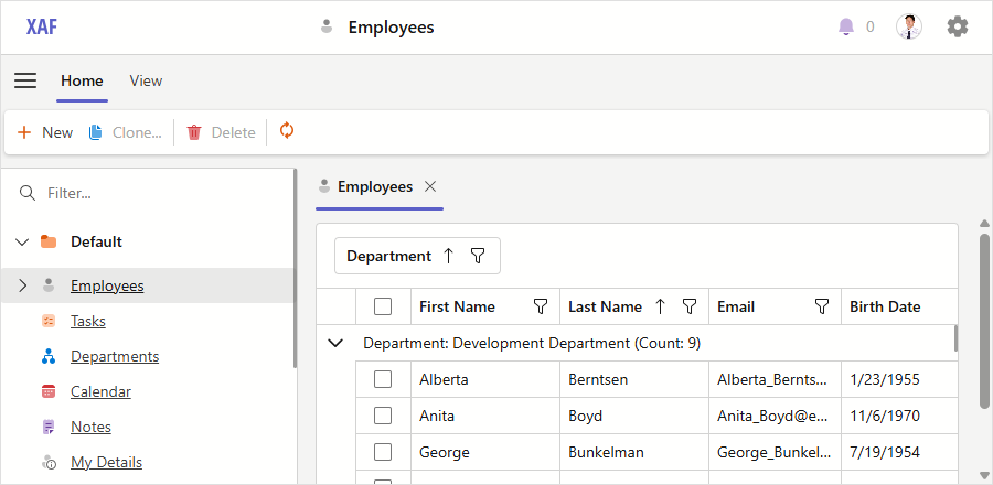
An XAF application with the Fluent icon set
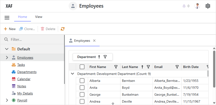
An XAF application with the Standard icon set
Add Custom Icons
To add custom icons to your XAF application, create an Images folder in your module project and add your image files as embedded resources.
Add Icons to a Module Project
In your module project (for example, SolutionName.Module), create an Images folder if it does not exist.
Add your image files to the Images folder.
For each image file, set the Build Action property to Embedded Resource in the file’s properties.
The framework automatically creates an Assembly Resource Image Source for the Images folder in your module. Icons from this folder are available throughout your application for use with business classes, Actions, and UI elements.
Add Icons from External Assemblies
If you have icons stored in a separate assembly:
Open the Model Editor in your module project.
Navigate to the ImageSources node.
Add a new AssemblyResourceImageSource node.
Set the Assembly property to the name of your image assembly.
Set the Folder property to the folder name containing the images.
Add a reference to the image assembly in all your module and application projects.
Replace Built-in Icons
XAF includes default icons for common UI elements. To replace a built-in icon with your custom version, add an image with the same name to your module’s Images folder.
In your module project (for example, SolutionName.Module), create an Images folder if it does not exist.
Add your custom image file to the Images folder. Name it exactly the same as the built-in icon you want to replace.
Set the Build Action property to Embedded Resource for the image file.
The framework searches for icons in the order specified by the Index property of image sources. If your module’s image source has a lower index than the source containing the original icon, your custom icon will be used instead.
Adjust Image Source Priority
To ensure your custom icons take precedence over built-in icons:
Open the Model Editor for your application project (for example, SolutionName.Win or SolutionName.Blazor.Server).
Navigate to the ImageSources node.
Locate the child nodes that correspond to different image sources.
Set the Index property for each image source node. Lower index values have higher priority.
Note
Embedding images as resources is more reliable than using file-based image sources. While you can add images to an application project’s Images folder, we recommend that you use embedded resources in module projects.
Set Icons for UI Elements
After adding icons to your application, assign them to business classes, actions, and other UI elements.
Enable Icons in UI
To display icons in the Navigation System and Tabbed MDI tabs, configure these Application Model properties:
| Property | Value | UI Item |
|---|---|---|
| IModelRootNavigationItems.ShowImages | true |
Navigation items |
| IModelOptionsWin.ShowTabImage | true |
Tab images (WinForms) |
| IModelOptionsBlazor.ShowTabImage | true |
Tab images (ASP.NET Core Blazor) |
| EnableLayoutGroupImages | true |
Tabbed layout groups |
Set Icons in the Application Model
The Application Model has an ImageName property for UI elements that can display icons. For example, the BOModel | <Class> node’s ImageName property controls the icon shown for a business class in Detail Views and other UI elements.
Tip
Use these naming rules:
- For images in the root of the Images folder:
"ImageName"(for example,"Department") - For images in a subfolder:
"SubfolderName.ImageName"(for example,"MyBusinessClasses.Department")
To set an icon using the Model Editor:
Open the Model Editor and navigate to the element you want to configure.
Locate the ImageName property.
Click the ellipsis button to open the Image Picker dialog.
Browse and select the icon you want to use.
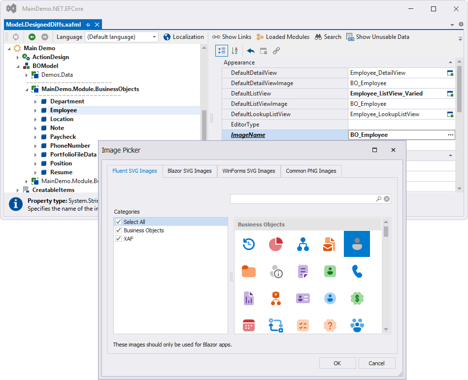
Note
The Image Picker may not display images from a custom image source if an Assembly Resource Image Source was added in the same model differences file. You can type the ImageName property value manually.
Set Icons in Code
You can assign icons programmatically instead of using the Model Editor.
Tip
Use these naming rules:
- For images in the root of the Images folder:
"ImageName"(for example,"Department") - For images in a subfolder:
"SubfolderName.ImageName"(for example,"MyBusinessClasses.Department")
Set an Icon for a Business Class
Apply the ImageNameAttribute to your business class:
File: SolutionName.Module/BusinessObjects/Department.cs
using DevExpress.Persistent.Base;
using DevExpress.Persistent.BaseImpl;
using DevExpress.Xpo;

namespace SolutionName.Module.BusinessObjects {
    [ImageName("Department")]
    public class Department : BaseObject {
        public Department(Session session) : base(session) { }
        //...
    }
}
Set an Icon for an Action
Use the ActionBase.ImageName property in your controller:
File: SolutionName.Module/Controllers/MyController.cs
using DevExpress.ExpressApp;
using DevExpress.ExpressApp.Actions;

namespace SolutionName.Module.Controllers {
    public class MyController : ViewController {
        public MyController() {
            var myAction = new SimpleAction(this, "MyAction", PredefinedCategory.View) {
                Caption = "My Action",
                ImageName = "Action_Refresh"
            };
        }
    }
}