Customize the Report Designer Toolbar
- 4 minutes to read
This document describes how to customize commands in the Report Designer‘s toolbar. It also shows how to add a new toolbar command and hide an existing command.
Tip
Online Example: How to customize the Web Report Designer’s toolbar
Create a Web Application
Open an ASP.NET MVC application or create a new one from scratch to get started with this tutorial.
See Add a New Report to an ASP.NET MVC Application for information on how to create a sample ASP.NET MVC application and add a report to it. Refer to the Quick Start section for step-by-step tutorials about Report Designer integration.
Add and Remove Commands
Handle the client-side CustomizeMenuActions event to customize commands at runtime.
The event argument provides access to the Actions collection that contains all the available Report Designer commands. You can add new commands to the collection and modify the existing commands. To obtain an existing command, call the event argument’s GetById method and pass the command ID as a parameter. Refer to the last document section for a complete command list.
Each command exposes the properties listed in the table below.
Option | Description |
|---|---|
Container | Specifies whether to display the command in the menu or on the main toolbar. |
Disabled | Specifies whether the command is disabled. |
HasSeparator | Specifies whether the command has a visual separator. |
HotKey | Specifies the keyboard shortcut to invoke the command |
ImageClassName ImageTemplateName | Use one of these options to specify the command’s icon:
|
JSClickAction | Specifies the client-side action to perform when the command is invoked. |
Text | Specifies the command’s tooltip. |
Visible | Specifies whether the command is visible in the user interface. |
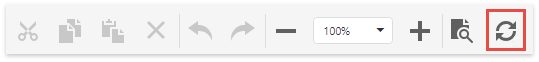
The following example demonstrates how to hide the existing Validate Bindings toolbar command and add a new Refresh command that refreshes the current report tab.
<script type="text/javascript">
    function customizeActions(s, e) {

        // Get the "Validate Bindings" action and hide it.
        var validateBindingsAction = e.GetById(DevExpress.Designer.Report.ActionId.ValidateBindings);
        if (validateBindingsAction)
            validateBindingsAction.visible = false;

        // Add a new action.
        e.Actions.push({
            text: "Refresh",
            imageTemplateName: "refresh",
            visible: true,
            disabled: false,
            hasSeparator: false,
            hotKey: { ctrlKey: true, keyCode: "Z".charCodeAt(0) },
            clickAction: function () {
                s.GetCurrentTab().refresh();
            }
        });
    }
</script>

@Html.DevExpress().ReportDesigner(settings => {
    settings.Name = "ReportDesigner1";
    settings.ClientSideEvents.CustomizeMenuActions = "customizeActions";
}).Bind(new DevExpress.XtraReports.UI.XtraReport()).GetHtml()
The image below shows the resulting toolbar.
Declare a Custom Command’s Icon
You can use two ways to provide a command’s icon.
HTML Templates for SVG Images (Recommended)
This approach allows you to apply a color scheme to SVG icons and make them consistent with the Report Designer control.
The following example demonstrates how to declare a sample HTML template. This template uses the predefined dxd-icon-fill CSS class to color the icon automatically according to the selected scheme.
<script type="text/html" id="refresh">
    <svg version="1.1" xmlns="http://www.w3.org/2000/svg" xmlns:xlink="http://www.w3.org/1999/xlink"
        x="0px" y="0px" viewBox="0 0 24 24" style="enable-background: new 0 0 24 24;" xml:space="preserve">
        <path class="dxd-icon-fill" d="M22,2v8h-0.2h-3.09H14l2.94-2.94C15.68,5.79,13.93,5,12,5c-3.87,0-7,3.13-7,7H2C2,6.48,6.48,2,12,2
            c2.76,0,5.26,1.12,7.07,2.93L22,2z M12,19c-1.93,0-3.68-0.79-4.94-2.06L10,14H5.29H2.2H2v8l2.93-2.93C6.74,20.88,9.24,22,12,22
            c5.52,0,10-4.48,10-10h-3C19,15.87,15.87,19,12,19z" />
    </svg>
</script>
Assign the declared template to the command’s ImageTemplateName property.
CSS Classes
You can add icons (SVG and PNG) as CSS classes with background images.
Note
This approach does not allow you to apply color schemes to icons.
Create an image file (24x24 pixels) and add it to the project (for instance, Refresh.png).
Add a new CSS file (Refresh.css) and declare the CSS class to specify the custom command icon.
.refresh {
background-image: url(../Refresh.png);
background-repeat: no-repeat;
}
Link the added CSS file in your View file.
...
<link href="~/Refresh.css" rel="stylesheet" />
Assign the declared CSS class to the command’s ImageClassName property.
Available Commands
The following tables list enumeration values that you can pass to the GetById method to obtain existing commands.
DevExpress.Designer.ActionId
| Value | Description |
|---|---|
| Cut | The Cut toolbar button. |
| Copy | The Copy toolbar button. |
| Paste | The Paste toolbar button. |
| Delete | The Delete toolbar button. |
| Undo | The Undo toolbar button. |
| Redo | The Redo toolbar button. |
| ZoomOut | The Zoom Out toolbar button. |
| ZoomSelector | The drop-down list with available zoom factors. |
| ZoomIn | The Zoom In toolbar button. |
DevExpress.Designer.Report.ActionId
| Value | Description |
|---|---|
| NewReport | The New menu command. |
| NewReportViaWizard | The New via Wizard menu command. |
| OpenReport | The Open menu command. |
| ReportWizard | The Design in Report Wizard menu command. |
| Preview | The Preview toolbar button. |
| Scripts | The Scripts toolbar button. |
| AddDataSource | The drop-down list with available data sources in the Field List. |
| AddSqlDataSource | The Add SQL Data Source menu command that runs the Data Source Wizard single-query version. |
| AddMultiQuerySqlDataSource | The Add SQL Data Source menu command that runs the Data Source Wizard multi-query version. |
| Save | The Save menu command. |
| SaveAs | The Save As menu command. |
| Exit | The Exit menu command. |
| ValidateBindings | The Validate Bindings menu command. |