Customize the HTML5 Document Viewer's Toolbar
- 5 minutes to read
This document describes how to customize commands in the Web Document Viewer‘s toolbar. It also shows how to add a new toolbar command and hide an existing command.
Tip
Online Example: How to customize the Web Document Viewer toolbar
Create a Web Application
Open an ASP.NET WebForms application or create a new one from scratch to get started with this tutorial.
See Add a New Report to an ASP.NET WebForms Application for information on how to create a sample ASP.NET WebForms application and add a report to it. Refer to the Quick Start section for step-by-step tutorials about Document Viewer integration.
Add a Custom Command at Design Time
Do the following to add a new toolbar command at design time:
Switch to the Design view, click the Document Viewer’s smart tag and select Designer.
Activate the Menu Items tab in the invoked ASPxWebDocumentViewer Designer.
Click the Add button to add a new command. This creates a new WebDocumentViewerMenuItem object and adds it to the ASPxWebDocumentViewer.MenuItems collection. Specify the command’s settings in the Item Properties list.
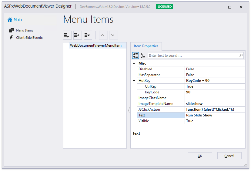
Each command exposes the properties listed in the table below.
Option
Description
Disabled
Specifies whether the command is disabled.
HasSeparator
Specifies whether the command has a visual separator.
HotKey
Specifies the keyboard shortcut to invoke the command
ImageClassName
ImageTemplateName
Use one of these options to specify the command’s icon:
- ImageClassName for an icon declared as a CSS class.
- ImageTemplateName for an icon declared as an HTML template.
JSClickAction
Specifies the client-side action to perform when the command is invoked.
Text
Specifies the command’s tooltip.
Visible
Specifies whether the command is visible in the user interface.
Click OK to apply changes and close the dialog.
Add and Remove Commands at Runtime
Handle the client-side ASPxClientWebDocumentViewer.CustomizeMenuActions event to customize commands at runtime.
The event argument provides access to the Actions collection that contains all the available Document Viewer commands. You can add new commands to the collection and modify the existing commands. To obtain an existing command, call the event argument’s GetById method and pass the command ID as a parameter. Refer to the last document section for a complete command list.
The following example demonstrates how to hide the existing Highlight Editing Fields toolbar command and add a new Run Slide Show command that navigates through document pages.
<script type="text/javascript">
    function customizeMenuAction(s, e) {

        // Get the "Highlight Editing Fields" action and hide it.
        var highlightEditingFieldsAction = e.GetById(DevExpress.Report.Preview.ActionId.HighlightEditingFields);
        if (highlightEditingFieldsAction)
            highlightEditingFieldsAction.visible = false;

        // Add a new action.
        var interval;
        var selected = ko.observable(false);
        e.Actions.push({
            text: "Run Slide Show",
            imageTemplateName: "slideshow",
            visible: true,
            disabled: false,
            selected: selected,
            hasSeparator: false,
            hotKey: { ctrlKey: true, keyCode: "Z".charCodeAt(0) },
            clickAction: function () {
                if (selected()) {
                    clearInterval(interval);
                    selected(false);
                    return;
                }
                var model = s.GetPreviewModel();
                if (model) {
                    selected(true);
                    interval = setInterval(function () {
                        var pageIndex = model.GetCurrentPageIndex();
                        model.GoToPage(pageIndex + 1);
                    }, 2000);
                }
            }
        });
    }
</script>

<dx:ASPxWebDocumentViewer ID="ASPxWebDocumentViewer1" runat="server">
    <ClientSideEvents CustomizeMenuActions="customizeMenuAction" />
</dx:ASPxWebDocumentViewer>
The image below shows the resulting toolbar.

Declare a Custom Command’s Icon
You can use two ways to provide a command’s icon.
HTML Templates for SVG Images (Recommended)
This approach allows you to apply a color scheme to SVG icons and make them consistent with the Document Viewer control.
The following example demonstrates how to declare a sample HTML template. This template uses the predefined dxd-icon-fill CSS class to color the icon automatically according to the selected scheme.
<script type="text/html" id="slideshow">
    <svg version="1.1" id="Layer_1" xmlns="http://www.w3.org/2000/svg" xmlns:xlink="http://www.w3.org/1999/xlink" x="0px" y="0px"
        viewBox="0 0 24 24" style="enable-background: new 0 0 24 24;" xml:space="preserve">
        <polygon class="dxd-icon-fill" points="4,2 4,22 22,12 " />
    </svg>
</script>
Assign the declared template to the command’s ImageTemplateName property.
CSS Classes
You can add icons (SVG and PNG) as CSS classes with background images.
Note
This approach does not allow you to apply color schemes to icons.
Create an image file (24x24 pixels) and add it to the project (for instance, SlideShow.png).
Add a new CSS file (SlideShow.css) and declare the CSS class to specify the custom command icon.
.slideShow {
background-image: url(../SlideShow.png);
background-repeat: no-repeat;
}
Link the added CSS file in your ASPX page.
...
<link href="~/SlideShow.css" rel="stylesheet" />
Assign the declared CSS class to the command’s ImageClassName property.
Available Commands
The following table lists the DevExpress.Report.Preview.ActionId enumeration’s values. You can pass these values to the GetById method to obtain existing commands.
| Value | Description |
|---|---|
| FirstPage | The First Page toolbar button. |
| PrevPage | The Previous Page toolbar button. |
| Pagination | The drop-down list that navigates to the selected page. |
| NextPage | The Next Page toolbar button. |
| LastPage | The Last Page toolbar button. |
| MultipageToggle | The Toggle Multipage Mode toolbar button. |
| HighlightEditingFields | The Highlight Editing Fields toolbar button. |
| ZoomOut | The Zoom Out toolbar button. |
| ZoomSelector | The drop-down list with available zoom factors. |
| ZoomIn | The Zoom In toolbar button. |
| The Print toolbar button. | |
| PrintPage | The Print Page toolbar button. |
| ExportTo | The Export To toolbar button. |
| Search | The Search toolbar button. |