Add a Custom Control to the Report Designer Toolbox
- 4 minutes to read
This document describes how to create a WPF project with a custom control and add the control to the WPF End-User Report Designer Toolbox.
Create a Project and Custom Control
- Create a new WPF project with the Report Designer named WpfApp_CustomNumericLabel.
- Add a new blank report to the project.
Implement a custom numeric label in a file named NumericLabel.cs:
Show Codeusing DevExpress.Utils.Serializing; using DevExpress.XtraReports; using DevExpress.XtraReports.Expressions; using DevExpress.XtraReports.UI; using System.ComponentModel; namespace WpfApp_CustomNumericLabel { [ToolboxItem(true)] [DefaultBindableProperty("Number")] [DisplayName("Numeric Label")] public class NumericLabel : XRLabel { [DefaultValue(0)] [XtraSerializableProperty] public int Number { get; set; } // Set the "Browsable" and "EditorBrowsable" attributes to "false" and "Never" // to hide the "Text" property from the "Properties" window and editor (IntelliSense). [Browsable(false), EditorBrowsable(EditorBrowsableState.Never)] public override string Text { get { return Number.ToString(); } set { int i; Number = (int.TryParse(value, out i)) ? i : 0; } } // Implement a static constructor as shown below to add // the "Number" property to the property grid's "Expressions" tab. static NumericLabel() { // Specify an array of events in which the property should be available. string[] eventNames = new string[] { "BeforePrint" }; // Specify the property position in the property grid's "Expressions" tab. // 0 - first, 1000 - last. int position = 0; // Specify an array of the property's inner properties. string[] nestedBindableProperties = new string[0]; // Specify the property's category in the property grid's "Expressions" tab. // The empty string corresponds the root category. string scopeName = ""; // Create and set description for the "Number" property. ExpressionBindingDescription description = new ExpressionBindingDescription( eventNames, position, nestedBindableProperties, scopeName ); ExpressionBindingDescriptor.SetPropertyDescription( typeof(NumericLabel), nameof(Number), description ); } } }
Add the Custom Control to the Toolbox
Add an .svg icon named NumericLabel.svg to the project and set the icon’s Build Action property to Resource.
Then, use the RegisterControl<T> method to add the custom control to the Toolbox:
using DevExpress.Utils;
using DevExpress.Xpf.Core.Native;
using DevExpress.Xpf.Reports.UserDesigner;
using DevExpress.Xpf.Reports.UserDesigner.XRDiagram;
using System.Windows;
using System.Windows.Media;
//..

public partial class MainWindow : Window {
    public MainWindow() {
        InitializeComponent();

        var resourceURI = AssemblyHelper.GetResourceUri(GetType().Assembly, "NumericLabel.svg");
        ImageSource icon = WpfSvgRenderer.CreateImageSource(resourceURI);
        ReportDesigner.RegisterControl<NumericLabel>(() => new DefaultXRControlDiagramItem(), icon);
    }

    private void Window_Loaded(object sender, RoutedEventArgs e) {
        reportDesigner.OpenDocument(new XtraReport1());
    }
}
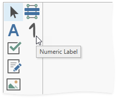
Build and run the project. The control with the specified icon appears in the toolbox.
See Also