OptionsColumnFilter.FilterPopupMode Property
Gets or sets display mode for the column’s filter dropdown.
Namespace: DevExpress.XtraGrid.Columns
Assembly: DevExpress.XtraGrid.v18.2.dll
Declaration
[DefaultValue(FilterPopupMode.Default)]
[XtraSerializableProperty]
public virtual FilterPopupMode FilterPopupMode { get; set; }Property Value
| Type | Default | Description |
|---|---|---|
| FilterPopupMode | **Default** | A FilterPopupMode value that specifies display mode for the column’s filter dropdown. |
Available values:
| Name | Description | ||||||||||||||||||||||||||
|---|---|---|---|---|---|---|---|---|---|---|---|---|---|---|---|---|---|---|---|---|---|---|---|---|---|---|---|
| Default | The actual display mode is determined by the View’s OptionsFilter.ColumnFilterPopupMode (ColumnViewOptionsFilter.ColumnFilterPopupMode) property. If the View’s OptionsFilter.ColumnFilterPopupMode property is set to Classic:
If the View’s OptionsFilter.ColumnFilterPopupMode property is set to Default (which is the initial value):
If the WindowsFormsSettings.ColumnFilterPopupMode property is also set to Default (which is the initial value):
|
||||||||||||||||||||||||||
| List | The filter dropdown is represented as a regular list of filter items. Clicking an item invokes a corresponding action, and automatically closes the dropdown.
|
||||||||||||||||||||||||||
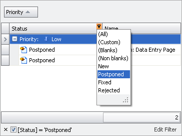
| CheckedList | The filter dropdown is represented as a checked list of filter items. In this mode, an end-user can select more than one item simultaneously. When the dropdown window is closed by clicking the OK button, the View will display those records that contain the checked values:
|
||||||||||||||||||||||||||
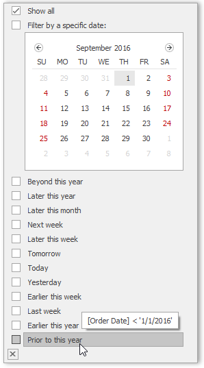
| Date | This mode is equivalent to DateSmart regarding the appearance of the filter dropdown. The filter dropdown displays all the available check boxes, even if there is no data that falls into a corresponding date range. |
||||||||||||||||||||||||||
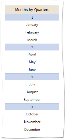
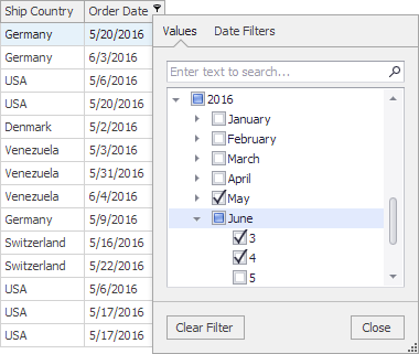
| DateSmart | The filter dropdown provides a built-in calendar plus check boxes to select common non-intersecting date intervals.
The table below describes the available date ranges for the DateSmart and Date modes.
If there is no underlying data that would fall into a specific date range, the corresponding check box is hidden. If all values in the date-time column are set to null, all check boxes are visible. |
||||||||||||||||||||||||||
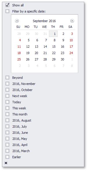
| DateAlt | This mode is equivalent to DateSmart, but with a different set of filters: Today, This week, This month, Next month, etc.
The table below describes several of the date ranges for the DateAlt mode.
|
||||||||||||||||||||||||||
| Excel | The tabbed UI, inspired by MS Excel, that displays column values and provides filtering options most suitable for the column’s data type.
|
Property Paths
You can access this nested property as listed below:
| Object Type | Path to FilterPopupMode |
|---|---|
| GridColumn |
|
| LayoutViewColumn |
|
| BandedGridColumn |
|
Remarks
Column filter dropdowns can be presented using the following display modes:
- Regular list
- Calendar (for date-time columns) - A window with an embedded calendar along with predefined filter items for quick selection of common date intervals
- Checked list
- MS Excel-inspired style
The style of column filter dropdowns can be set at three levels.
Application level
The static WindowsFormsSettings.ColumnFilterPopupMode property specifies the default column filter dropdown style for all GridControls in your application.
Control level
A View’s ColumnViewOptionsFilter.ColumnFilterPopupMode property (ColumnView.OptionsFilter.ColumnFilterPopupMode) specifies the default column filter dropdown style in a certain View. This setting overrides the WindowsFormsSettings.ColumnFilterPopupMode global setting.
Column level
The current GridColumn.OptionsFilter.FilterPopupMode property specifies the filter dropdown style for a specific column. This setting overrides the ColumnView.OptionsFilter.ColumnFilterPopupMode setting.
Note
If you handle any events from the list below, Data Grid switches from Excel-style filters to classic filtering menus. In this case, set the FilterPopupMode property to Excel explicitly in case you wish to continue using Excel filters.
Related GitHub Examples
The following code snippets (auto-collected from DevExpress Examples) contain references to the FilterPopupMode property.
Note
The algorithm used to collect these code examples remains a work in progress. Accordingly, the links and snippets below may produce inaccurate results. If you encounter an issue with code examples below, please use the feedback form on this page to report the issue.