RangeControl Class
Supports range selection for any data.
Namespace: DevExpress.XtraEditors
Assembly: DevExpress.XtraEditors.v21.1.dll
NuGet Packages: DevExpress.Win.Design, DevExpress.Win.Navigation
Declaration
public class RangeControl :
    BaseStyleControl,
    ISupportXtraAnimation,
    IRangeControl,
    IMouseWheelSupport,
    ISupportInitialize,
IDirectXClientRelated API Members
The following members return RangeControl objects:
Remarks
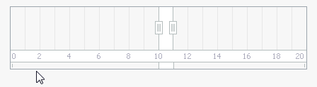
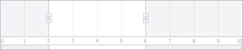
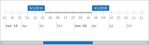
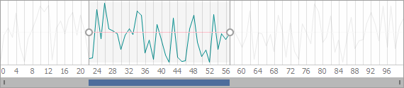
The Range Control allows end-users to select ranges of data using mouse and fingers (when using touch screens).
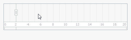
In addition to simple scrolling, you can zoom data in and out:
Clients
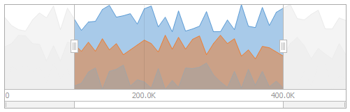
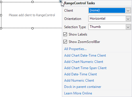
Data for the Range Control is provided by a Range Control Client, which must be associated with the Range Control by using the RangeControl.Client property. The client also visualizes data in the Range Control’s viewport in a specific manner. Embedded into the Range Control, the client automatically gains support for range selection and zooming.
The following Range Control Clients are available out of the box.
NumericRangeControlClient - A RangeControl‘s client that supports numeric (integer, double, decimal or float) range selection.
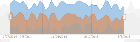
NumericChartRangeControlClient - The RangeControl‘s client that renders a lightweight chart with a numeric horizontal axis.
DateTimeRangeControlClient - A RangeControl‘s client that supports date-time range selection.
DateTimeChartRangeControlClient - The RangeControl‘s client that renders a lightweight chart with a date-time horizontal axis.
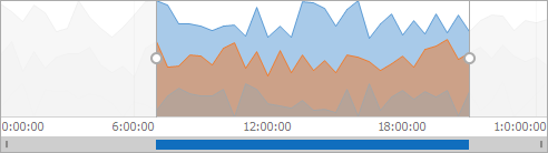
TimeSpanChartRangeControlClient - The RangeControl‘s client that renders a lightweight chart with a time-span horizontal axis.
- SchedulerControl - When using this client, the Range Control allows end-users to select date ranges for the associated Scheduler Control. See Scheduler Range Control.
- ChartControl - When using this client, the Range Control allows end-users to select ranges for the associated Chart Control. See Integration with a Range Control.
To embed a NumericRangeControlClient, NumericChartRangeControlClient or DateTimeChartRangeControlClient into the Range Control at design time, use the Range Control’s smart tag.
When required, you can implement your own Range Control Client that will display data in a custom manner within the Range Control. See the Custom Range Control Client topic to learn more.
Selection
The current selection can be obtained using the RangeControl.SelectedRange property. When displaying numeric ranges, you can specify the range bounds using the Range Control’s ClientOptions.Minimum and ClientOptions.Maximum properties.
Additional Information
The following topics provide more information on the Range Control:
Tooltips
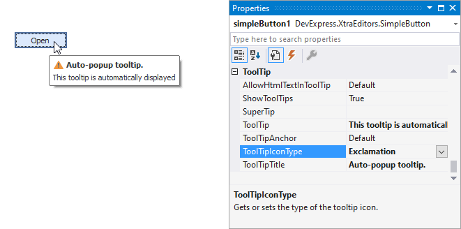
DevExpress controls support regular and super tooltips. If the ShowToolTips option is enabled, tooltips are shown when the mouse pointer hovers the control.
Use the following properties to specify a regular tooltip’s content:
- ToolTip — a regular tooltip’s text. If the text is not specified, the tooltip is not displayed even if the title is specified. You can use line breaks in regular tooltips. Use the AllowHtmlTextInToolTip property to specify whether to parse HTML tags in the text. HTML tags allow you to format the text: size, style, hyperlinks, etc.
- ToolTipTitle — a regular tooltip’s title. If the title is not specified, it is not displayed.
ToolTipIconType — a regular tooltip’s predefined icon. Use the controller’s IconSize property to specify the image size.
To display a custom image in all regular tooltips, use the controller’s ImageList and ImageIndex properties.
To display a custom image in a particular regular tooltip, handle the BeforeShow event. Use the ImageOptions event argument to assign a raster or vector image to the processed tooltip.
To assign a super tooltip to a control, use the SuperTip property. Enable the AllowHtmlText property to use HTML tags in the super tooltip.
To replace regular tooltips with super tooltips, set the ToolTipController.ToolTipType property to SuperTip. The controller automatically converts regular tooltips to super tooltips. To access this property, you can use the DefaultToolTipController component or a custom controller assigned to the ToolTipController property. See Tooltips for more information.