ProgressBarControl Class
The control that indicates the progress of lengthy operations.
Namespace: DevExpress.XtraEditors
Assembly: DevExpress.XtraEditors.v21.1.dll
NuGet Packages: DevExpress.Win.Design, DevExpress.Win.Navigation
Declaration
[DefaultBindingPropertyEx("Position")]
public class ProgressBarControl :
ProgressBarBaseControlRemarks
The ProgressBarControl can indicate the progress of lengthy operations (copying files, program install progress, etc.).
Main Settings
- ProgressBarControl.Position - Gets or sets the progress bar position.
- RepositoryItemProgressBar.Minimum and RepositoryItemProgressBar.Maximum (accessible from the ProgressBarControl.Properties object) - Specify the limits for the progress bar’s ProgressBarControl.Position.
- ProgressBarControl.PerformStep - Advances the progress position by a value (RepositoryItemProgressBar.Step).
- ProgressBarControl.Increment and ProgressBarControl.Decrement - Increase and decrease the control’s value (position) by a specified value.
- ProgressBarControl.PositionChanged - Occurs after the value of the ProgressBarControl.Position property has been changed.
- ProgressBarControl.ShowProgressInTaskBar - Gets or sets whether the progress is reflected in the application button in the Windows Task Bar.
Text Settings
- RepositoryItemBaseProgressBar.ShowTitle - Gets or sets whether the control displays the textual representation of the progress bar’s current position.
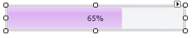
- RepositoryItemProgressBar.PercentView - Gets or sets whether to present the current position as a relative value between the RepositoryItemProgressBar.Minimum and RepositoryItemProgressBar.Maximum and format it as a percentage. The RepositoryItemBaseProgressBar.ShowTitle property must be set to true.
- RepositoryItem.DisplayFormat - Allows you to apply custom formatting to the control’s value.
- RepositoryItem.CustomDisplayText - Allows you to provide custom display text.
Appearance Settings
- RepositoryItemBaseProgressBar.ProgressKind - Gets or sets a value that specifies the direction of the progress indicator.
- RepositoryItemBaseProgressBar.ProgressViewStyle - Gets or sets the progress indicator paint style.
- RepositoryItemBaseProgressBar.StartColor and RepositoryItemBaseProgressBar.EndColor - Allow you to provide a gradient fill.
- RepositoryItemBaseProgressBar.MaxHeight - Gets or sets the maximum height of the progress block.
- RepositoryItemBaseProgressBar.ProgressPadding - Gets or sets the amount of space around the progress block.
- RepositoryItemProgressBar.FlowAnimationEnabled - Gets or sets whether the progress indicator is displayed using flow animation.
- RepositoryItemProgressBar.Appearance - Gets the appearance settings used to paint the editor when it’s enabled.
- RepositoryItemProgressBar.AppearanceDisabled - Gets the appearance settings used to paint the editor when it’s disabled.
- RepositoryItemProgressBar.AppearanceFocused - Gets the appearance settings used to paint the current editor when it’s focused.
- RepositoryItemProgressBar.AppearanceReadOnly - Gets the appearance settings used to paint the read-only editor.
Tooltips
DevExpress controls support regular and super tooltips. If the ShowToolTips option is enabled, tooltips are shown when the mouse pointer hovers the control.
Use the following properties to specify a regular tooltip’s content:
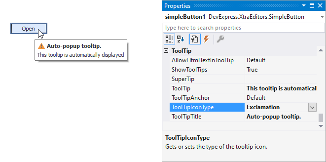
- ToolTip — a regular tooltip’s text. If the text is not specified, the tooltip is not displayed even if the title is specified. You can use line breaks in regular tooltips. Use the AllowHtmlTextInToolTip property to specify whether to parse HTML tags in the text. HTML tags allow you to format the text: size, style, hyperlinks, etc.
- ToolTipTitle — a regular tooltip’s title. If the title is not specified, it is not displayed.
ToolTipIconType — a regular tooltip’s predefined icon. Use the controller’s IconSize property to specify the image size.
To display a custom image in all regular tooltips, use the controller’s ImageList and ImageIndex properties.
To display a custom image in a particular regular tooltip, handle the BeforeShow event. Use the ImageOptions event argument to assign a raster or vector image to the processed tooltip.
To assign a super tooltip to a control, use the SuperTip property. Enable the AllowHtmlText property to use HTML tags in the super tooltip.
To replace regular tooltips with super tooltips, set the ToolTipController.ToolTipType property to SuperTip. The controller automatically converts regular tooltips to super tooltips. To access this property, you can use the DefaultToolTipController component or a custom controller assigned to the ToolTipController property. See Tooltips for more information.
Example
In the code fragment below, a DeleteFiles method removes all files contained within the directory specified by the source parameter. The ProgressBarControl is used to display the progress of file delete operations. The RepositoryItemProgressBar.Minimum and RepositoryItemProgressBar.Maximum properties are used to specify a range for the progress bar that is equivalent to the number of files to be removed. The code also uses the RepositoryItemProgressBar.Step property with the ProgressBarControl.PerformStep method, to increment the position of the progress bar as soon as a file is removed.
using System.IO;
using DevExpress.XtraEditors.Controls;
// ...
private void DeleteFiles(string source){
   if (Directory.Exists(source)){
      string[] fileEntries = Directory.GetFiles(source);
      // Initializing progress bar properties
      progressBarControl1.Properties.Step = 1;
      progressBarControl1.Properties.PercentView = true;
      progressBarControl1.Properties.Maximum = fileEntries.Length;
      progressBarControl1.Properties.Minimum = 0;
      // Removing the list of files found in the specified directory
      foreach(string fileName in fileEntries){
         File.Delete(fileName);
         progressBarControl1.PerformStep();
         progressBarControl1.Update();
      }
   }
}
// ...
DeleteFiles("d:\\Temp");
Related GitHub Examples
The following code snippets (auto-collected from DevExpress Examples) contain references to the ProgressBarControl class.
Note
The algorithm used to collect these code examples remains a work in progress. Accordingly, the links and snippets below may produce inaccurate results. If you encounter an issue with code examples below, please use the feedback form on this page to report the issue.