ValidationHintBaseDefaultProperties.ShowHint Property
Gets or sets whether or not this ValidationHint object should display a hint next to its target UI element.
Namespace: DevExpress.Utils.VisualEffects
Assembly: DevExpress.Utils.v21.2.dll
NuGet Packages: DevExpress.Utils, DevExpress.Win.Design, DevExpress.Wpf.Core
Declaration
[DefaultValue(DefaultBoolean.Default)]
[DXCategory("Appearance")]
public DefaultBoolean ShowHint { get; set; }Property Value
| Type | Default | Description |
|---|---|---|
| DefaultBoolean | Default | A DefaultBoolearn enumerator value that specifies whether or not this ValidationHint object should display a hint next to its target UI element. |
Available values:
| Name | Description |
|---|---|
| True |
|
| False |
|
| Default | The default behavior determined by the control’s logic. |
Remarks
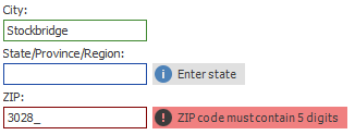
A hint displayed next to the target UI element of this ValidationHint object can display both string content and an image. Also, a ValidationHint object can draw a border around its target UI element. The figure below illustrates an example.
To assign a content for your hint, utilize the ValidationHintBaseDefaultProperties.Text, ValidationHintBaseDefaultProperties.Icon and ValidationHintBaseDefaultProperties.IconType properties. The ValidationHintBaseDefaultProperties.HintLocation property allows you to set the hint position relative to a target UI element.
The ShowHint and ValidationHintBaseDefaultProperties.ShowBorder properties are accessed through the ValidationHint.Properties group, which provides three sets of properties, one for each available control navigation state - valid, invalid and indeterminate. Thus, you can customize the ValidationHint object’s behavior for each validation state separately.
If the ShowHint property equals DefaultBoolean.Default, this ValidationHint will act based on the global behavior (the ValidationHintBaseProperties.ShowHint property). Otherwise, the ShowHint setting will be prioritized.
Refer to the Adorner UI Manager article for more details.