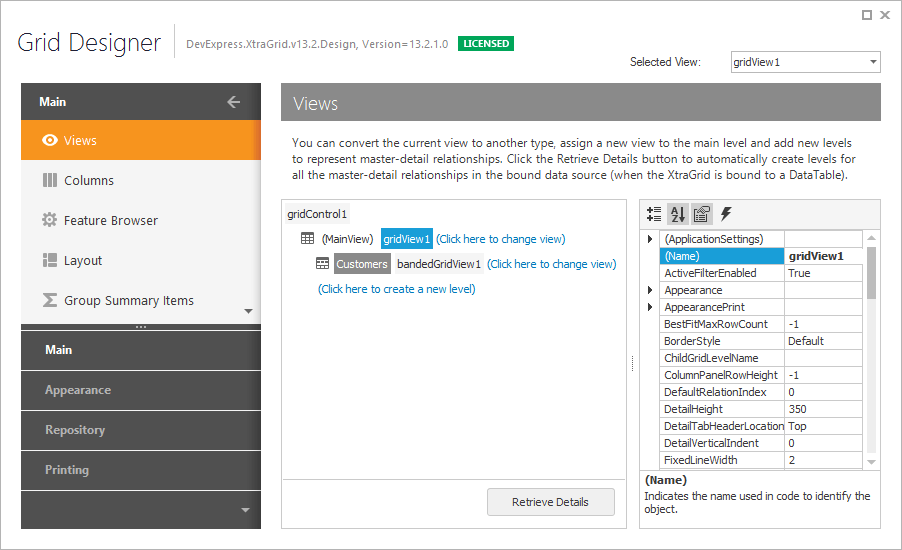
Grid Designer
- 3 minutes to read
The Grid Control provides an advanced Designer dialog that allows you to customize Views and View levels, bands and columns, summaries, the in-place editor and View repository, appearance settings, and printing options. Some customization features provided by the designer can also be used directly within the grid control without having to invoke the designer. Please refer to the On-form Band and Column Customization and Level Designer documents for details.
Grid Designer
Use one of the following approaches to invoke the Grid Designer:
- Click the Run Designer button in the Level Designer.
- Right-click the Grid Control and select the Run Designer item from the context menu.
- Click the Run Designer command displayed at the bottom of the Properties window (when the grid control is selected).
- Invoke the control’s smart tag and select Run Designer.

The designer contains Main, Appearance, Repository and Printing sections in the navigation bar. Each section, in turn, contains a number of pages that relate to specific aspects of the control or View functionality. You can switch to a particular section/page by clicking the corresponding link in the navigation bar. Each page is described in detail in the following topics.
The Main section:
- Views Page - allows the View hierarchy to be customized and provides access to the currently selected View’s settings.
- Columns Page - provides column management features.
- Bands Page - provides band management features (this page is only displayed for banded and advanced banded Grid Views).
- Feature Browser - allows controls to be easily customized by providing a structured feature list with related settings. Selecting a particular feature within the tree View results in filtering the property grid so that only the properties and events that relate to this feature are displayed.
- Layout Page - enables the View layouts to be customized, saved and restored.
- Group Summary Items Page - provides group summary management features.
- EditForm Designer - allows you to customize the layout of the Edit Form.
The Appearances section:
- Appearances Page - allows the appearance settings that are used to paint View elements to be customized.
- Style Format Rules Page - enables conditional formatting to be implemented.
The Repository section:
- In-place Editor Repository Page - enables in-place editors to be created and customized.
- View Repository Page - enables the Views used to represent the data in Grid Control to be created and customized.
The Printing section:
- Print Appearances Page - specifies appearance settings used when printing the grid control.
- Print Settings Page - provides access to the View’s print settings.