Filter Data
- 5 minutes to read
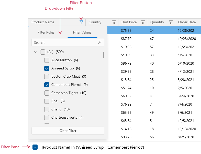
Drop-down Filter
A column’s drop-down filter allows users to filter GridControl data. To filter data against a column, a user should click the filter button in a column header and select an item. The GridControl displays records that have the selected value in the current column.
| API | Description |
|---|---|
| ColumnBase.AllowFiltering | Gets or sets whether users can filter data by this column. This is a dependency property. |
| ColumnBase.FilterPopupMode | Gets or sets the display mode of the column’s drop-down filter. This is a dependency property. |
| ColumnBase.ShowAllTableValuesInFilterPopup | Gets or sets whether to display all unique column values in the drop-down filter even if they are filtered out. This is a dependency property. |
| ColumnBase.CustomColumnFilterPopupTemplate | Gets or sets a template that defines the appearance of the column’s drop-down filter. This is a dependency property. |
| DataControlBase.ShowFilterPopup | Enables you to customize a column’s drop-down filter. |
| DataControlBase.CustomUniqueValues | Allows you to specify unique values displayed in a column’s drop-down filter. |
Refer to the following help topic for more information: Excel-style Drop-down Filter.
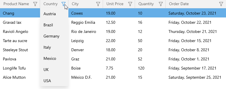
List Drop-down Filter
A regular drop-down filter allows users to select one item at a time. To use this filter for a column, set the column’s ColumnBase.FilterPopupMode property to List.
Date-time Drop-down Filter
You can use the Date-time Drop-down Filter to filter data in GridDateColumn columns. This filter allows users to select a specific date in the calendar or select date intervals from a set of check boxes with predefined filters.
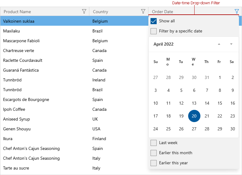
The predefined date intervals depend on the ColumnBase.FilterPopupMode property value:
| FilterPopupMode | Description |
|---|---|
| DateSmart (Default) | The drop-down filter displays filters if the column contains dates that fall into corresponding intervals. |
| Date | The drop-down filter displays all date filters, even if the column does not contain dates that fall into a corresponding date range. |
| DateAlt | This mode is similar to DateSmart, but with a different set of filters (Today, This week, This month, and a list of months). |
| DateCompact | The drop-down filter does not display predefined values. |
Set the ColumnBase.ShowEmptyDateFilter property to true to display an Empty check box in the Date-time Drop-down Filter. This option allows users to select records that contain null values.
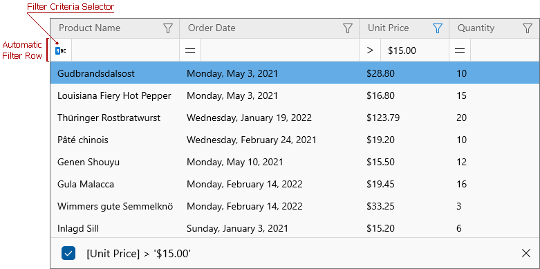
Automatic Filter Row
The automatic filter row allows users to filter data. When a user types text in the row, the GridControl creates a filter condition based upon the value entered and applies it to the column.
Set the DataControlBase.ShowAutoFilterRow property to true to show the automatic filter row.
To remove the filter, clear the text from the automatic filter row.
| Property | Description |
|---|---|
| ColumnBase.AllowAutoFilter | Specifies whether users can use the automatic filter row to filter the column’s values. When you set this property to false, the GridControl disables the automatic filter row’s cell for this column. |
| ColumnBase.ShowCriteriaInAutoFilterRow | Specifies whether to display the filter criteria selector in the automatic filter row. This selector allows users to apply the required criteria type to the column. |
| ColumnBase.AutoFilterCondition | Specifies the comparison operator type. |
| ColumnBase.AutoFilterValue | Specifies the automatic filter row’s cell value. |
| ColumnBase.ImmediateUpdateAutoFilter | The GridControl updates the filter condition when a user modifies the automatic filter row’s text. You can set this property to false to disable the column’s automatic updates. In this mode, the GridControl filters its data when a user presses the Enter key or focuses another cell. |
Note
If the ColumnBase.ShowCriteriaInAutoFilterRow property is set to true, the GridControl ignores the ColumnBase.AutoFilterCondition property. In this case, use the ColumnBase.AutoFilterCriteria property to apply the required condition.
Filter Data in Code
Use the DataControlBase.FilterCriteria or DataControlBase.FilterString property to apply a filter to the GridControl. Both properties specify the GridControl‘s filter, which can consist of multiple conditions applied to multiple columns.
When you use the DataControlBase.FilterCriteria property, you should create a CriteriaOperator object or its descendant that represents the filter expression:
grid.FilterCriteria = (
  new BinaryOperator("OrderDate", new DateTime(2019, 1, 1), BinaryOperatorType.Less) &
  new BinaryOperator("UnitPrice", 10, BinaryOperatorType.Less)) |
  ( new BinaryOperator("OrderDate", new DateTime(2020, 1, 1), BinaryOperatorType.GreaterOrEqual) &
  new BinaryOperator("UnitPrice", 100, BinaryOperatorType.GreaterOrEqual));
Or you can use the CriteriaOperator.Parse method:
grid.FilterCriteria =
    CriteriaOperator.Parse("([OrderDate] < #1/1/2019# AND [UnitPrice] < 10)" +
    " OR ([OrderDate] >= #1/1/2020# AND [UnitPrice] >= 100)");
The DataControlBase.FilterString property allows you to specify the filter string:
grid.FilterString = "([OrderDate] < #1/1/2019# AND [UnitPrice] < 10)" +
    " OR ([OrderDate] >= #1/1/2020# AND [UnitPrice] >= 100)";
You can also use the DataControlBase.MergeColumnFilters method, which combines the specified filter and the GridControl‘s current filter with the AND operator.
Clear Filters
To clear the GridControl‘s filter, set the DataControlBase.FilterCriteria property to null or the DataControlBase.FilterString property to an empty string.
Use the DataControlBase.ClearColumnFilter method to clear a column’s filter.
grid.ClearColumnFilter("OrderDate");
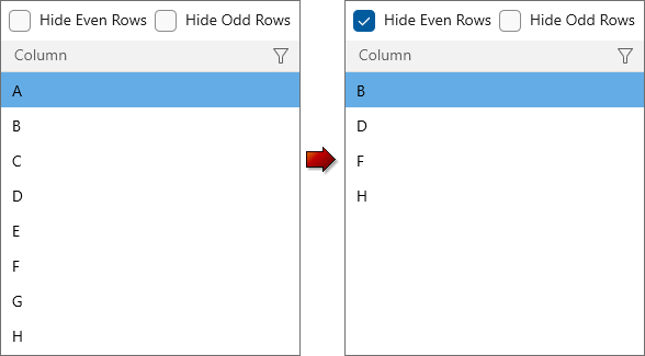
Custom Filter Rules
You can use custom rules to hide and show data rows. The custom filter takes priority over the filter criteria applied in a column’s Drop-down Filter or the Automatic Filter Row.
To apply a custom filter condition, handle the CustomRowFilter event. The GridControl raises this event for each record in a data source. The ListSourceRowIndex property returns the row’s data source index. The DefaultVisibility property returns the row’s visibility state based on the applied filter.
To hide or show a row, specify the Visible property.
<Grid>
    <Grid.RowDefinitions>
        <RowDefinition Height="36" />
        <RowDefinition Height="*" />
    </Grid.RowDefinitions>
    <StackPanel Grid.Row="0" Orientation="Horizontal">
        <CheckBox Name="chkHideEven"
                  Margin="7,0,7,0"
                  VerticalAlignment="Center"
                  Content="Hide Even Rows"
                  Checked="OnCheckedChanged"
                  Unchecked="OnCheckedChanged"/>
        <CheckBox Name="chkHideOdd"
                  VerticalAlignment="Center"
                  Content="Hide Odd Rows"
                  Checked="OnCheckedChanged"
                  Unchecked="OnCheckedChanged"/>
    </StackPanel>
    <dxg:GridControl x:Name="grid" Grid.Row="1"
                     ItemsSource="{x:Bind ViewModel.Source}"
                     CustomRowFilter="GridControl_CustomRowFilter"/>
</Grid>
void OnCheckedChanged(object sender, RoutedEventArgs e) {
    grid.RefreshData();
}
void GridControl_CustomRowFilter(object sender, DevExpress.WinUI.Grid.RowFilterEventArgs e) {
    if(chkHideOdd.IsChecked.Value && e.ListSourceRowIndex % 2 == 1)
        e.Visible = false;
    if(chkHideEven.IsChecked.Value && e.ListSourceRowIndex % 2 == 0)
        e.Visible = false;
}