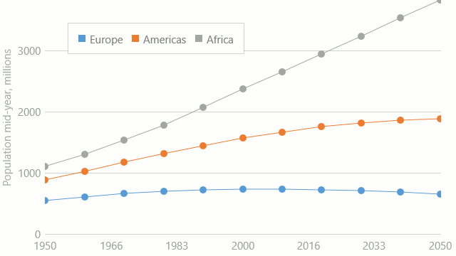
Stacked Line
The Stacked Line series displays data as lines on a diagram, so that the value of each data point is aggregated with underlying data point values. This chart is useful when it is necessary to compare how much each series adds to the total aggregate value for specific arguments.
An example of the Stacked Line chart is shown in the image below.