TileNavPane.NavButtons Property
Provides access to the collection of NavButton objects displayed in the TileNavPane‘s nav bar.
Namespace: DevExpress.Xpf.Navigation
Assembly: DevExpress.Xpf.Controls.v19.1.dll
Declaration
Property Value
| Type | Description |
|---|---|
| DevExpress.Xpf.Navigation.NavButtonCollection | A collection of NavButton objects. |
Remarks
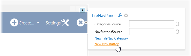
The TileNavPane‘s nav bar displays buttons that implement specific functionality. The Main Button (see below) provides access to the root elements of the navigation hierarchy. Other buttons perform a specific action on a click. In the following image, you can see buttons displayed in the TileNavPane‘s nav bar.

Read the NavButtons property to obtain a collection of NavButton objects displayed in the current TileNavPane. The NavButtonCollection type provides methods to manipulate elements of this collection in code. At design time, you can add buttons to the nav bar time using the TileNavPane‘s smart tag menu.
If you add a button to the nav bar using the TileNavPane‘s smart tag menu, it is aligned to the left margin of the nav bar. To specify the button’s alignment, use the NavButton.HorizontalAlignment property.
One of buttons displayed in the nav bar can be specified as the Main Button. The Main Button is the drop-down button that invokes the primary drop-down tile bar on a click. This bar contains tiles corresponding to root level navigation elements. To create a Main Button, add a NavButton object to the NavButtons collection and set its NavButton.IsMain property to true.
Any button which is not the Main Button, can invoke a drop-down tile bar containing tiles. To create this button, populate this button’s content with TileNavItem objects. See the definition of the Create… button in the example below.
The following markup shows how to populate the NavButtons collection. The result of this markup is shown in the figure above.
<dxnav:TileNavPane.NavButtons>
    <dxnav:NavButton Content="DevExpress CRM" IsMain="True" Glyph="{dx:DXImageGrayscale Image=Home_32x32.png}" AllowGlyphTheming="True"/>
    <dxnav:NavButton Content="Create..." HorizontalAlignment="Right" AllowGlyphTheming="True" Click="NavButton_Click_3" Glyph="{dx:DXImageGrayscale Image=Add_32x32.png}">
        <dxnav:TileNavItem Content="Staff">
            <dxnav:TileNavSubItem Content="Manager"/>
            <dxnav:TileNavSubItem Content="Seller"/>
        </dxnav:TileNavItem>
        <dxnav:TileNavItem Content="Client"/>
    </dxnav:NavButton>
    <dxnav:NavButton Content="Settings" GlyphAlignment="Right" Glyph="{dx:DXImageGrayscale Image=Customization_32x32.png}" AllowGlyphTheming="True" HorizontalAlignment="Right" Click="NavButton_Click_2"/>
    <dxnav:NavButton HorizontalAlignment="Right" Glyph="{dx:DXImageGrayscale Image=Cancel_32x32.png}" AllowGlyphTheming="True" Click="NavButton_Click_1"/>
</dxnav:TileNavPane.NavButtons>
Note that buttons representing breadcrumbs links in the nav bar are not contained in the NavButtons collection.
Related GitHub Examples
The following code snippets (auto-collected from DevExpress Examples) contain references to the NavButtons property.
Note
The algorithm used to collect these code examples remains a work in progress. Accordingly, the links and snippets below may produce inaccurate results. If you encounter an issue with code examples below, please use the feedback form on this page to report the issue.