TileBar Class
A bar with tiles that support the dropdown functionality.
Namespace: DevExpress.Xpf.Navigation
Assembly: DevExpress.Xpf.Controls.v18.2.dll
Declaration
Remarks
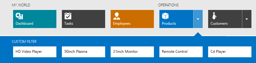
You can use the TileBar control to implement a tile-based menu for your application. The TileBar consists of tiles (TileBarItem objects) arranged in a single row. Any tile can be associated with a dropdown control via the TileBarItem.FlyoutContent property. In this case, this tile displays a dropdown button used to invoke the dropdown control.
You can assign any control to the TileBarItem.FlyoutContent property, including another TileBar control. In this case, when you click an item’s dropdown button, another TileBar is displayed in a dropdown window.
For a TileBar control displayed in a dropdown, set the TileBar.ItemColorMode property to Inverted to achieve a tile color different from the TileBar’s background.
Tiles in the TileBar can be of different widths. Use the TileBarItem.Size property to specify the item size.
Related GitHub Examples
The following code snippets (auto-collected from DevExpress Examples) contain references to the TileBar class.
Note
The algorithm used to collect these code examples remains a work in progress. Accordingly, the links and snippets below may produce inaccurate results. If you encounter an issue with code examples below, please use the feedback form on this page to report the issue.