SimpleButton Class
Serves as a base for classes that represent button controls.
Namespace: DevExpress.Xpf.Core
Assembly: DevExpress.Xpf.Core.v19.1.dll
Declaration
Remarks
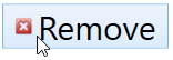
The following code snippet adds the SimpleBitton with the custom size, glyph, and font size.
<dx:SimpleButton Glyph="{dx:DXImage Image=Close_16x16.png}" Width="150" Height="40">
    <dx:SimpleButton.Content>
        <Grid>
            <TextBlock TextAlignment="Center" VerticalAlignment="Center" FontSize="30">Remove</TextBlock>
        </Grid>
    </dx:SimpleButton.Content>
</dx:SimpleButton>
Refer to the SimpleButton topic for more information.
Related GitHub Examples
The following code snippets (auto-collected from DevExpress Examples) contain references to the SimpleButton class.
Note
The algorithm used to collect these code examples remains a work in progress. Accordingly, the links and snippets below may produce inaccurate results. If you encounter an issue with code examples below, please use the feedback form on this page to report the issue.
Inheritance
Extension Methods
See Also