SimpleButton
Overview
The SimpleButton control is a basic button.
The SimpleButton control offers the following features.
Total control over button content
Use the SimpleButton.Content property to specify the SimpleButton‘s content.
<dx:SimpleButton x:Name="simpleButton"  Height="100" Width="226">
    <dx:SimpleButton.Content>
        <Grid>
            <Ellipse Height="80" Width="150" Fill="#FFAFAFF3"/>
            <TextBlock TextAlignment="Center" VerticalAlignment="Center" FontSize="30">Button</TextBlock>
        </Grid>
    </dx:SimpleButton.Content>
</dx:SimpleButton>
Customizable glyph
You can use the SimpleButton.Glyph property to assign a custom glyph.
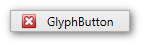
<dx:SimpleButton Width="120" Height="22" Content="GlyphButton" Glyph="{dx:DXImage Image=Close_16x16.png}"/>Adding image outside of DXImage
Add an image to your project and set the SimpleButton.Glyph property to image path and name in this project. This code snippet sets the closebutton.png image from the images project folder as theSimple Button control’s glyph:
<dx:SimpleButton Width="120" Height="22" Content="GlyphButton" Glyph="images/closebutton.png"/>Toggle mode
Set the SimpleButton.ButtonKind property to Toggle to enable the Toggle mode.
By default, Toggle mode supports two states, True and False. To enable the Indeterminate state, use the SimpleButton.IsThreeState property.
Repeat mode
Setting the SimpleButton.ButtonKind property to Repeat puts the SimpleButton control into Repeat mode.
Use the SimpleButton.Delay and SimpleButton.Interval properties to control the repeat behavior.