Layout Control Items
- 3 minutes to read
Overview
A LayoutControlItem object is a control that provides label and content regions. The control region can display any UIElement object:

Layout Control Items are wrappers for your controls. Controls cannot be added directly to the layout, but they can be added with the help of Layout Control Items.
Note
Layout Control Items can be used inside LayoutGroups only. Otherwise, an exception will be thrown.
A layout of controls can be built within a Layout Group container. You create a Layout Group and add layout items (Layout Control Items and/or other Layout Groups) as children. Child Layout Groups can own other Layout Control Items and other Layout Groups, and so on. For more information on this container, see Layout Groups.
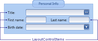
The following image shows a sample layout of controls, implemented using Layout Control Item and Layout Group objects:
Note
Do not combine dock and layout items within a single group.
Do not combine groups containing dock items with groups containing layout items. If you need to arrange layout items next to dock items, add the layout items into a dock panel (a LayoutPanel object).
Do not use dock items outside the DockLayoutManager control.
Content
To specify the content for the Layout Control Item, use the LayoutControlItem.Control property. This property accepts any UIElement object. In XAML, any element declared between the LayoutControlItem start and end tags is used to initialize the Control property.
<dxdo:LayoutControlItem Caption="First name">
    <dxe:TextEdit/>
</dxdo:LayoutControlItem>
Label and Image
A Layout Control Item allows you to display a label and image next to the item’s control. To specify the label, use the BaseLayoutItem.Caption inherited property. If required, the caption can be hidden via the BaseLayoutItem.ShowCaption property.
By default, a colon is appended to the item’s caption. You can assign a custom format string and override the default format string via the BaseLayoutItem.CaptionFormat member.
An item’s caption can be displayed on the left, right, top or bottom edge of the control. To specify the location, see BaseLayoutItem.CaptionLocation.
It’s possible to display an image (BaseLayoutItem.CaptionImage) on the left or right of the caption. To customize the image’s location, use BaseLayoutItem.CaptionImageLocation.
Alignment of Controls
For the controls displayed with the help of Layout Control Items, the automatic alignment feature is supported. By default, the left edges of items’ controls are aligned across all groups that belong to the same root layout container (a root LayoutGroup object).
Layout Control Items and Layout Groups inherit the BaseLayoutItem.CaptionAlignMode property, allowing you to customize control alignment settings for individual items and groups. For instance, to enable the local alignment of controls within a specific group, set the group’s CaptionAlignMode property to AlignInGroup. To enable the auto-size feature for an item’s caption, and therefore display the control immediately next to the caption, set the item’s CaptionAlignMode property to AutoSize.