Bar Containers
- 2 minutes to read
A bar container (BarContainerControl) is a control that can display bars (ToolBarControl, MainMenuControl, StatusBarControl and Bar). You can use bar containers to accomplish several tasks.
- To display a bar(s) at any position within the window, add a bar container at this position, and then add the bar(s) to this bar container.
- Bars wrapped in a bar container are displayed side-by-side, without overlapping.
- A drag widget is displayed for ToolBarControl and Bar objects, wrapped in a bar container. The drag widget allows bars to be dragged and made floating.
- Bar objects can only be displayed onscreen when added to or associated with a bar container.
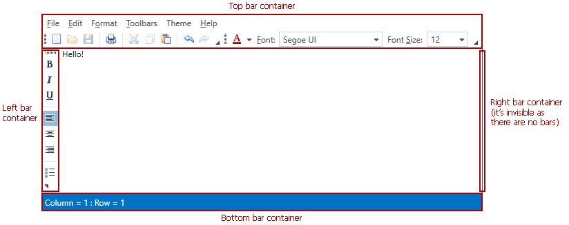
When using the BarManager component, four bar containers are implicitly added at the top, left, right and bottom edges of the BarManager (provided that the BarManager.CreateStandardLayout property is set to true; this is the default value). You can display a Bar object at any of these edges by associating the bar with a corresponding bar container using the Bar.DockInfo property. A bar container is invisible, unless a bar is docked to the container.

To create a floating bar in XAML, define a Bar object in the BarManager.Bars collection and set its Bar.DockInfo.ContainerType (BarDockInfo.ContainerType) property to BarContainerType.Floating.