Lesson 7 - Using Conditional Formatting in Grid
- 3 minutes to read
In this lesson, you will learn how to customize the appearance of grid cells using conditional formatting capabilities provided by the GridControl.
The EmployeeTaskCollectionView module from DevExpress.HybridApp is used to showcase applying format conditions to the GridControl.
Step 1 - Using Projections to Sort Tasks
In the Lesson 3 - Customize Layout of the Collection Views, you used the projections mechanism to order items in the UI. In the employee tasks module, tasks should be arranged so the most recent tasks are shown at the top. Add the OrderByDescending projection query to the base constructor invocation in the EmployeeTaskCollectionViewModel class.
protected EmployeeTaskCollectionViewModel(IUnitOfWorkFactory<IDevAVDbUnitOfWork> unitOfWorkFactory = null)
    : base(unitOfWorkFactory ?? UnitOfWorkSource.GetUnitOfWorkFactory(), x => x.Tasks, query => query.OrderByDescending(x => x.DueDate)) {
    }
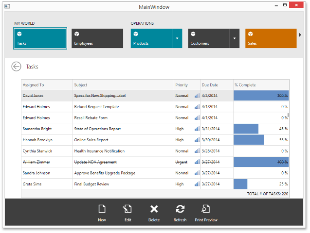
Step 2 - Using Data Bar Format Condition to Indicate Task Completion Progress
Customize the GridControl as described in the Lesson 3 - Customize Layout of the Collection Views.
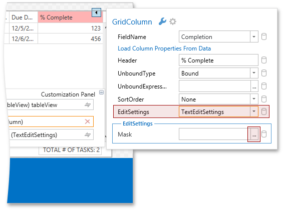
Configure the % Complete column to show its values as percentages. Select the % Complete column, invoke its smart tag and set the ColumnBase.EditSettings property to TextEditSettings. Invoke the Mask property editor.
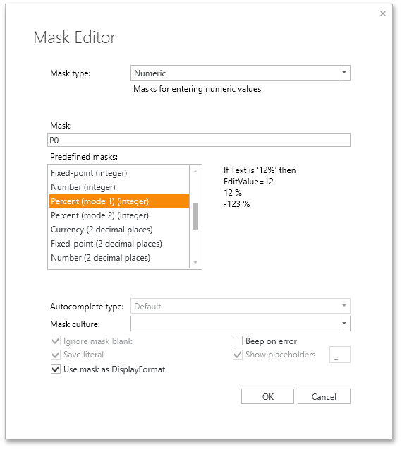
In the Mask Editor, select the Percent (mode 1) (integer) predefined mask and click OK.
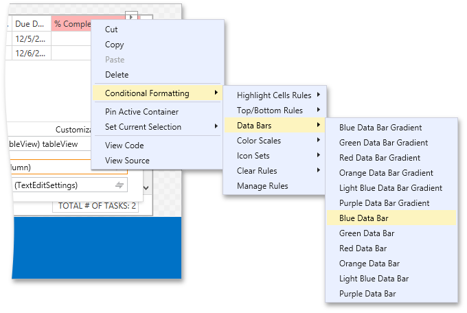
You will use the DataBarFormatCondition to display task completion progress. To add one of the predefined data bar formats, select the % Completed column, invoke its context menu and select the Conditional Formatting | Data Bars | Blue Data Bar option.
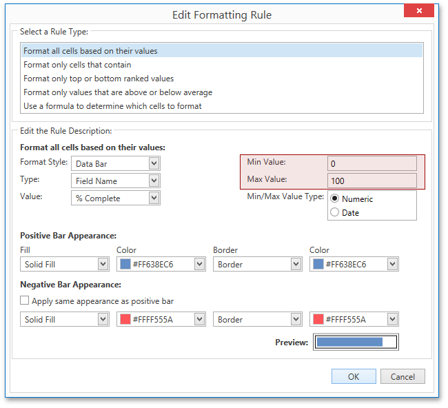
By default, the minimum and maximum values for the data bar are automatically calculated based on the minimum and maximum cell values for the corresponding column. You will however set the minimum and maximum values explicitly to 0 and 100 so that data bar is always rendered correctly even if there are no 0 and/or 100 values in the column. Invoke context menu for the % Complete columns and select Conditional Formatting | Manage Rules.
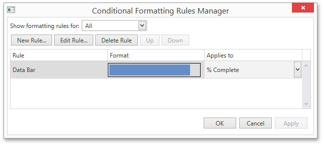
In the Conditional Formatting Rules Manager double-click the Data Bar rule. In the Edit Format Rule window, set the Min Value to 0 and Max Value to 100.
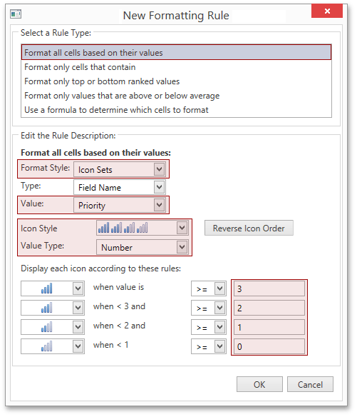
To display icons in the Priority column, use the IconSetFormatCondition. Select the Priority column and invoke the Conditional Formatting Rules Manager for it. Click the New Rule button, set up the new formatting rule as shown below and click OK.
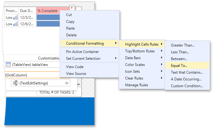
To display completed tasks with strikethrough text, select the % Complete column, invoke its context menu and select Conditional Formatting | Highlight Cell Rules | Equal To.
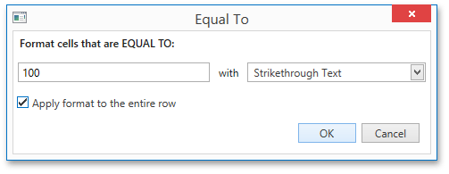
Set up the Equal To rule as shown below.
Run the application.
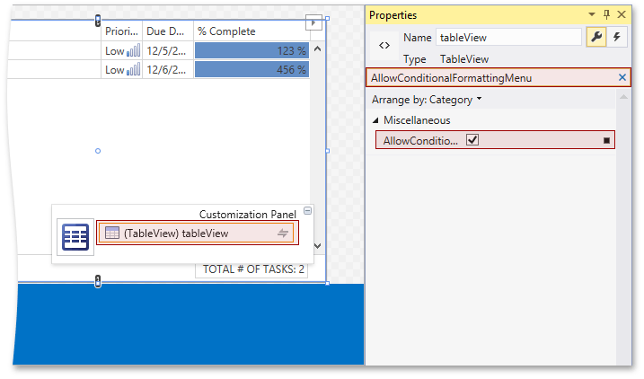
The GridControl provides conditional formatting rules customization at runtime. Select the grid view using the Customization Panel and set the TableView.AllowConditionalFormattingMenu property to true.
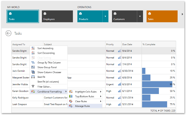
Run the application and invoke the context menu for any grid column. The Conditional Formatting sub menu provides the end-user to customize conditional formatting rules.
Applications that contain the result of this lesson are available here: DevExpress.OutlookInspiredApp and DevExpress.HybridApp.