Lesson 5 - Use Cards Layout in Collection Views
- 8 minutes to read
This lesson describes how to change the data representation mode for Employees modules to cards. You will do this for both projects: DevExpress.OutlookInspiredApp and DevExpress.HybridApp.
Step 1 - Changing GridControl data representation to CardView
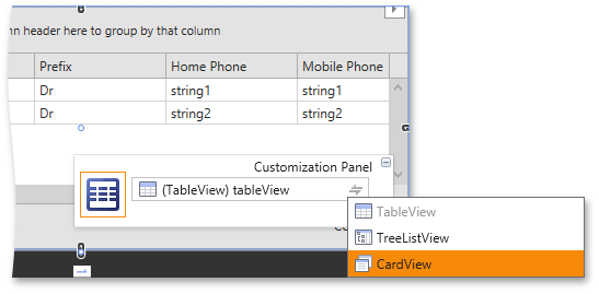
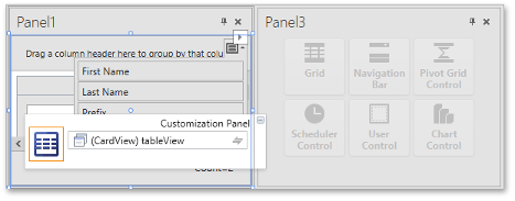
Along with the widely used table data representation, GridControl allows using cards for displaying data. To enable this feature, set the GridControl.View property to CardView. Open the EmployeeCollectionView in the DevExpress.OutlookInspiredApp project, select the GridControl, and convert its view to CardView using the GridControl Customization Panel.
By default, data fields are displayed one under another in cards. You can create your own card layout by setting the CardView.CardTemplate property.
<dxg:CardView x:Name="tableView" AllowEditing="False" ShowFixedTotalSummary="True">
                <dxg:CardView.CardTemplate>
                    <DataTemplate>
                        <Grid Width="295" Height="151">
                            <Grid.ColumnDefinitions>
                                <ColumnDefinition Width="Auto" />
                                <ColumnDefinition Width="*" />
                            </Grid.ColumnDefinitions>
                            <dxe:ImageEdit IsReadOnly="True" EditValue="{Binding Row.Picture}" Stretch="Uniform" Width="100" Margin="0,0,12,17" />
                            <StackPanel Grid.Column="1">
                                <TextBlock Text="ADDRESS" />
                                <TextBlock Text="{Binding Row.AddressLine}" />
                                <TextBlock Text="{Binding Row.AddressCityLine}" />
                                <TextBlock Text="EMAIL" Margin="0,13,0,0" />
                                <TextBlock Text="{Binding Row.Email}" />
                                <TextBlock Text="PHONE" Margin="0,13,0,0" />
                                <TextBlock Text="{Binding Row.HomePhone}" />
                            </StackPanel>
                        </Grid>
                    </DataTemplate>
                </dxg:CardView.CardTemplate>
            </dxg:CardView>
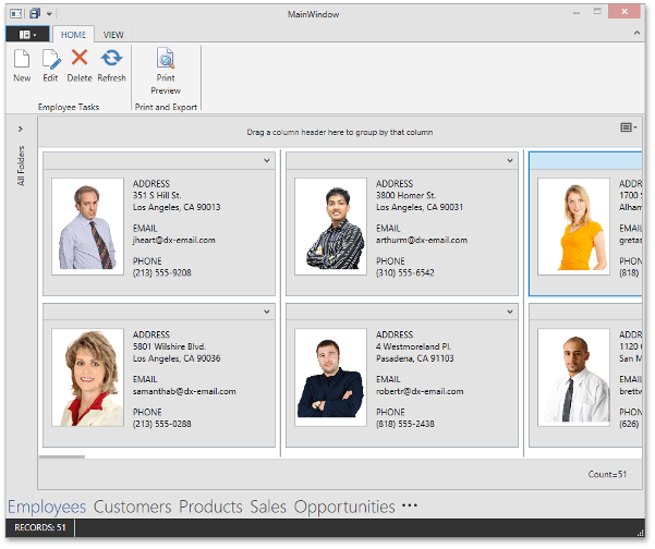
The result is shown in the screenshot below.
Step 2 - Displaying a Collection of Tasks Assigned to the Employee
In the previous lesson, you displayed the detail collection using the SlideView control. In this step, you will place a control that shows tasks assigned to the selected employee to a separate UserControl.
Select the GridControl and cut it from the design surface using the Ctrl+X key combination or designer context menu. The Instant Layout Assistant will appear over the appropriate area in the designer and will suggest controls that can be used in that area. Clicking one of these controls generates its corresponding code.
Note
You can enable or disable the Instant Layout Assistant via the DEVEXPRESS | WPF Controls v14.2 category in the Visual Studio menu.
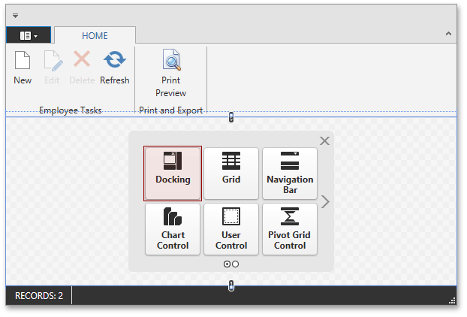
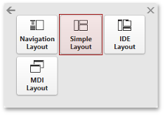
Click the Docking item in the Instant Layout Assistant and choose the Simple Layout item.
The following configuration of DockingPanels will be generated.
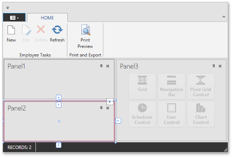
Delete Panel2, select Panel1 and paste the GridControl (that was cut previously) into it using the Ctrl+V key combination or designer context menu.
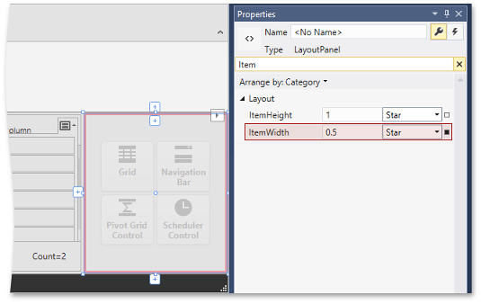
Select Panel1 and set its BaseLayoutItem.ShowCaption and ShowBorder properties to false. Do the same for Panel3. Change its BaseLayoutItem.ItemWidth property to 0.5:
Create a user control that will show the detail collection of the assigned task for the selected employee.
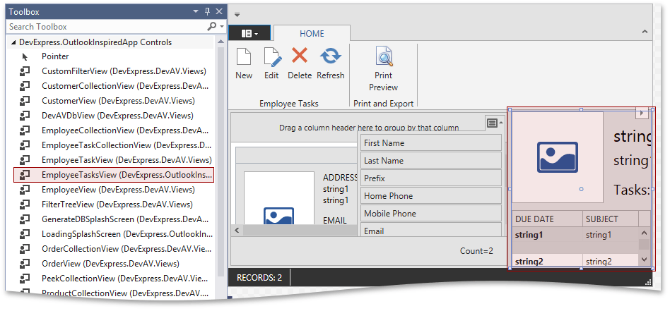
Add a new UserControl to the Views/Employee folder and name it EmployeeTasksView. Create the following layout using Toolbox, Property Grid and standard designer functionality, or simply copy-paste the following XAML into the created file.
This user control does not have the DataContext property set in XAML, because in runtime it is a part of EmployeeCollectionView, and its DataContext is bound to the selected entity. Thus, EmployeePanelView does not need to have its own DataContext in runtime. But it is preferable to have DataContext with an appropriate type assigned to EmployeePanelView in design time. To accomplish this, we use a special property, called d:DataContext.
<UserControl x:Class="DevExpress.OutlookInspiredApp.Views.EmployeeTasksView"
    xmlns="http://schemas.microsoft.com/netfx/2009/xaml/presentation"
    xmlns:d="http://schemas.microsoft.com/expression/blend/2008"
    xmlns:x="http://schemas.microsoft.com/winfx/2006/xaml"
    xmlns:mc="http://schemas.openxmlformats.org/markup-compatibility/2006"
    xmlns:dxe="http://schemas.devexpress.com/winfx/2008/xaml/editors"
    xmlns:dxg="http://schemas.devexpress.com/winfx/2008/xaml/grid"
    xmlns:devav="clr-namespace:DevExpress.DevAV"
    mc:Ignorable="d"
    d:DesignHeight="300" d:DesignWidth="400" d:DataContext="{d:DesignInstance Type=devav:Employee}">
    <Grid>
        <Grid.RowDefinitions>
            <RowDefinition Height="Auto" />
            <RowDefinition Height="*" />
        </Grid.RowDefinitions>
        <Grid.ColumnDefinitions>
            <ColumnDefinition Width="Auto" />
            <ColumnDefinition Width="*" />
        </Grid.ColumnDefinitions>
        <dxe:ImageEdit Width="130" Height="130" Margin="0,0,8,0" IsReadOnly="True" Stretch="Uniform" Source="{Binding Picture}" />
        <StackPanel Grid.Column="1" Margin="6,22,0,0">
            <TextBlock Text="{Binding FullName}" FontSize="24" Margin="0,-5,0,0" />
            <TextBlock Text="{Binding Title}" FontSize="20" Margin="0,5,0,0" />
            <TextBlock Text="Tasks:" FontSize="20" Margin="0,15,0,0" />
        </StackPanel>
        <dxg:GridControl Grid.Row="1" Grid.ColumnSpan="2" Margin="0,10,0,0" ItemsSource="{Binding AssignedTasks}">
            <dxg:GridControl.View>
                <dxg:TableView AutoWidth="True" ShowIndicator="False" ShowGroupPanel="False" AllowEditing="False" AllowBestFit="False" NavigationStyle="Row" RowDetailsVisibilityMode="Visible">
                    <dxg:TableView.FormatConditions>
                        <dxg:FormatCondition FieldName="DueDate" Expression="True" PredefinedFormatName="BoldText"/>
                    </dxg:TableView.FormatConditions>
                    <dxg:TableView.RowDetailsTemplate>
                        <DataTemplate>
                            <TextBlock Text="{Binding Row.Description}" Margin="5,0" TextWrapping="Wrap"/>
                        </DataTemplate>
                    </dxg:TableView.RowDetailsTemplate>
                </dxg:TableView>
            </dxg:GridControl.View>
            <dxg:GridControl.Columns>
                <dxg:GridColumn FieldName="DueDate" Header="DUE DATE" Width="100" FixedWidth="True"/>
                <dxg:GridColumn FieldName="Subject" Header="SUBJECT" />
            </dxg:GridControl.Columns>
        </dxg:GridControl>
    </Grid>
</UserControl>
Set up data bindings. Select ImageEdit and bind its ImageEdit.Source propety to Employee.Picture:
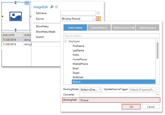
Bind the Text property of two TextBlocks in the StackPanel to Employee.FullName and Employee.Title in the same manner. Then, bind the GridControl’s DataControlBase.ItemsSource property to Employee.AssignedTasks.
<dxe:ImageEdit Width="130" Height="130" Margin="0,0,8,0" IsReadOnly="True" Stretch="Uniform" Source="{Binding Picture}" />
    <StackPanel Grid.Column="1" Margin="6,22,0,0">
        <TextBlock Text="{Binding FullName}" FontSize="24" Margin="0,-5,0,0" />
        <TextBlock Text="{Binding Title}" FontSize="20" Margin="0,5,0,0" />
        <TextBlock Text="Tasks:" FontSize="20" Margin="0,15,0,0" />
    </StackPanel>
    <dxg:GridControl Grid.Row="1" Grid.ColumnSpan="2" Margin="0,10,0,0" ItemsSource="{Binding AssignedTasks}">
        <!-- ... -->
    </dxg:GridControl>
Step 3 - Customizing the GridControl
The DueDate property is the most important one for an end-user, so let’s mark it in bold. The GridControl component provides powerful Conditional Formatting capabilities, which you can use to accomplish this task.
Select the DueDate column and invoke its context menu, select Conditional Formatting | Hightlight Cell Rules | Custom Condition.
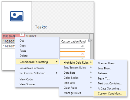
In the invoked Custom Condition editor, set the condition value to True, select the Bold Text format and click OK.
You can also use the TableView.RowDetailsTemplate property to display task descriptions underneath cells in each row. Add the following TableView.RowDetailsTemplate property definition into your EmployeeTasksView.
<dxg:TableView.RowDetailsTemplate>
                <DataTemplate>
                    <TextBlock Text="{Binding Row.Description}" Margin="5,0" TextWrapping="Wrap"/>
                </DataTemplate>
            </dxg:TableView.RowDetailsTemplate>
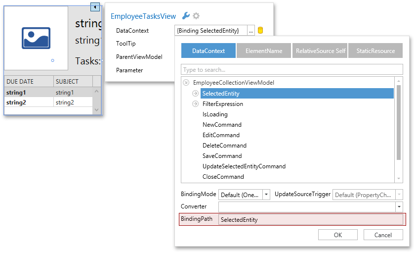
Build the project. Open the EmployeeCollectionView control in the designer and drop the EmployeeTasksView from the Toolbox to the left layout panel.
Select the dropped user control, open its smart tag and bind the DataContext property to SelectedEntity.
Run the application.

Step 4 - Using ListView to Display Employees
The MVVM approach allows us to use any controls, including standard controls, in the UI without changing the application logic. In the DevExpress.HybridApp project, you will use the ListView to display the Employees table.
Open the EmployeeCollectionView and run the designer.
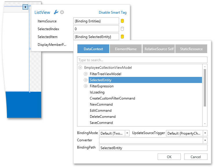
Delete the GridControl and drop the standard ListView instead. Using the Smart Tag and Binding Editor, bind its ItemsSource and SelectedItem properties to Entities and SelectedEntity respectively.
To display Employee objects as cards, assign the ItemTemplate property:
<ListView.ItemTemplate>
            <DataTemplate>
                <Grid Width="340">
                    <Grid.RowDefinitions>
                        <RowDefinition Height="Auto" />
                        <RowDefinition Height="*" />
                    </Grid.RowDefinitions>
                    <Border BorderThickness="0" Height="33">
                        <TextBlock Text="{Binding Path=FullName}" FontWeight="Normal" Margin="12,0,12,0" VerticalAlignment="Center" />
                    </Border>
                    <Grid Grid.Row="1" Margin="12">
                        <Grid.ColumnDefinitions>
                            <ColumnDefinition Width="Auto" />
                            <ColumnDefinition Width="*" />
                        </Grid.ColumnDefinitions>
                        <Border Grid.Column="0" BorderBrush="#FFC2C4CB" BorderThickness="1">
                            <Image Stretch="UniformToFill" Height="150" Width="120" Source="{Binding Path=Picture}" />
                        </Border>
                        <Grid Margin="12,10,12,0" Grid.Column="1">
                            <Grid.RowDefinitions>
                                <RowDefinition Height="*" />
                                <RowDefinition Height="*" />
                                <RowDefinition Height="*" />
                            </Grid.RowDefinitions>
                            <StackPanel VerticalAlignment="Top">
                                <TextBlock Text="ADDRESS:" Foreground="#FF808080" FontSize="13" />
                                <TextBlock Text="{Binding Path=AddressLine}" />
                                <TextBlock Text="{Binding Path=AddressCityLine}" />
                            </StackPanel>
                            <StackPanel Grid.Row="1" VerticalAlignment="Top">
                                <TextBlock Text="PHONE:" Foreground="#FF808080" FontSize="13" />
                                <TextBlock Text="{Binding Path=MobilePhone}" TextTrimming="CharacterEllipsis" />
                            </StackPanel>
                            <StackPanel Grid.Row="2" VerticalAlignment="Top">
                                <TextBlock Text="EMAIL:" Foreground="#FF808080" FontSize="13" />
                                <TextBlock Text="{Binding Path=Email}" TextTrimming="CharacterEllipsis" />
                            </StackPanel>
                        </Grid>
                    </Grid>
                </Grid>
            </DataTemplate>
        </ListView.ItemTemplate>
To display employee cards horizontally, use WrapPanel as the ItemsPanel template:
<ListView.ItemsPanel>
            <ItemsPanelTemplate>
                <WrapPanel Orientation="Vertical" />
            </ItemsPanelTemplate>
        </ListView.ItemsPanel>
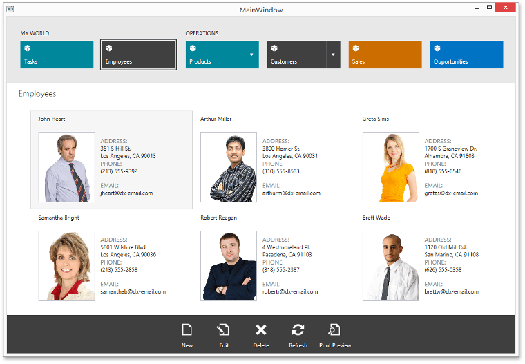
Run the application:
Step 5 - Customizing the ListView Behavior
By default, the Scaffolding Wizard generates an out-of-the-box functionality for collection views that implies opening an editing form when an end-user double-clicks a grid row. Let’s implement the same feature for the ListView.
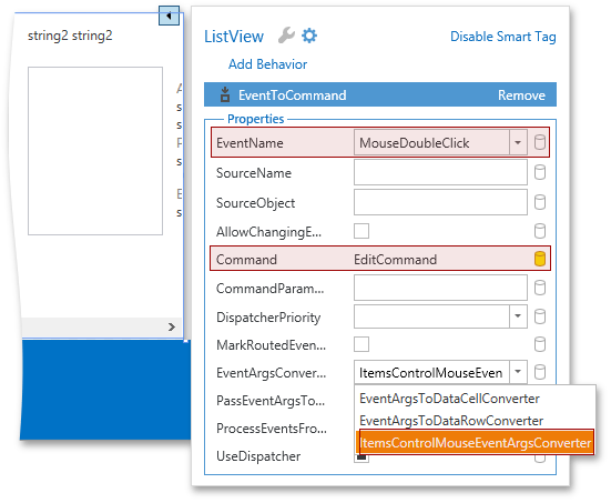
Open the ListView’s smart tag, switch to the MVVM Behaviors and Services tab and attach the EventToCommand behavior to the list view.
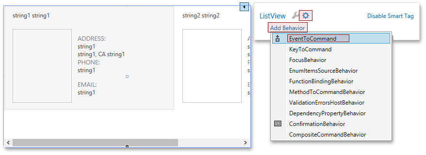
Using the smart tag, set the EventName property to MouseDoubleClick, bind the Command property to EditCommand and select the ItemsControlMouseEventArgsConverter class as the EventArgsConverter.
Now, a double click on an employee card opens a detail editing form.
It is also necessary to enable scrolling the ListView via the mouse wheel. ListView doesn’t support this feature out-of-the-box. The easiest way to implement this feature manually is to subscribe to the PreviewMouseWheel event and perform scrolling:
void OnPreviewMouseWheel(object sender, MouseWheelEventArgs e) {
            var scrollBar = (ScrollBar)LayoutHelper.FindElementByName(AssociatedObject, "PART_HorizontalScrollBar");
            if(e.Delta > 0)
                ScrollBar.LineLeftCommand.Execute(null, scrollBar);
            else if(e.Delta < 0) {
                ScrollBar.LineRightCommand.Execute(null, scrollBar);
            }
        }
However, this approach prevents reusing the feature without duplicating the code-behind. Let’s create a custom behavior and move the code above into it:
public class HorizontalScrollingOnMouseWheelBehavior : Behavior<ListView> {
        protected override void OnAttached() {
            base.OnAttached();
            AssociatedObject.PreviewMouseWheel += OnPreviewMouseWheel;
        }
        protected override void OnDetaching() {
            base.OnDetaching();
            AssociatedObject.PreviewMouseWheel -= OnPreviewMouseWheel;
        }
        void OnPreviewMouseWheel(object sender, MouseWheelEventArgs e) {
            var scrollBar = (ScrollBar)LayoutHelper.FindElementByName(AssociatedObject, "PART_HorizontalScrollBar");
            if(e.Delta > 0)
                ScrollBar.LineLeftCommand.Execute(null, scrollBar);
            else if(e.Delta < 0) {
                ScrollBar.LineRightCommand.Execute(null, scrollBar);
            }
        }
    }
Now, to enable the mouse wheel scrolling feature for a ListView, simply register the created behavior for this ListView:
<dxmvvm:Interaction.Behaviors>
                <local:HorizontalScrollingOnMouseWheelBehavior />
...
            </dxmvvm:Interaction.Behaviors>
Note
The EmployeeCollectionView.xaml file contains the view:StaticFiltersPanel element which will be described in the Lesson 8 - Add Advanced End-user Filtering Functionality to Applications. To use this code, temporarily delete it from XAML.
Result
Note
A complete sample project is available at https://github.com/DevExpress-Examples/hybrid-ui-demo-application-created-using-scaffolding-wizards-t196735.
Note
A complete sample project is available at https://github.com/DevExpress-Examples/outlook-inspired-demo-application-created-using-scaffolding-wizards-t196733.