Visual Elements in Spreadsheet Control for WPF
- 6 minutes to read
The WPF Spreadsheet application can include the following UI elements:
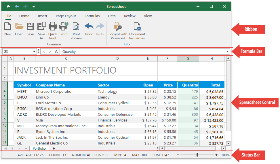
Ribbon
A ribbon contains multiple tabs with grouped commands that enable users to perform basic operations in the Spreadsheet control: create, load, modify, save, and print spreadsheet documents.
Set the SpreadsheetControl.CommandBarStyle property to CommandBarStyle.Ribbon to display the integrated ribbon. When you create a new WPF Spreadsheet application, it contains a ribbon UI with all the available spreadsheet ribbon pages. You can add new ribbon elements, modify or remove the existing items.
See how to customize the integrated ribbon for the Spreadsheet.
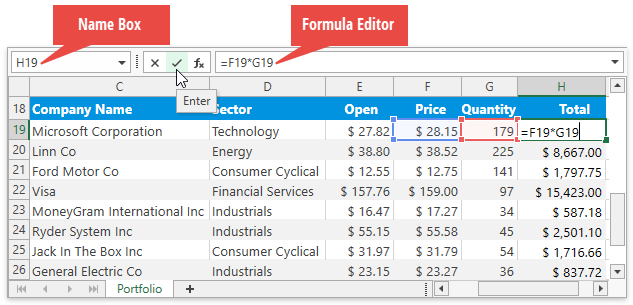
Formula Bar
The Formula Bar displays an active cell’s value and allows users to view, enter, and edit formulas and cell data in the Spreadsheet control. The drop-down button at the right corner allows you to expand and collapse the formula bar.
Set the SpreadsheetControl.ShowFormulaBar property to true to display the built-in Formula Bar.
See how to create a Spreadsheet application with a Formula Bar.
Use the following API to control the visibility of the Formula Bar’s elements:
| Property | Action |
|---|---|
| SpreadsheetControl.FormulaBarShowNameBox | Shows or hides the Name Box. |
| SpreadsheetControl.FormulaBarShowButtons | Shows or hides the Cancel, Enter and Insert Function buttons. |
| SpreadsheetControl.FormulaBarShowEditor | Shows or hides the formula editor. |
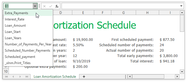
The Name Box is a part of the Formula Bar that displays a reference to an active cell or a name for the selected cell range (if specified), picture or chart. The Name Box also enables users to create named ranges, and quickly navigate to cells by their references and names.
Spreadsheet Control
Worksheet
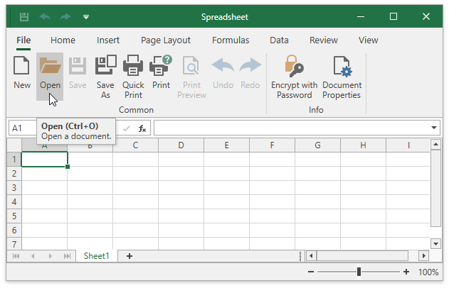
A worksheet is a single page within a document. It is a grid of cells used to store and edit data in the Spreadsheet control. The default Spreadsheet application contains one blank worksheet.
The Worksheet.ActiveView property returns options used to specify a worksheet’s appearance in the Spreadsheet control:
| Property | Action |
|---|---|
| WorksheetView.ShowGridlines | Shows or hides gridlines. |
| WorksheetView.ShowHeadings | Shows or hides row and column headers. |
| WorksheetView.Zoom | Specifies the zoom level. |
| WorksheetView.TabColor | Specifies a worksheet’s tab color. |
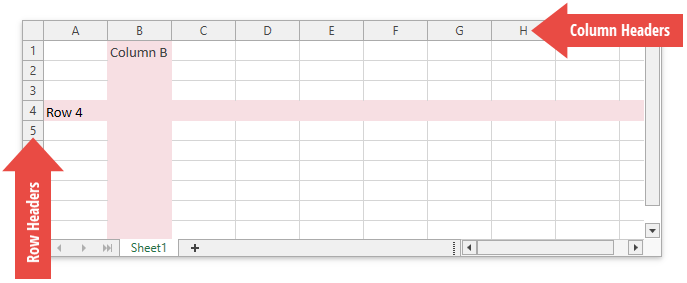
Rows and Columns
Each worksheet is divided into 1,048,576 rows and 16,384 columns. Each row is numbered (1, 2, 3, …) and each column is lettered (A, B, C, …) or numbered (1, 2, 3, …), depending on the reference style applied.
Use the following API to set the row height and column width, and customize the appearance of row and column headers:
| Property | Action |
|---|---|
| Row.Height CellRange.RowHeight |
Specify the row height. |
| Column.Width CellRange.ColumnWidth |
Specify the column width. |
| SpreadsheetViewOptions.ShowColumnHeaders | Shows or hides column headers in the Spreadsheet control. |
| SpreadsheetViewOptions.ShowRowHeaders | Shows or hides row headers in the Spreadsheet control. |
| WorksheetView.ShowHeadings | Shows or hides row and column headers in a worksheet. |
| SpreadsheetViewOptions.ColumnHeaderHeight | Specifies the height of column headers. |
| SpreadsheetViewOptions.RowHeaderWidth | Specifies the width of row headers. |
Specify the Display Area
The Spreadsheet control displays all columns and rows. You can call the WorksheetDisplayArea.SetSize method to restrict the number of visible columns and rows.
Freeze Rows or Columns
The Worksheet.FreezeRows, Worksheet.FreezeColumns, and Worksheet.FreezePanes methods enable you to keep specific rows and columns visible when a user scrolls a worksheet. See the following example for details: How to: Freeze and Unfreeze Rows and Columns.
Cells
All worksheet data is stored in cells. All cells have faint borders, or gridlines, around them. The WorksheetView.ShowGridlines property allows you to show or hide gridlines. Use the SpreadsheetControl.GridLinesColor property to change the gridline color.
Use the SpreadsheetControl.GetCellBounds method to obtain a cell’s coordinates and size.
Edit Cells
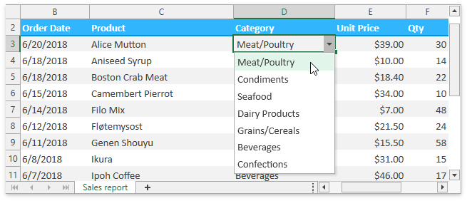
Users can double-click a cell, press F2 or start typing to edit a selected cell’s value. They can enter a numeric or text value, or insert a formula to calculate a cell’s value dynamically. You can assign a custom in-place editor to a cell to facilitate user input.
Cell Appearance
Use the following API to format cells in a worksheet:
| Property | Action |
|---|---|
| CellRange.Style | Applies a predefined or custom cell style. |
| Formatting.Font | Specifies cell font settings. |
| Formatting.Fill | Allows you to color the cell background. |
| Formatting.Alignment | Specifies how to align cell content. |
| Formatting.Borders | Allows you to add borders to a cell. |
| Formatting.NumberFormat | Applies a number format to a cell value. |
| SpreadsheetControl.CellTemplate | Allows you to paint cells in a custom manner. |
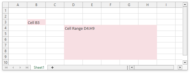
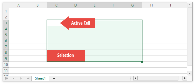
Selection
The Spreadsheet control enables users to select cells, cell ranges, rows, and columns in a worksheet. The selected cell used to enter data is called an active cell. Use the SpreadsheetControl.ActiveCell property to obtain the active cell. When a cell range is selected, the active cell is usually the top left cell of this range.
Use the following API to specify selection in code:
| Property | Action |
|---|---|
| SpreadsheetControl.SelectedCell Worksheet.SelectedCell |
Specify an active cell. |
| SpreadsheetControl.Selection Worksheet.Selection |
Allow you to select the continuous cell range. |
| SpreadsheetControl.SetSelectedRanges Worksheet.SetSelectedRanges |
Allow you to select multiple non-adjacent cell ranges. |
Selection Options
The SpreadsheetControl.Options.Behavior.Selection property returns the following selection options:
| Property | Action |
|---|---|
| SpreadsheetSelectionBehaviorOptions.AllowMultiSelection | Specifies whether a user can select multiple cell ranges or drawing objects at a time. |
| SpreadsheetSelectionBehaviorOptions.AllowExtendSelection | Specifies whether a user can extend selection with the mouse or arrow keys. |
| SpreadsheetSelectionBehaviorOptions.HideSelection | Specifies whether to highlight selected cells in the Spreadsheet control. |
| SpreadsheetSelectionBehaviorOptions.MoveActiveCellMode | Specifies the direction in which an active cell moves when the Enter key is pressed. |
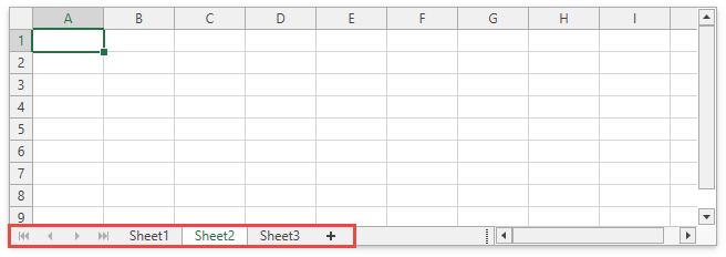
Sheet Tab Selector
The Sheet Tab Selector displays all worksheets in a workbook. It enables users to add new worksheets, move between the existing worksheets, rename, hide or delete them.
| Property | Action |
|---|---|
| SpreadsheetControl.ShowTabSelector | Shows or hides the Sheet Tab Selector. |
| WorksheetView.TabColor | Specifies a worksheet’s tab color. |
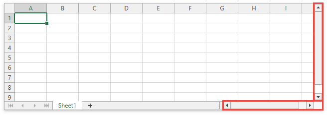
Vertical and Horizontal Scroll Bars
The horizontal and vertical scroll bars allow users to navigate through the current worksheet.
| Property | Action |
|---|---|
| SpreadsheetControl.VerticalScrollbarVisibility | Controls the visibility of vertical scroll bars. |
| SpreadsheetControl.HorizontalScrollbarVisibility | Controls the visibility of horizontal scroll bars. |
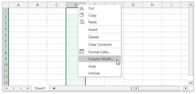
Context Menu
When a user right-clicks anywhere on a worksheet (that is, a cell, row or column header, picture or chart), a context menu appears. It contains basic commands used to work with the current object.
See the list of available context menu types.
| Property | Action |
|---|---|
| SpreadsheetControl.MenuCustomizations SpreadsheetControl.PopupMenuShowing |
Allow you to customize a context menu (add or remove menu items). |
| SpreadsheetBehaviorOptions.ShowPopupMenu | Disables or hides a context menu. |
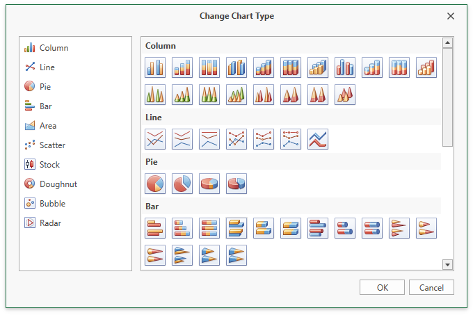
Dialogs
The WPF Spreadsheet ships with a number of dialogs that enable users to load documents, format cells, insert functions, create charts, tables, and pivot tables, specify print settings, and so on.
See the list of Spreadsheet dialogs.
Status Bar
A status bar appears at the bottom of the Spreadsheet application and displays the following elements:
A progress bar that indicates the progress of lengthy operations (file load/save operations and export to PDF/HTML).
End Mode: Indicates whether End Mode is activated. Press END to turn End Mode on and use an arrow key to move to the first or last cell of a data range in the row or column. If cells are blank, the active cell moves to the first or last cell in the row or column. End Mode turns off after you press an arrow key. Press END to activate End Mode again.
Summary data: the average, count, numerical count, min, max, and sum of selected cells.
A zoom slider and zoom level.
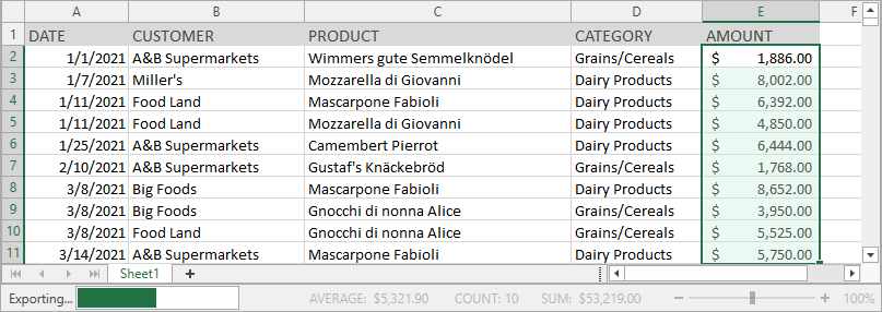
Set the SpreadsheetControl.ShowStatusBar property to true to display the built-in status bar.
See how to create a Spreadsheet application with a status bar.