Lesson 2 - Display and Edit Data
- 4 minutes to read
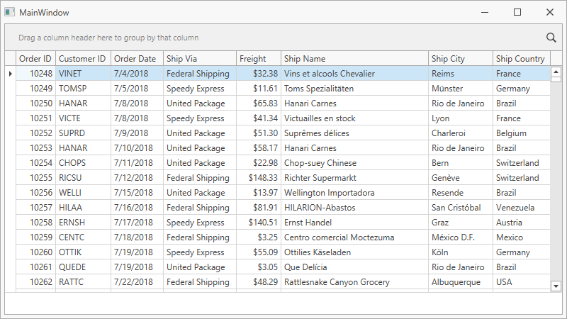
This tutorial demonstrates how to display and edit data within the GridControl. The tutorial is based on Lesson 1.
Create Columns
Add columns to the GridControl explicitly to access individual settings for each column.
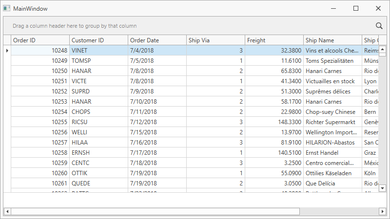
Create the GridColumn objects and specify their ColumnBase.FieldName and ColumnBase.IsSmart properties:
<dxg:GridControl ItemsSource="{Binding Orders}">
    <dxg:GridControl.View>
        <dxg:TableView ShowTotalSummary="True"/>
    </dxg:GridControl.View>
    <dxg:GridColumn FieldName="OrderID" IsSmart="True"/>
    <dxg:GridColumn FieldName="CustomerID" IsSmart="True"/>
    <dxg:GridColumn FieldName="OrderDate" IsSmart="True"/>
    <dxg:GridColumn FieldName="ShipVia" IsSmart="True"/>
    <dxg:GridColumn FieldName="Freight" IsSmart="True"/>
    <dxg:GridColumn FieldName="ShipName" IsSmart="True"/>
    <dxg:GridColumn FieldName="ShipCity" IsSmart="True"/>
    <dxg:GridColumn FieldName="ShipCountry" IsSmart="True"/>
</dxg:GridControl>
If your field name has a complex path (like “ClientClasses.Count“) and you want the GridControl to reflect changes made in these nested properties, set the DataControlBase.DetectNestedPropertyChanges property to true.
Change Column Layout
Fit columns to the GridControl and set the optimal width for all columns to completely display their contents:
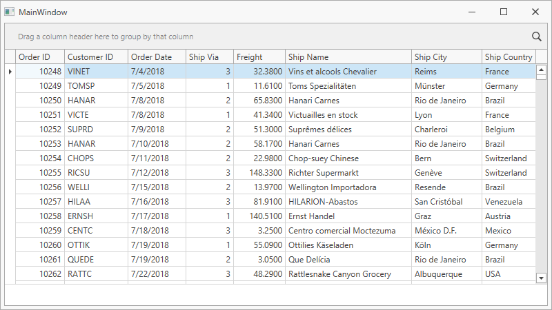
- Set the TableView.AutoWidth property to true to fit columns to the GridControl.
Set the TableView.BestFitModeOnSourceChange property to VisibleRows to calculate the optimal width for all columns:
<dxg:GridControl ItemsSource="{Binding Orders}">
    <dxg:GridControl.View>
        <dxg:TableView ShowTotalSummary="True"
                       AutoWidth="True"
                       BestFitModeOnSourceChange="VisibleRows"/>
    </dxg:GridControl.View>
    ...
</dxg:GridControl>
Specify an In-Place Editor
The GridControl uses in-place editors to edit cell values. The editor’s type depends on a column’s content. The CheckEdit is used for Boolean values, the DateEdit - for dates, the TextEdit - for strings and numbers. You can also define a custom editor (for example, the ComboBoxEdit):
Add a Shippers collection to the ViewModel:
using DevExpress.Mvvm;
using System.Collections.ObjectModel;
using System.Data.Entity;

namespace WPFBlankAppWithDatabase {
    public class ViewModel : ViewModelBase {

        NorthwindEntities northwindDBContext;
        public ViewModel() {
            if (IsInDesignMode) {
                Orders = new ObservableCollection<Order>();
                Shippers = new ObservableCollection<Shipper>();
            }
            else {
                northwindDBContext = new NorthwindEntities();

                northwindDBContext.Orders.Load();
                Orders = northwindDBContext.Orders.Local;

                northwindDBContext.Shippers.Load();
                Shippers = northwindDBContext.Shippers.Local;
            }
        }
        public ObservableCollection<Order> Orders {
            get => GetValue<ObservableCollection<Order>>();
            private set => SetValue(value);
        }
        public ObservableCollection<Shipper> Shippers {
            get => GetValue<ObservableCollection<Shipper>>();
            private set => SetValue(value);
        }
    }
}
Design Time
Build the solution to make the Shippers collection visible in the column’s Quick Actions.
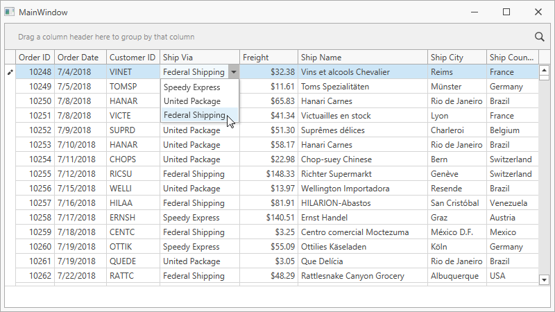
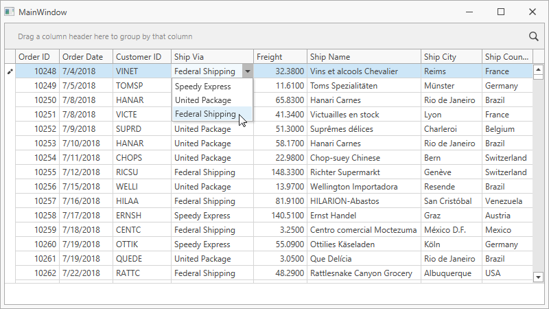
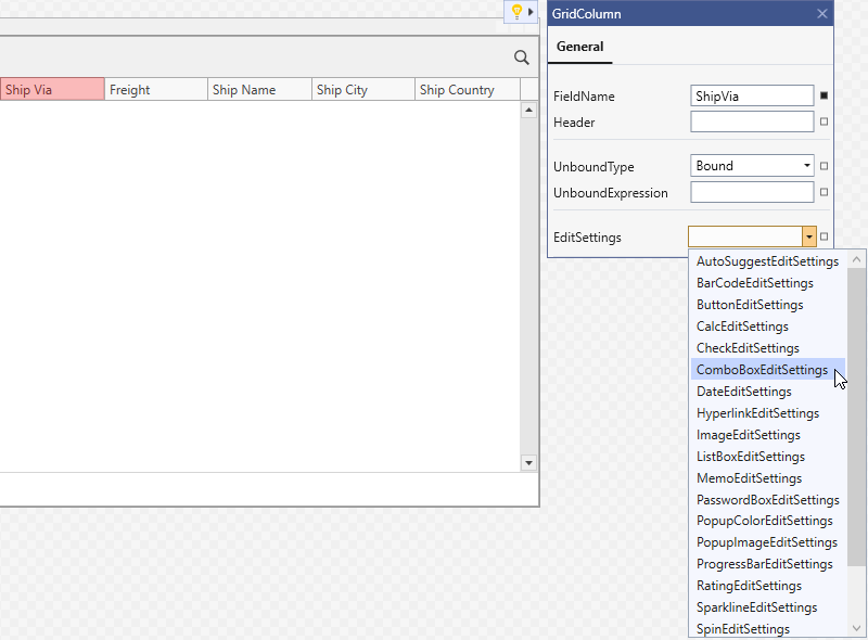
Invoke the Ship Via column’s Quick Actions and select ComboBoxEditSettings:
Set the Shippers collection as the ComboBoxEdit‘s ItemsSource:
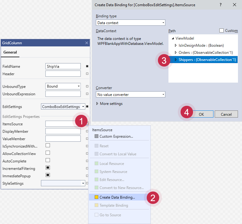
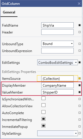
Set the DisplayMember property to CompanyName and the ValueMember property to ShipperID:
Runtime
Add the
xmlns:dxe="http://schemas.devexpress.com/winfx/2008/xaml/editors"namespace to the ThemedWindow.Create the ComboBoxEdit object and assign it to the Ship Via column’s ColumnBase.EditSettings property.
Specify the ItemsSource property to bind the ComboBoxEdit to data.
Set the DisplayMember property to CompanyName and the ValueMember property to ShipperID:
<dx:ThemedWindow
    ...
    xmlns:dxe="http://schemas.devexpress.com/winfx/2008/xaml/editors">
    ...
    <dxg:GridColumn FieldName="ShipVia" IsSmart="True">
        <dxg:GridColumn.EditSettings>
            <dxe:ComboBoxEditSettings ItemsSource="{Binding Shippers}"
                                      DisplayMember="CompanyName"
                                      ValueMember="ShipperID"/>
        </dxg:GridColumn.EditSettings>
    </dxg:GridColumn>
Format Values
You can configure how the GridControl displays data. The following example formats the Freight column’s data:
Design Time
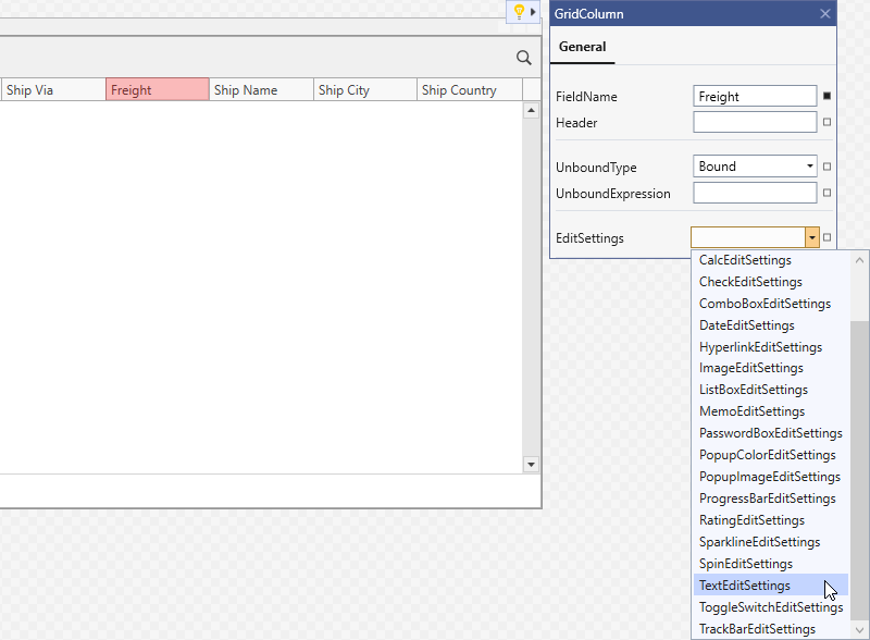
Invoke the Freight column’s Quick Actions and select TextEditSettings:
Select the Numeric mask type.
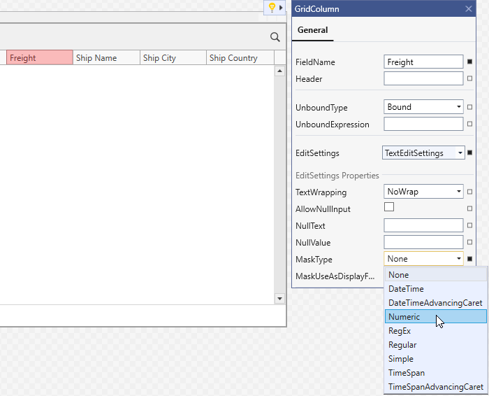
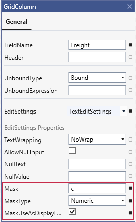
Reopen the Quick Actions to reveal the mask options. Set the Mask property to “c”.
Check Use mask as DisplayFormat and click OK:
Runtime
Create a TextEditSettings object and assign it to the Freight column’s ColumnBase.EditSettings property.
Specify the TextEditSettings.MaskType and TextEditSettings.Mask properties to set the in-placed editor’s mask to Currency.
Set the TextEditSettings.MaskUseAsDisplayFormat property to true:
<dxg:GridColumn FieldName="Freight" IsSmart="True">
    <dxg:GridColumn.EditSettings>
        <dxe:TextEditSettings Mask="c" MaskType="Numeric"
                              MaskUseAsDisplayFormat="True"/>
    </dxg:GridColumn.EditSettings>
</dxg:GridColumn>