DataGridView Class
A data grid view.
Namespace: DevExpress.XamarinForms.DataGrid
Assembly: DevExpress.XamarinForms.Grid.dll
Declaration
public class DataGridView :
    View,
    IDataControllerOwner,
    ICustomCellTextProvider,
    IGridControlTest,
    IGridDataProvider,
    IStyledElement
Related API Members
The following members return DataGridView objects:
Remarks
DataGridView is a data-aware control that presents data in a tabular format. To display data in a grid and allow users to manage it, bind the grid to a data source via the DataGridView.ItemsSource property. Note that the unbound mode (add and save records directly to a grid) is not supported and the grid cannot operate without a data source.
Columns
The grid represents data source’s fields as columns. It automatically generates columns based on the bound data source, or you can add columns to the grid and associate them with data fields manually. The AutoGenerateColumnsMode property allows you to prevent columns from being automatically created or set another mode of auto generating columns.
The grid stores its columns in the DataGridView.Columns collection. An individual column is a GridColumn class descendant that corresponds to the type of data this column displays. The following column types are supported:
Column Object | Description |
|---|---|
A grid column used to display and edit text values. | |
A grid column used to display and edit numeric values. | |
A grid column used to display and edit date values. | |
A grid column that displays Boolean values and allows a user to change a cell value by switching between two states. | |
A grid column used to display images. | |
A grid column that allows a user to edit a cell value by selecting an item from the predefined set. | |
A column type that allows you to define a custom template for column cells. |
The GridColumn.FieldName property specifies a data source’s field to which the column is bound. Each column object provides a set of properties to adjust column settings (for example, data display format, column width, header caption, content alignment), and manage grid data (sort and group).
Unbound Columns
In addition to columns bound to data source fields, you can create unbound columns to display data values calculated based on values of other columns. To create an unbound column in the grid, add a column object that corresponds to the type of data the column should display to the DataGridView.Columns collection, and set the following column properties:
- FieldName - a unique string that does not match any field name in the grid’s underlying data source.
- UnboundType - the type of data the column should display (Boolean, DateTime, Decimal, Integer, String or Object).
- UnboundExpression - a formula (string expression) that automatically calculates the column’s values.
The DataGridView.CustomUnboundColumnData event is another way to populate an unbound column with data. It allows you to implement custom logic of any complexity to provide cell values. Use also this event (not an expression), if you need to save changes that a user made in an unbound column.
Fixed Columns
The grid allows you to anchor (fix) columns to its left or right edge, so they always remain visible while a user scrolls the view horizontally. To fix a column, set its GridColumn.FixedStyle property to Start or End.
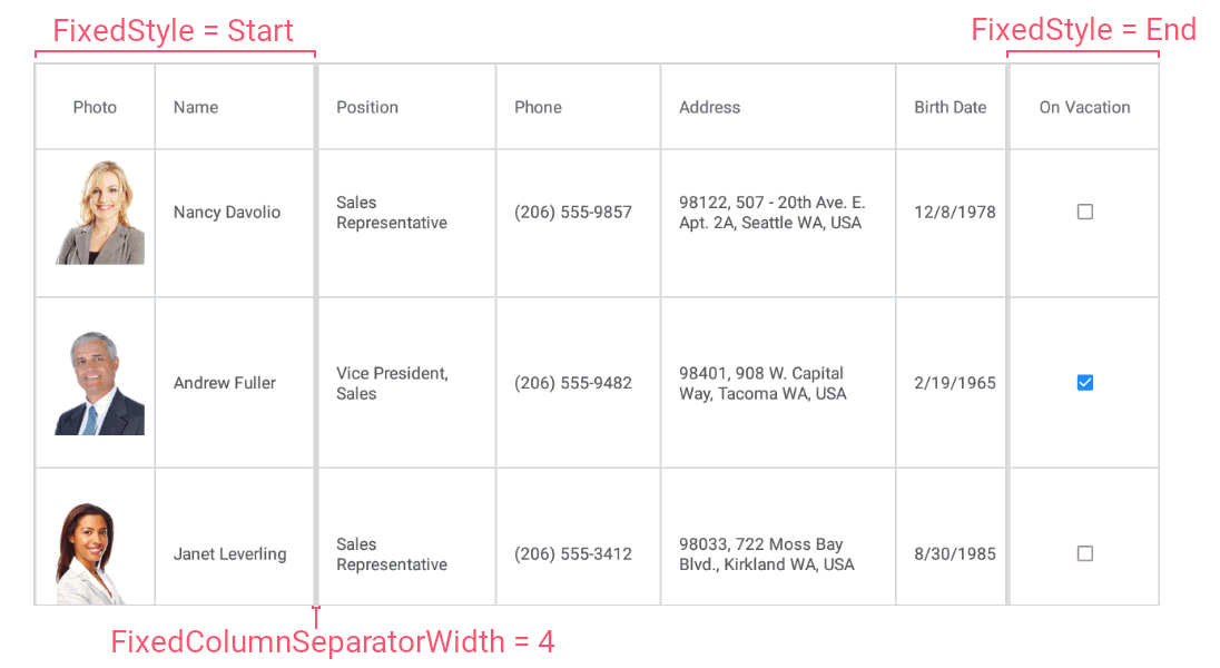
The grid’s FixedColumnSeparatorWidth property allows you to change the thickness of the line that separates fixed columns from scrollable columns.
Rows
Data rows in the grid represent records from the data source. To obtain the number to data rows in the grid, use the DataGridView.RowCount property.
The grid automatically adjusts the height of data rows to display the entire content of cells. If you specify the DataGridView.RowHeight property, all data rows have the same height.
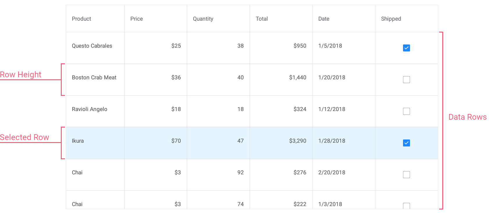
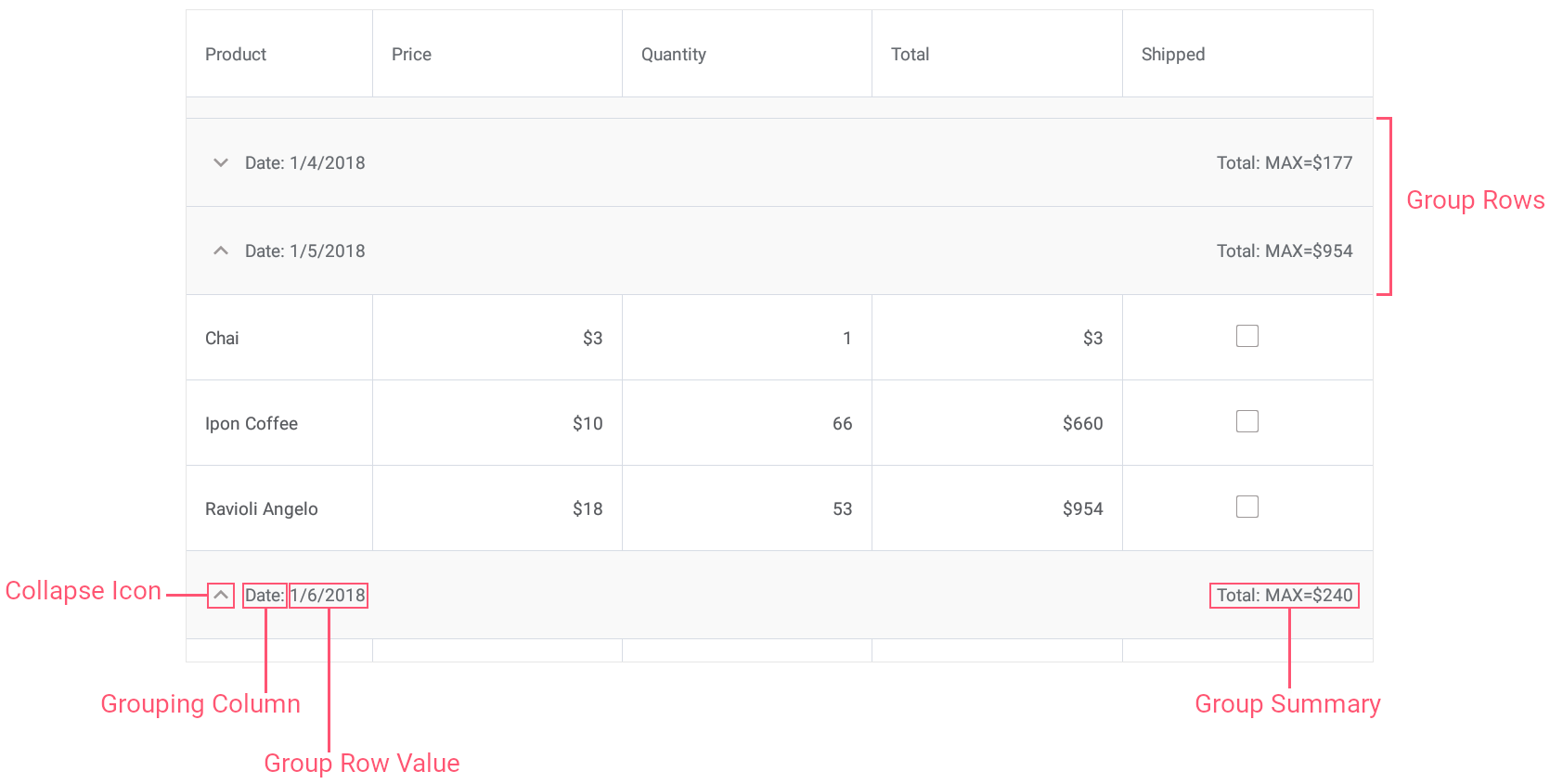
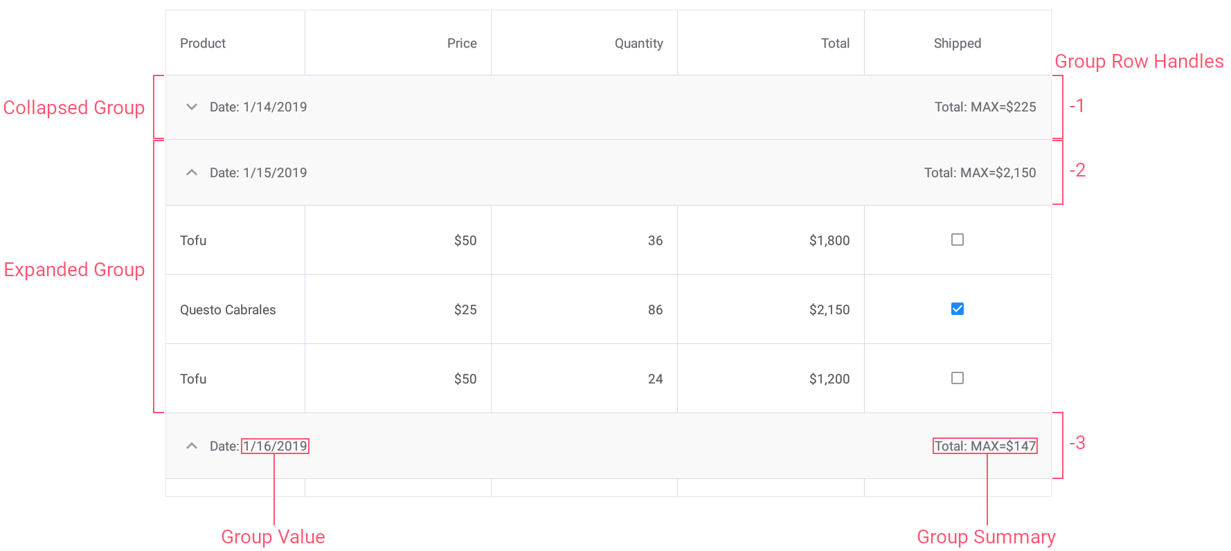
When data is grouped, the grid also displays group rows to separate groups of data rows. End users can tap group rows to expand and collapse groups.
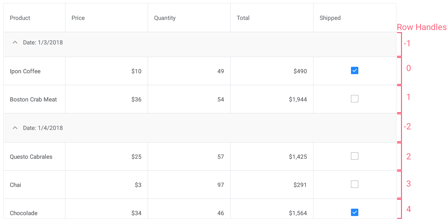
Row Handles
Grid rows are identified by unique integer values - row handles. Each row has a row handle, regardless of whether a row is currently visible (for example, a row might be scrolled off-screen or hidden within a collapsed group).
A row handle depends on the rows’s current location in the grid and changes dynamically when rows are reordered (for example, when data is sorted or grouped).
- Data row handles are zero-based indexes that correspond to row order from top to bottom.
- Group row handles are negative values that start with -1. The order matches the order of group rows from top to bottom.
The grid provides the following methods and properties to obtain row handles:
Method | Description |
|---|---|
Returns the handle of the first row that matches the specified criteria. | |
Searches for the value in the column and returns the handle of the corresponding row. | |
Returns the handle of the row that corresponds to the specified record in the data source. | |
Gets or sets the selected row handle. |
You can pass row handles as parameters to the following methods that operate with rows:
Method | Description |
|---|---|
Gets the value of the specified cell. | |
Assigns a value to the specified cell. | |
Gets an object that provides access to the data of the specified row. | |
Gets the index of the data source record to which the specified row handle corresponds. | |
Deletes the specified data row. | |
Scrolls the grid to make the specified row visible. | |
Provides access to the information on the specified group of rows. | |
Gets the value of the specified group row. | |
Collapses the specified group of rows. | |
Expands the specified group of rows. |
Cells
The grid displays data values in cells located at the intersection of columns and rows. You can use the following methods and properties to obtain and set cell values, and prevent users from changing cell values:
Method | Description |
|---|---|
Gets the value of the specified cell. | |
Gets the text displayed within the specified cell. | |
Assigns a value to the specified cell. | |
Gets or sets whether the grid is read-only. |
Edit Data
You can allow users to edit cell values via in-place editors or an edit form.
Related API
Member | Description |
|---|---|
Invokes an in-place editor for the specified cell. | |
Closes a cell in-place editor. | |
Gets or sets a gesture by which a user can invoke an in-place editor for a data cell. | |
Occurs after an in-place editor is closed and a modified cell value is applied or canceled. | |
The page that allows users to edit grid’s cell values. | |
Stores appearance settings of the grid’s edit form view. | |
Contains information on a data row that a user currently edits via the edit form. |
<dxg:DataGridView ItemsSource="{Binding Orders}" EditorShowMode="Tap">
    <!-- ... -->
</dxg:DataGridView>
Sort Data
Users can tap column headers to sort data in the grid.
Related API
Member | Description |
|---|---|
Specifies whether end users can sort data in the grid. | |
Specifies whether end users can sort data by the column. | |
Specifies whether the grid allows data sorting by multiple columns or by a single column only. | |
Gets or sets the column’s sort order. | |
Gets or sets the column’s position among sorted columns. | |
Specifies whether the grid should sort data by column values or display text. | |
Sorts data by the specified column. | |
Clears the sorting applied to the grid. |
<dxg:DataGridView x:Name="grid" ItemsSource="{Binding Orders}"
                 SortMode="Multiple">
    <dxg:DataGridView.Columns>
        <dxg:TextColumn FieldName="Product.Name"
                        SortOrder="Descending" SortIndex="0"/>
        <!-- ... -->
        <dxg:NumberColumn FieldName="Quantity"
                          SortOrder="Ascending" SortIndex="1"/>
        <!-- ... -->
        <dxg:SwitchColumn FieldName="Shipped" AllowSort="False"/>
    </dxg:DataGridView.Columns>
</dxg:DataGridView>
Group Data
The grid allows you to group data by a single column.
Groups of data rows (rows that have identical values in the specified column) are separated with group rows that a user can tap to expand or collapse groups. You can also display summary information about groups (for example, the sum of values, the number of records, the minimum or maximum value, etc.) on group rows.
Related API
Member | Description |
|---|---|
Gets or sets whether the grid’s data is grouped by the current column. | |
Gets or sets how data rows are combined into groups. | |
Groups data in the grid by the specified column. | |
Ungroups data in the grid. | |
Gets or sets whether the grid displays a column used to group data. | |
Provides access to the information on the specified group of rows. | |
Provides access to the collection of group summary items. | |
Specifies whether end users can collapse and expand groups of rows. | |
Collapses the specified group of rows. | |
Collapses all groups of rows. | |
Expands the specified group of rows. | |
Expands all groups of rows. |
<dxg:DataGridView x:Name="grid" ItemsSource="{Binding Orders}">
    <dxg:DataGridView.Columns>
         <!-- ... -->
        <dxg:DateColumn FieldName="Date" DisplayFormat="d"
                        IsGrouped="true" GroupInterval="Date"/>
         <!-- ... -->
    </dxg:DataGridView.Columns>
</dxg:DataGridView>
Filter Data
You can filter data in the grid against single or multiple columns. When a filter is applied, the grid displays a subset of data records that meet the specified criteria.
Related API
Member | Description |
|---|---|
Use any of these properties to apply a filter to the grid (a filter expression can consist of multiple conditions applied to multiple columns). | |
Gets the string that specifies a filter currently used in the grid. | |
Clears the filter applied to data in the grid. |
<dxg:DataGridView ItemsSource="{Binding Orders}"
                  FilterString="Contains([Product.Name], 'Choco')">
    <!-- ... -->
</dxg:DataGridView>
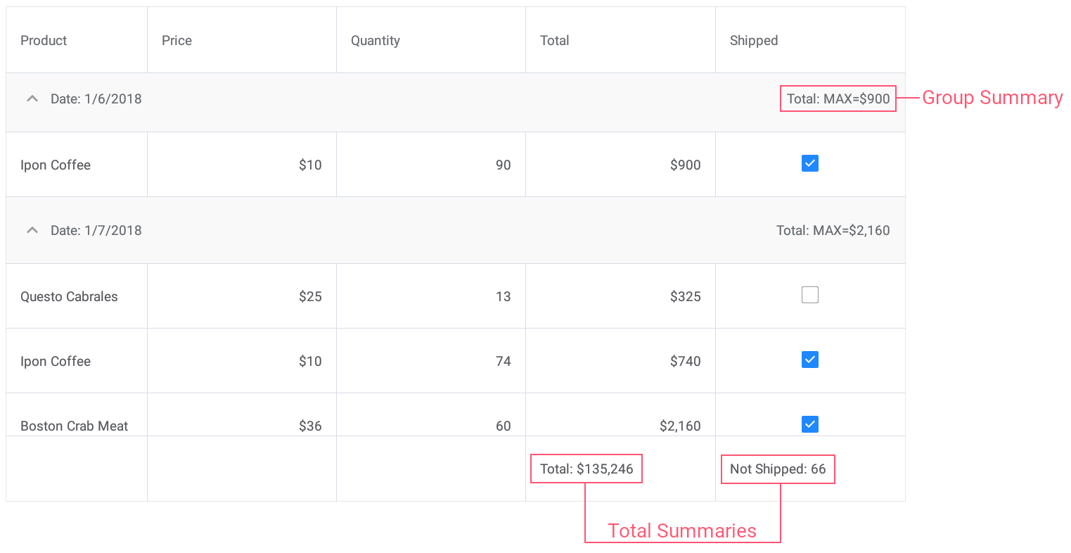
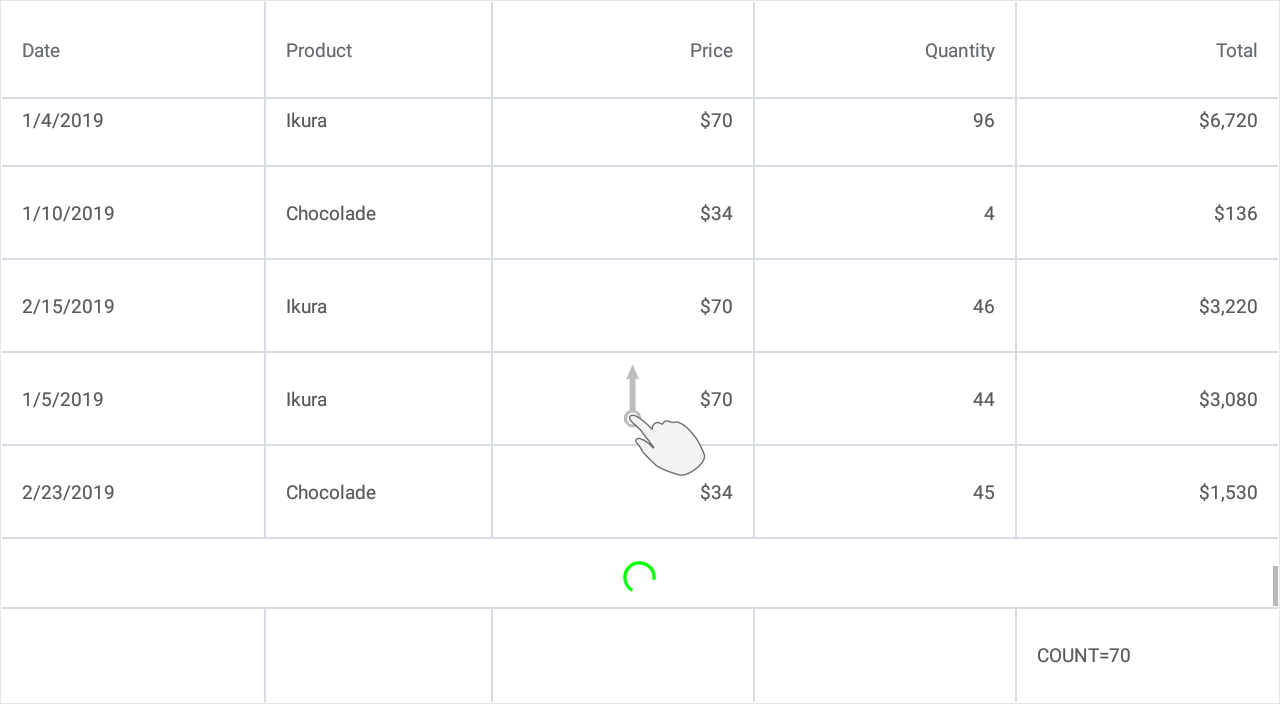
Data Summaries
The grid allows you to display summary information about groups of rows or particular columns. For example, you can display the sum of values, the number of records, the minimum or maximum value, etc.
Two summary types are supported: total summaries (calculated over all rows in a column and displayed below this column) and group summaries (calculated over all rows in a group and displayed in a group row).
Related API
A grid stores its total and group summaries in the DataGridView.TotalSummaries and DataGridView.GroupSummaries collections.
An individual summary (group or total) is a GridColumnSummary object that contains the following summary settings:
Property | Description |
|---|---|
Gets or sets the field name of the column for which a summary should be calculated. | |
Gets or sets the aggregate function type. | |
Gets or sets the pattern used to format the summary value. |
To implement and apply a custom aggregate function, set the GridColumnSummary.Type property to Custom and handle the DataGridView.CalculateCustomSummary event.
<dxg:DataGridView x:Name="grid" ItemsSource="{Binding Orders}"
                 CalculateCustomSummary="OnCalculateCustomSummary">
    <!-- ... -->
    <dxg:DataGridView.GroupSummaries>
        <dxg:GridColumnSummary FieldName="Total" Type="Max"/>
    </dxg:DataGridView.GroupSummaries>

    <dxg:DataGridView.TotalSummaries>
        <dxg:GridColumnSummary FieldName="Total" Type="Sum"
                                DisplayFormat="Total: {0:C0}"/>
        <dxg:GridColumnSummary FieldName="Shipped" Type="Custom"
                                DisplayFormat="Not Shipped: {0}"/>
    </dxg:DataGridView.TotalSummaries>
</dxg:DataGridView>
Pull to Refresh
You can set up the grid so that it allows users to initiate content refresh with the pull-down gesture.
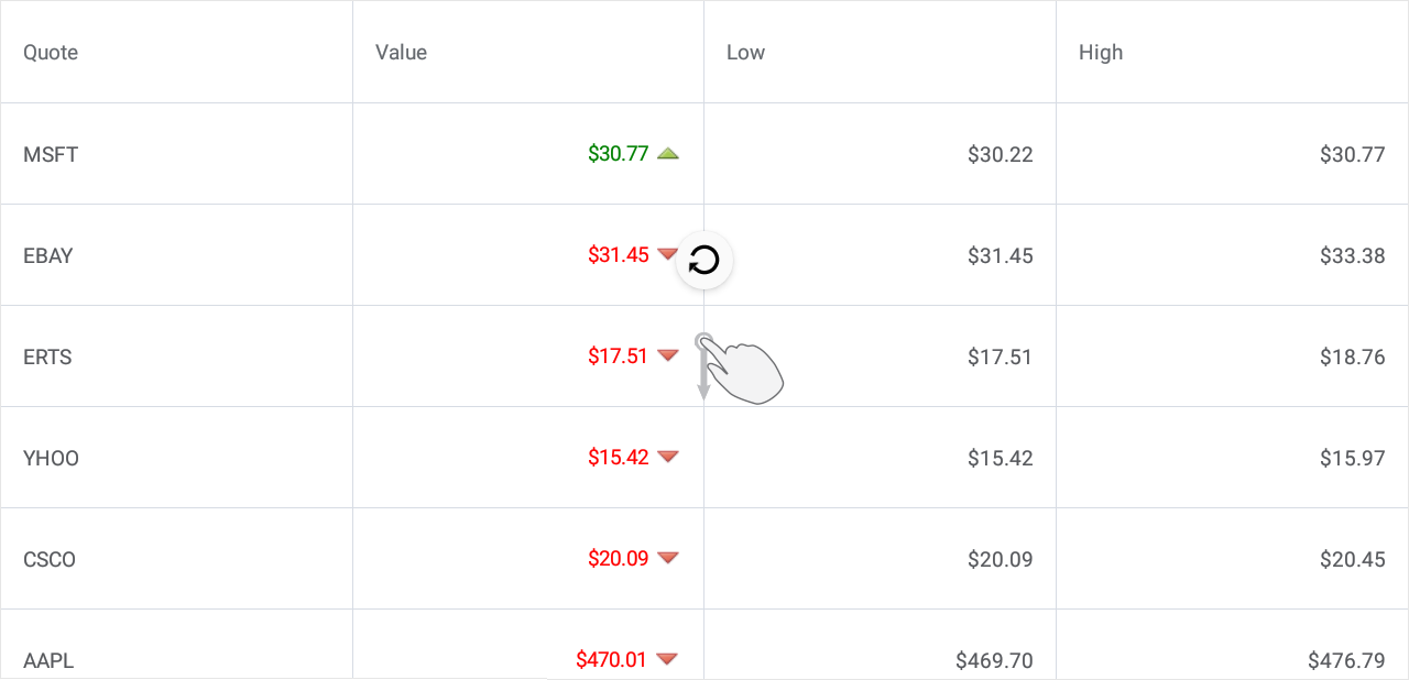
To enable this functionality, set the IsPullToRefreshEnabled property to true. Then, either define a refresh command in a view model and bind it to the PullToRefreshCommand property, or handle the PullToRefresh event. Use the IsRefreshing property to notify the grid that the pull-to-refresh activity is completed and the refresh indicator should be hidden.
Load More
You can set up the grid so that it adds a set of new data items when a user scrolls to the last row.
To enable this functionality, set the IsLoadMoreEnabled property to true. Then, either define a load-more command in a view model and bind it to the LoadMoreCommand property, or handle the LoadMore event. Use the IsRefreshing property to notify the grid that the load-more activity is completed and the loading indicator should be hidden. The DataGridView.IndicatorColor property allows you to change the indicator color.
Swipe Actions
You can extend the grid’s UI with additional elements (buttons) that appear when a user swipes a data row (from left to right or from right to left) and perform custom actions on tap.
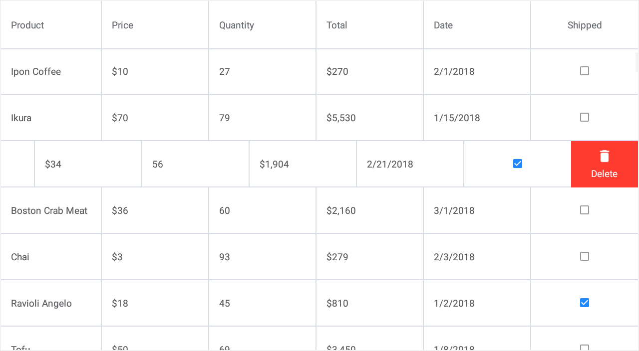
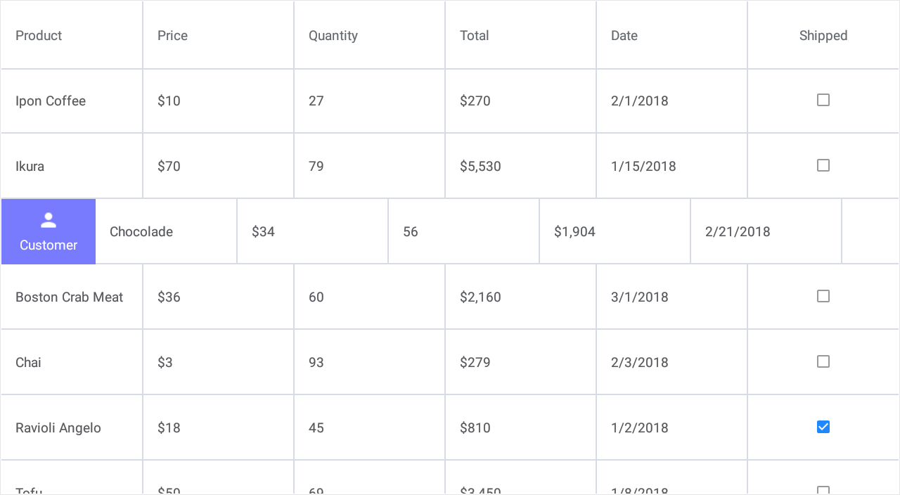
To define a swipe action in the grid, do the following.
- Add a SwipeItem object to the DataGridView.StartSwipeItems or DataGridView.EndSwipeItems collection.
- Use this object’s properties (for example, Image, Caption, FontColor or BackgroundColor) to customize the button appearance.
If you add multiple swipe buttons to the grid and need to apply the same appearance settings to all of them, assign a SwipeItemStyle object with the specified properties to DataGridView.SwipeItemStyle. - Handle the SwipeItem.Tap event to assign a custom action to a button.
<dxg:DataGridView x:Name="grid" ItemsSource="{Binding Orders}">
    <!-- ... -->
    <dxg:DataGridView.StartSwipeItems>
            <dxg:SwipeItem Caption="Customer" BackgroundColor="#797bff" Image="person.png"
                           Tap="Swipe_ShowCustomerInfo" />
    </dxg:DataGridView.StartSwipeItems>
    <dxg:DataGridView.EndSwipeItems>
            <dxg:SwipeItem Caption="Delete" BackgroundColor="#ff3b30" Image="delete.png"
                           Tap="Swipe_Delete"/>
    </dxg:DataGridView.EndSwipeItems>

    <dxg:DataGridView.SwipeItemStyle>
        <dxg:SwipeItemStyle Width="100"/>
    </dxg:DataGridView.SwipeItemStyle>
</dxg:DataGridView>
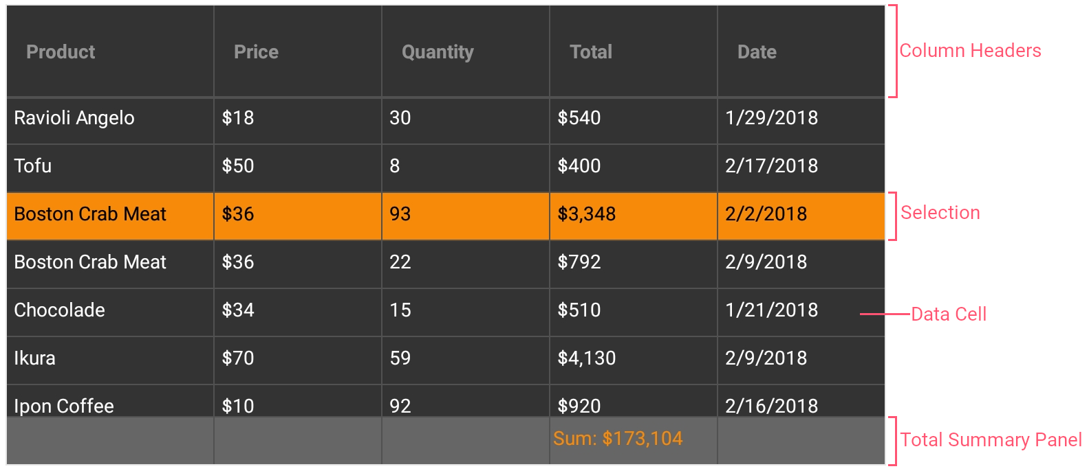
Grid Appearance
The following properties allow you to customize the appearance of grid elements (cells, columns headers, summaries, etc.):
Property | Description |
|---|---|
Gets or sets the grid border color. | |
Gets or sets the grid border thickness. | |
Gets or sets the data cell appearance settings. | |
Gets or sets the group row appearance settings. | |
Gets or sets the column header appearance settings. | |
Gets or sets the total summary panel appearance settings. | |
Gets or sets the swipe item appearance settings. |
You can also create styles for the following target types:
Class | Description |
|---|---|
Stores the data cell appearance settings. | |
Stores the group row appearance settings. | |
Stores the column header appearance settings. | |
Stores the total summary panel’s appearance settings. | |
Stores the swipe item appearance settings. |
<ContentPage xmlns="http://xamarin.com/schemas/2014/forms"
             xmlns:x="http://schemas.microsoft.com/winfx/2009/xaml"
             x:Class="DataGridExample.MainPage"
             xmlns:dxg="clr-namespace:DevExpress.XamarinForms.DataGrid;assembly=DevExpress.XamarinForms.Grid">
    <dxg:DataGridView x:Name="grid" ItemsSource="{Binding Orders}"
                      RowHeight="35" TotalSummaryHeight="35">
        <!-- Specify grid columns and total summaries here. -->

        <!--Customize the appearance of grid cells.-->
        <dxg:DataGridView.CellStyle>
            <dxg:CellStyle Padding="5,5,5,5" BackgroundColor="#333333" BorderColor="#515151"
                           FontSize="8" FontColor="White"
                           SelectionColor="#f78a09" SelectionFontColor="Black"/>
        </dxg:DataGridView.CellStyle>

        <!--Customize the appearance of column headers.-->
        <dxg:DataGridView.HeaderStyle>
            <dxg:HeaderStyle BackgroundColor="#333333" BorderColor="#515151"
                             FontSize="12" FontColor="#929292" FontAttributes="Bold"
                             HorizontalLineThickness="2"/>
        </dxg:DataGridView.HeaderStyle>

        <!--Customize the appearance of the total summary panel displayed at the bottom of the grid.-->
        <dxg:DataGridView.TotalSummaryStyle>
            <dxg:TotalSummaryStyle Padding="2,5,2,5" BackgroundColor="#666666" BorderColor="#515151"
                                   FontSize="8" FontColor="#f78a09"/>
        </dxg:DataGridView.TotalSummaryStyle>
    </dxg:DataGridView>
</ContentPage>