DevExpress Slide View for .NET MAUI
- 3 minutes to read
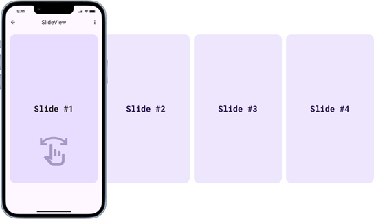
The DevExpress SlideView component for .NET MAUI allows you to show a collection of items. Users can swipe left/right or up/down to navigate between items.
Add a Slide View to the Page
Before you proceed, read the following topic: Get Started with DevExpress Controls for .NET Multi-platform App UI (.NET MAUI).
The markup below adds a SlideView instance to a ContentPage:
<ContentPage ...
             xmlns:dx="clr-namespace:DevExpress.Maui.Core;assembly=DevExpress.Maui.Core">
    <dx:SlideView x:Name="slideView">
    </dx:SlideView>
</ContentPage>
Populate a Slide View with Items (MVVM)
- Assign a ViewModel instance to the page’s
BindingContextproperty. This example uses an instance of theHouseViewModelclass as the ViewModel. - Bind the SlideView.ItemsSource property to the ViewModel’s property that returns a collection of items (
Housesin this example). - Specify the SlideView.ItemTemplate property to define item appearance.
<ContentPage ...
             xmlns:local="clr-namespace:SlideViewExample">
    <ContentPage.BindingContext>
        <local:HouseViewModel/>
    </ContentPage.BindingContext>

    <dx:SlideView x:Name="slideView"
                    ItemsSource="{Binding Houses}">
        <dx:SlideView.ItemTemplate>
            <DataTemplate>
                <dx:DXImage Source="{Binding HouseImageSource}" Margin="10"/>
            </DataTemplate>
        </dx:SlideView.ItemTemplate>
    </dx:SlideView>
</ContentPage>
public class HouseViewModel {
    public ObservableCollection<House> Houses { get; set; } = new ObservableCollection<House>();
    public HouseViewModel() {
        for (int i = 1; i < 25; i++) {
            Houses.Add(new House () { HouseImageName = i.ToString() });
        }
    }
}
public class House {
    string imageName;
    public string HouseImageName {
        get => this.imageName;
        set {
            this.imageName = value;
            // House images are named according to the pattern "house1.jpg"
            // and are stored in the Resources/Houses folder
            HouseImageSource = ImageSource.FromFile("house" + value + ".jpg");
        }
    }
   public ImageSource HouseImageSource { get; set; }
}
Add Items Directly to a SlideView
As an alternative to the SlideView.ItemsSource property, you can use the SlideView.Items property to add slides to a SlideView.
The following markup adds three slides with images to a SlideView:
<dx:SlideView AllowLooping="True"
              AllowSwipe="True">
    <dx:SlideView.Items>
        <dx:DXImage Source="house1.jpg"/>
        <dx:DXImage Source="house2.jpg"/>
        <dx:DXImage Source="house3.jpg"/>
    </dx:SlideView.Items>
</dx:SlideView>
Access the Currently Visible Item
Use the properties below to retrieve information about the selected item:
- CurrentIndex
- Gets or sets the zero-based index of the currently displayed item.
- CurrentItem
- Gets or sets the source object corresponding to the current item.
The SlideView control raises the CurrentItemChanged event when the currently displayed item is replaced with another item.
Cache Items
The SlideView controls caches item content. You can specify the ContentCacheMode property to select an appropriate cache mode. The following modes are available:
None– Item content is not cached.All– All item content is cached at once, when theSlideViewcontrol is loaded and displayed.OnFirstShow– When the control displays an item for the first time, it caches this item’s content.
Scroll Through Items
The control supports swipe gestures that allow users to navigate between items. You can implement your own UI and use the following methods and commands for navigation:
- SlideView.ShowPrevious | SlideViewCommands.ShowPrevious
- Shows the previous item in the item collection.
- SlideView.ShowNext | SlideViewCommands.ShowNext
- Shows the next item in the item collection.
The following example implements a simple gallery in which users can tap Previous and Next buttons to scroll images:
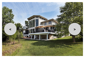
<Grid ColumnDefinitions="*,*">
<dx:SlideView x:Name="slideView" AllowLooping="True">
<!--...-->
</dx:SlideView>
<dx:DXButton Grid.Column="0" Content="<"
Command="{Binding Commands.ShowPrevious, Source={x:Reference slideView}}"
WidthRequest="60" HeightRequest="60"
VerticalOptions="Center" HorizontalOptions="Start"
BackgroundColor="LightGray" DisabledBackgroundColor="Gray"
TextColor="Black" Margin="20,0,0,0" FontSize="20"/>
<dx:DXButton Grid.Column="1" Content=">"
Command="{Binding Commands.ShowNext, Source={x:Reference slideView}}"
WidthRequest="60" HeightRequest="60"
VerticalOptions="Center" HorizontalOptions="End"
BackgroundColor="LightGray" DisabledBackgroundColor="Gray"
TextColor="Black" Margin="0,0,20,0" FontSize="20"/>
</Grid>
You can disable built-in swipe gesture support. Set AllowSwipe property to false.
Set the AllowLooping property to true to allow users to scroll items endlessly. Otherwise, scrolling stops when a users reaches the first/last item.
Specify the Orientation property to define whether users should use “left” and “right” swipes (horizontal orientation) or “up” and “down” swipes (vertical orientation) to scroll through SlideView items.