Customize Layout and Appearance in DevExpress Data Form for .NET MAUI
- 4 minutes to read
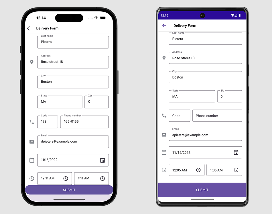
When a data form is generated based on a bound object’s properties, it arbitrarily positions editors vertically and displays the corresponding property name next to the input box. You can change the form’s default layout. To adjust layout settings for individual editors, use attributes or data form item properties. The DataFormView class has a set of properties for layout customization at the form level.
Reorder Editor
You can locate multiple editors in a single row and specify editor order.

To do this, use the following parameters of the DataFormItemPosition attribute or properties of the DataFormItem descendant object:
RowOrder- A row where the editor is located.
ItemOrderInRow- The editor position within a row.
<dxdf:DataFormView>
    <dxdf:DataFormTextItem RowOrder="0" ItemOrderInRow="0"
                           FieldName="FirstName"/>
    <dxdf:DataFormTextItem RowOrder="0" ItemOrderInRow="1"
                           FieldName="LastName"/>
</dxdf:DataFormView>
If two items have the same RowOrder value, they are located in the same row in the order specified by their ItemOrderInRow values. The DataFormView.EditorHorizontalSpacing and DataFormGroup.EditorHorizontalSpacing properties specify the distance between editors in a row for an entire form or specific group.
Items with unspecified RowOrder are displayed at the bottom of the data form.
Manage Labels
The data form can display strings or icons as editor labels.

To specify an editor label and its position, use the following parameters of the DataFormDisplayOptions attribute or properties of the DataFormItem descendant object:
- DataFormDisplayOptionsAttribute.LabelText | DataFormItem.LabelText
- Define label text.
- DataFormDisplayOptionsAttribute.LabelIcon | DataFormItem.LabelIcon
- Specify the label icon.
- DataFormDisplayOptionsAttribute.LabelPosition | DataFormItem.LabelPosition
- Specify the label position relative to the editor.
- DataFormDisplayOptionsAttribute.LabelIndent | DataFormItem.LabelIndent
- Define the distance between the label and the editor.
- DataFormDisplayOptionsAttribute.IsLabelVisible | DataFormItem.IsLabelVisible
- Control label visibility.
- DataFormItem.LabelColor | DataFormItem.ErrorColor | DataFormItem.HelpTextColor
- Specify text color at the item level.
You can also use the following properties of the DataFormView object to specify settings for all editor labels on the form:
- EditorLabelPosition
- EditorLabelIndent
- IsEditorLabelVisible
- EditorLabelColor
- EditorHelpTextColor
- EditorErrorColor
For more information on how to customize DataForm labels, refer to the following help topic: Labels.
Change Editor and Label Width
To change the width of editors and their labels, use the following parameters of the DataFormDisplayOptions attribute or properties of the DataFormItem descendant object:
EditorWidth,EditorMinWidth,EditorMaxWidthLabelWidth,LabelMinWidth,LabelMaxWidth
You can also use the following properties of the DataFormView to set the width for all editors and labels on the data form:
- EditorWidth, EditorMinWidth, EditorMaxWidth
- EditorLabelWidth, EditorLabelMinWidth, EditorLabelMaxWidth
These properties allow you to define absolute or proportional (*) width values.
Group Editors
You can organize editors into expandable groups with headers. The following image shows a DataForm with “Profile” and “Contact Info” groups:

To place an editor in a group, assign the group name to the GroupName property of the DataFormDisplayOptions attribute or data form item object. Editors with an undefined GroupName are placed in a default group that is displayed at the top of the form without a header.
The data form stores groups in the Groups collection. When you specify the GroupName parameter for an editor, a group with this name is added to this collection. You can also add items to the collection directly.
An individual item of the Groups collection is a DataFormGroup object that stores group settings:
- HeaderBackgroundColor | HeaderTextColor
- Specify group header colors.
- HeaderFontSize | HeaderFontFamily | HeaderFontAttributes
- Adjust group header font settings.
- IsHeaderVisible
- Shows or hides a group header.
- IsCollapsed | AllowCollapse
- Collapses or expands a group and prevents a user from collapsing a group.
The DataFormView class also has corresponding properties to specify similar settings for all groups on the form.
For more information about groups and group header customization, refer to the following help topic: Groups.
Apply Themes
The DevExpress components for .NET MAUI including DataFormView control support the common theming mechanism. You can use more than 10 built-in color schemes in both light and dark modes.
For more information, refer to the following help topic: Color Themes for DevExpress .NET MAUI Controls.

Specify Background
Use the properties below to specify the DataFormView fill colors:
Show Separators Between Editors
You can show separator lines between DataFormView editors:

The following API members allow you to customize separators:
- RowSeparatorColor
- Specifies the separator color.
- RowSeparatorThickness
- Specifies the separator thickness.
- IsLastRowSeparatorVisible
- Indicates whether to show a separator after the last editor.
<dxdf:DataFormView ...
                   RowSeparatorColor="Red"
                   RowSeparatorThickness="2"
                   IsLastRowSeparatorVisible="False">