Utility Palettes in the DevExpress Design System
- 3 minutes to read
A utility palette is a complementary collection of stable, non-adaptive colors used for data visualization, categorization, and analytical contexts. This article explains the structure of utility palettes and their use in the DevExpress Design System.
Important
Applicable to DevExpress Blazor suite only.
Utility Palette Basics
The DevExpress Design System uses utility palettes when a scenario requires exact visual control and color precision. Utility palettes are essential in the following cases:
UI elements require distinct visual separation. For example:
- Category colors in calendars
- Pins and markers in maps
- Labels or statuses
- Complex interfaces that rely on categorical color coding
You need stable colors for data visualization. For example:
- Charts
- Graphs
- Infographics
- Dashboards
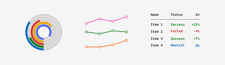
The following image demonstrates how Fluent themes use their utility palette:
Utility Palette Structure
The DevExpress Design System arranges each utility palette into the following color families (groups):
- Gray
- Blue
- Cyan
- Teal
- Green
- Yellow
- Orange
- Red
- Pink
- Purple
- Indigo
Each color family is a 12-step scale from the lightest (10) to the darkest (120) shade. The following table lists shade ranges and typical use cases:
| Shade Range | Visual Character | Use Case |
|---|---|---|
| 10–30 | Very light | Area fill (heatmap lowest intensity), subtle backgrounds |
| 40–60 | Mid-light to mid | Primary line/area fills on light backgrounds |
| 70 | Mid anchor | Default for solid markers, balanced contrast |
| 80–100 | Deep tones | Series emphasis, selected states, hover amplification |
| 110–120 | Near-dark | Dark mode primary tones, contrasting strokes, focus outlines |
Utility palettes remain unchanged regardless of the color mode (Light or Dark) and the theme’s primary (accent) color.
Base CSS Variables
Each color family corresponds to a dedicated group of CSS variables. Variable values depend on the theme, while remaining unchanged regardless of the theme’s primary (accent) color. This structure ensures that DevExpress components always reference the same variables, and interface elements apply consistent colors throughout a theme set.
The following table lists utility color families and corresponding CSS variables:
| Color Family | CSS Variables |
|---|---|
| Gray | --dxds-utility-gray-10…--dxds-utility-gray-120 |
| Blue | --dxds-utility-blue-10…--dxds-utility-blue-120 |
| Cyan | --dxds-utility-cyan-10…--dxds-utility-cyan-120 |
| Teal | --dxds-utility-teal-10…--dxds-utility-teal-120 |
| Green | --dxds-utility-green-10…--dxds-utility-green-120 |
| Yellow | --dxds-utility-yellow-10…--dxds-utility-yellow-120 |
| Orange | --dxds-utility-orange-10…--dxds-utility-orange-120 |
| Red | --dxds-utility-red-10…--dxds-utility-red-120 |
| Pink | --dxds-utility-pink-10…--dxds-utility-pink-120 |
| Purple | --dxds-utility-purple-10…--dxds-utility-purple-120 |
| Indigo | --dxds-utility-indigo-10…--dxds-utility-indigo-120 |
To see the full list of base utility CSS variables and associated color values in Fluent themes, refer to the following help topic: Fluent Utility Palette.
Semantic Role of Utility Colors
Utility palettes are raw color scales. The DevExpress Design System uses these colors in semantic (content-aware) CSS variables that automatically adapt to the active theme and its color mode.
Important
Do not use raw color values (base CSS variables) in your application. Use semantic variables only.
The following table demonstrates the utility color-layer schema and lists semantic CSS variables for the Blue utility color. The variable structure also applies to other palette colors.
Color Role | Intensity | CSS Variable | Use Case |
|---|---|---|---|
Surface | Default |
| Saturated fill for element backgrounds (for example, chart bars, status badges, markers). |
Subdued |
| Low-contrast fill for backgrounds, subtle highlights, or secondary areas. | |
Content | Default |
| Text and icon color used for distinct categorization. |
Subdued |
| Less prominent text and icon color. | |
Border | Default |
| Base stroke color used for boundaries and outlines. |