Color Roles in the DevExpress Design System
- 3 minutes to read
Color roles define the function and semantic purpose of each UI color. In the DevExpress Design System, these roles follow a multi-layer model that maps high-level design intent to specific visual values. This structure has the following advantages:
- Visual consistency: A unified color language makes interfaces easier to scale and keeps styling consistent across components.
- Accessibility: Role-based colors account for contrast requirements. Standard pairings (such as text and background) align with WCAG contrast guidelines.
- Theme awareness: The resulting color value adapts dynamically to the active theme and its color mode (light or dark).
- Reduced maintenance: Designers and developers define the appearance once instead of creating separate designs for each theme.
Color Role Schema
The DevExpress Design System uses the same color-layer schema for all themes and color modes (light or dark). Follow this schema to assign roles correctly. The table below lists all color layers:
| High-Level Role | Semantic Role | Intensity | State |
|---|---|---|---|
| Surface | Neutral | Default | Rest |
| Content | Primary | Subdued | Active |
| Border | Secondary | Deep | Hovered |
| Info | Compound | Selected | |
| Success | Alpha | Selected-Hovered | |
| Warning | Accessible | Disabled | |
| Danger | Static-Light | ||
| Backdrop | Static-Dark | ||
| Transparent | Inverted | ||
| Highlight | On-Surface | ||
| Utility |
These layers help you build a path to a specific color value, for example: Content → Primary → Default → Hovered.
Note
Our Design System does not cover all potential combinations.
High-Level Roles
The DevExpress Design System operates with the following high-level roles:
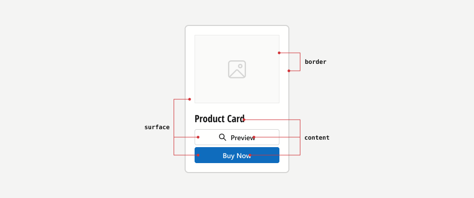
- Surface
- A background (surface) for content. Surfaces always use light colors in light mode, and dark colors in dark mode.
- Content
- Text or graphics displayed on a surface. Usually use inverted colors compared to surface. Content colors do not change in all states (except for disabled).
- Border
- Surface borders.
Semantic Roles
The DevExpress Design System defines relevant semantic roles for each high-level role. The following semantic roles are available:
- Primary
- Main brand or accent color.
- Secondary
- An additional accent color used for secondary elements.
- Info
- Colors used for informational messages (notes).
- Success
- Colors used to convey success states.
- Warning
- Colors used to convey warnings.
- Danger
- Colors used to convey error states.
- Neutral
- Grayscale colors used throughout the interface for backgrounds, surfaces, dividers, and text (light/dark variants).
- Backdrop
- Colors used to shade background information.
- Highlight
- Service colors used to highlight small application/component regions.
- Transparent
- Color used to create transparent backgrounds.
- Utility
- Colors used for data visualization, categorization, and analytical contexts.
Intensity
You can choose the color intensity from the following values:
- Default
- The brightest shade.
- Subdued
- Meduim brightness of the shade.
- Deep
- The least bright shade.
- Compound
- A semantic extension of high-level roles. May be of use if you need several high-level roles to have the came color.
- Alpha
- Adjusts color opacity using the alpha channel.
- Accessible
- The shade that meets the Non-Text Contrast criterion for small UI elements.
States
Components can have the following design states:
- Rest
- Colors used to convey the default state (component is not being interacted with).
- Hovered
- Colors used to convey the hovered state.
- Selected
- Colors used to convey the selected state.
- Selected-hovered
- Colors used to convey selected and hovered state.
- Disabled
- Colors used to convey the disabled state.
- Static-light
- Light colors that do not change in light/dark modes.
- Static-dark
- Dark colors that do not change in light/dark modes.
- Inverted
- Colors that are inverted from primary (for accents).
- On-surface
- Colors used for content or other surfaces placed on a surface.