Customization
- 3 minutes to read
This topic describes how you can customize the WinForms Dashboard Designer.
Access to Underlying Controls
The WinForms Dashboard Designer uses DevExpress WinForms controls to visualize data within dashboard items. If necessary, you can access these controls and customize their settings to add specific capabilities.
Documentation: Access to Underlying Controls
Custom Properties
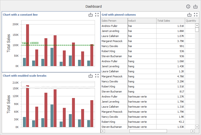
Custom properties allow you to store custom settings in a dashboard definition. You can read these settings and use these values to implement and embed your functionality into the Dashboard Designer.
The image below displays added custom functionality:
Documentation: Create Custom Properties
Custom Item
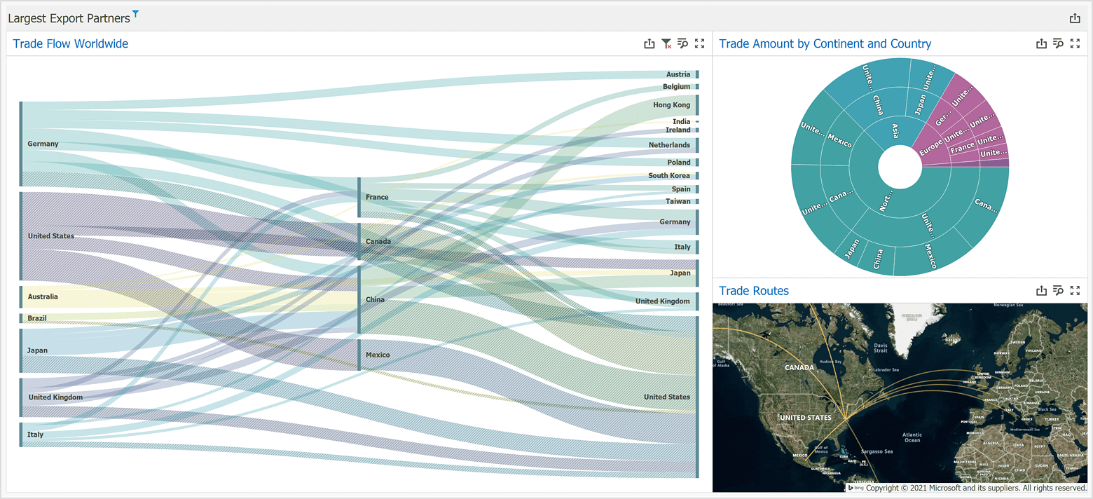
Custom items allow you to embed any WinForms control into a Dashboard. You can use the custom item API to create a custom item in several steps.
The following image illustrates Custom Sankey, Sunburst, and Custom Map items:
Documentation: Create a Custom Item
Ribbon, Toolbar, Popup Menu
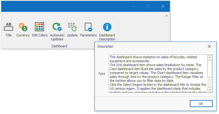
In the Dashboard Designer, you can customize a traditional toolbar or a Ribbon interface that allow users to interact with dashboard items or the entire dashboard. You can also manage different popup menus.
The image below displays the Dashboard Description button added to the Ribbon:
Documentation:
Title and Caption
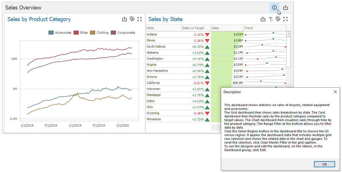
The Dashboard Title and Dashboard Item Caption are areas located on the dashboard surface and contain relevant up-to-date information and command buttons. They are already packed with useful indicators and buttons, but you can also deliberately hide built-in items or add your own.
The image below displays the Description button added to the dashboard title:
Documentation:
Data Source Wizard
The Data Source Wizard allows users to establish a connection and select data from various sources. If necessary, you can skip certain pages, specify the list of available data providers and customize the wizard in other ways.
Documentation: How to Customize the Data Source Wizard
Item Click
You can use the following API to handle mouse actions and get information about clicked elements:
| API | Description |
|---|---|
| DashboardDesigner.DashboardItemClick | Occurs when an end-user clicks a dashboard item. |
| DashboardDesigner.DashboardItemDoubleClick | Occurs when an end-user double-clicks a dashboard item. |
| DashboardDesigner.DashboardItemMouseDown | Occurs when the mouse pointer is over the dashboard item and a mouse button is pressed. |
| DashboardDesigner.DashboardItemMouseUp | Occurs when the mouse pointer is over the dashboard item and a mouse button is released. |
| DashboardDesigner.DashboardItemMouseEnter | Occurs when the mouse pointer enters the dashboard item. |
| DashboardDesigner.DashboardItemMouseLeave | Occurs when the mouse pointer leaves the dashboard item. |
| DashboardDesigner.DashboardItemMouseHover | Occurs when the mouse pointer rests on the dashboard item. |
| DashboardDesigner.DashboardItemMouseMove | Occurs when the mouse pointer is moved over the dashboard item. |
Custom Interactivity
You can provide custom visual interactivity for data-bound dashboard items that support element selection and highlighting.
The following table lists possible target axes for each dashboard item and supported interactivity capabilities:
Dashboard Item | Target Axes | Selection | Highlighting |
|---|---|---|---|
| |||
|
| ||
|
| ||
|
| ||
|
| ||
|
| ||
| |||
|
|

Note
A Grid dashboard item with enabled Cell Merging does not support custom interactivity.
Documentation: DashboardDesigner.DashboardItemVisualInteractivity