Filter Elements Overview
- 3 minutes to read
In the Dashboard Designer you can create filter elements that allow end users to filter other dashboard items.
To add the required filter element to the dashboard, use the Filter Elements button in the Home ribbon tab.
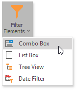
Combo Box
The Combo Box dashboard item allows end users to select a value(s) from the drop-down list.
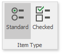
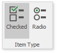
You can switch the combo box type using the ribbon Design tab, in the Item Type group of the Filter Element Tools contextual tab set.
| Combo Box Type | Example | Description |
|---|---|---|
| Standard | 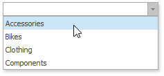 |
Allows end users to select only a single value. |
| Checked | 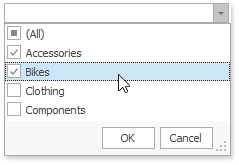 |
Allows end users to select multiple values in the invoked drop-down list. |
The Combo Box is the ComboBoxDashboardItem class in Dashboard API. To specify the combo box type, use the ComboBoxDashboardItem.ComboBoxType property.
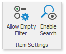
To manage combo box settings, use the Item Settings ribbon group.
| Setting | Description | API |
|---|---|---|
| Allow Empty Filter | Allows an empty selection when no item is selected and the filter does not apply. Enables the Clear Master Filter button that resets the filter to an empty selection. Applies only to the Standard combo box type. | ComboBoxDashboardItem.ShowAllValue |
| Enable Search | Allows end users to filter the list by typing in the box. | ComboBoxDashboardItem.EnableSearch |
Tip
You can also enable the Neutral Filter Mode to display all values when the selection is empty.
List Box
The List Box dashboard item allows end users to select a value(s) from the list.
You can switch the list box type using the ribbon Design tab, in the Item Type group of the Filter Element Tools contextual tab set.
| List Box Type | Example | Description |
|---|---|---|
| Checked | 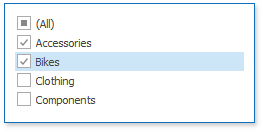 |
Allows end users to select multiple values in the list box. |
| Radio | 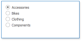 |
Allows end users to select a single value in the radio group. |
The List Box is the ListBoxDashboardItem class in Dashboard API. To specify the list box type, use the ListBoxDashboardItem.ListBoxType property.
To manage combo box settings, use the Item Settings ribbon group.
| Setting | Description | API |
|---|---|---|
| Allow Empty Filter | Allows an empty selection when no item is selected and the filter does not apply. Enables the Clear Master Filter button that resets the filter to an empty selection. Applies only to the Radio list box type. | ListBoxDashboardItem.ShowAllValue |
| Enable Search | Allows end users to filter the list by typing in the box. | ListDashboardItem.EnableSearch |
Tip
You can also enable the Neutral Filter Mode to display all values when the selection is empty.
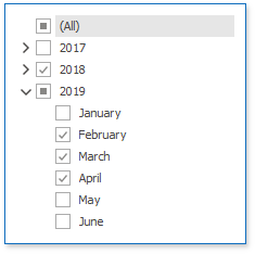
Tree View
The Tree View dashboard item displays values hierarchically and allows end users to expand/collapse nodes.
The Tree View is the TreeViewDashboardItem class in dashboard API.
You can specify Tree View settings using the ribbon Design tab in the Filter Element Tools contextual tab set.
| Setting | Description | API |
|---|---|---|
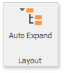 |
Specifies the initially expanded Tree View state. | TreeViewDashboardItem.AutoExpandNodes property |
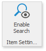 |
Allows end users to filter the nodes by typing in the item’s edit box. | TreeViewDashboardItem.EnableSearch |
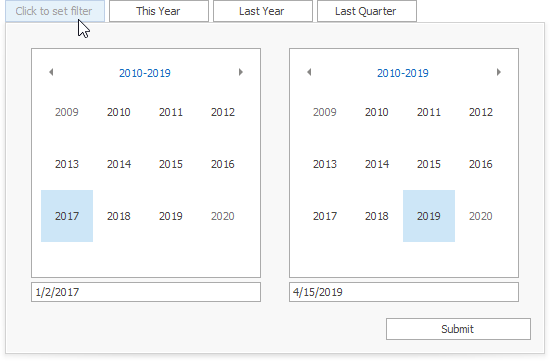
Date Filter
The Date Filter dashboard item allows you to filter dashboard data based on the selected data range. The range can be relative (Last 3 Months), use fixed dates (01-01-2018), or presets (Month-to-date). You can also filter dates before or after a specified date.
The Date Filter item displays a set of intervals that can be used as quick filters.
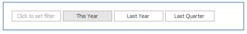
End-users can click the button to invoke the Date Picker:
The Date Filter is the DateFilterDashboardItem class in Dashboard API.
See Date Filter for more information.