This example shows you how to create a simple custom item displaying a list of dimension values. This item can be filtered by other master filter items and also contains one custom property that specifies whether to display the field header caption in the list.
To learn more information about the custom item creating, see Custom Item Creating.
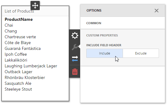
View Example
<!DOCTYPE html>

<html>
<head>
    <meta charset="UTF-8" />
    <title>@ViewBag.Title</title>

    @Html.DevExpress().GetStyleSheets(
        new StyleSheet { ExtensionSuite = ExtensionSuite.NavigationAndLayout },
        new StyleSheet { ExtensionSuite = ExtensionSuite.Editors },
        new StyleSheet { ExtensionSuite = ExtensionSuite.Dashboard }
    )
    @Html.DevExpress().GetScripts(
        new Script { ExtensionSuite = ExtensionSuite.NavigationAndLayout },
        new Script { ExtensionSuite = ExtensionSuite.Editors },
        new Script { ExtensionSuite = ExtensionSuite.Dashboard }
    )
    <script>
        function onBeforeRender(sender) {
            var dashboardControl = sender.GetDashboardControl();
            dashboardControl.registerExtension(new CustomItemExtension(dashboardControl));
        }
  </script>
</head>

<body>
    <div style="position: absolute; top: 0; bottom: 0; left: 0; right: 0">
        @RenderBody()
    </div>
    <script src="scripts/customExtension/CustomItemExtension.js"></script>
</body>
</html>
@{
    ViewBag.Title = "DevExpress Web Dashboard Application";
}

@Html.DevExpress().Dashboard(settings =>
{
    settings.Name = "Dashboard";
    settings.Width = Unit.Percentage(100);
    settings.Height = Unit.Percentage(100);
    settings.ClientSideEvents.BeforeRender = "onBeforeRender";
}).GetHtml()
var CustomItemExtension = (function () {
    var Dashboard = DevExpress.Dashboard;
    var Designer = DevExpress.Dashboard.Designer;

    // Defines a custom item icon.
    var svgIcon = '<svg id= "customItemIcon" viewBox="0 0 24 24" ><path stroke="#42f48f" fill="#42f48f" d="M12 2 L2 22 L22 22 Z" /></svg>';

    // Defines a custom item meta description.
    var customItemExtensionMeta = {
        bindings: [{
            propertyName: 'customBinding',
            dataItemType: 'Dimension',
            array: false,
            displayName: 'Custom Binding',
            emptyPlaceholder: 'Add Dimension',
            selectedPlaceholder: 'Configure Dimension'
        }],
        customProperties: [{
            ownerType: 'CustomItem',
            propertyName: 'customProperty',
            valueType: 'string',
            defaultValue: 'Exclude'
        }],
        optionsPanelSections: [{
            title: 'Custom Properties',
            items: [{
                dataField: 'customProperty',
                label: {
                    text: 'Include Field Header'
                },
                template: Designer.FormItemTemplates.buttonGroup,
                editorOptions: {
                    items: [{ text: 'Include' }, { text: 'Exclude' }]
                }
            }]
        }],

        icon: 'customItemIcon',
        title: 'Simple Custom Item',
        index: 0
    };

    // Specifies an item viewer behavior.
    var Viewer = function(model, container, options) {
        Dashboard.CustomItemViewer.call(this, model, container, options)
    }
    Viewer.prototype = Object.create(Dashboard.CustomItemViewer.prototype);
    Viewer.prototype.constructor = Viewer;
    Viewer.prototype.renderContent = function ($element, changeExisting) {
        var dataSource = [];
        this.iterateData(function (dataRow) {
            dataSource.push(dataRow.getDisplayText('customBinding'));
        });

                    var element = $element.jquery ? $element[0] : $element;
        while(element.firstChild)
            element.removeChild(element.firstChild);

        if (this.getPropertyValue('customProperty') == 'Include') {
            var div = document.createElement('div');
            div.style.marginLeft = "10px";
            div.style.fontWeight = "bold";
            div.innerText = this.getBindingValue('customBinding')[0].displayName();
            element.appendChild(div);
        }
        var div = document.createElement('div');
        div.style.marginLeft = "10px";
        div.innerHTML = dataSource.join("<br />");
        element.appendChild(div);
    };

    // Creates function that implements a custom item extension.
    function CustomItemExtension(dashboardControl) {
        Dashboard.ResourceManager.registerIcon(svgIcon);

        this.name = "CustomItemExtension";
        this.metaData = customItemExtensionMeta;
        this.createViewerItem = function (model, $element, content) {
            return new Viewer(model, $element, content);
        };
    }

    return CustomItemExtension;
}())