Drag and Drop Rows in Blazor Grid
- 4 minutes to read
This article describes how to enable drag-and-drop operations in the DevExpress Blazor Grid. You can reorder rows within the grid or move rows between components.

Set Up Drag and Drop Permissions
Use the following properties to enable drag and drop functionality:
- AllowDragRows
- Specifies whether users can start row drag-and-drop operations.
- AllowedDropTarget
- Specifies allowed drag-and-drop targets. Targets can include the current Grid and other components (Grids and TreeLists).
The table below lists allowed operations for various property value combinations:
| AllowDragRows | AllowedDropTarget | Allowed Operations |
|---|---|---|
| Any | None |
- |
false |
Internal |
- |
false |
External, All |
Drop from external components |
true |
Internal |
Reorder |
true |
External |
Drop onto/from external components |
true |
All |
Reorder and drop onto/from external components |
Users can select multiple rows and move the entire selection in a single drag-and-drop operation. Ensure that the SelectionMode property value is Multiple and enable at least one of the following UI selection methods:
- Set the AllowSelectRowByClick property to
trueto enable row selection by mouse clicks, tap gestures, and keyboard shortcuts. - Declare a DxGridSelectionColumn object in the Columns collection to display the selection column.
Update Data Sources
When a user drops rows, the target component’s ItemsDropped event fires. In its handler, update the data source: insert rows at the drop position and remove them from the initial position, if required. You may need to call the Reload method to apply data source changes. Refer to method descriptions for more information:
The DxGrid.DropTargetMode property specifies drop position indication style for operations initiated externally:
BetweenRows- Users can choose a specific drop position between two existing rows. TargetItem and DropPosition properties return information about this location.

Component- Users drop rows onto the entire data area. You need to implement custom insertion logic (for example, if your data is sorted or grouped) in the ItemsDropped event handler.

Note
If you allow users to sort data, the data source arranges data items based on sort settings. The component cannot guarantee a specific drop position and automatically switches to the Component mode.
Example
In the following example, the first Grid inserts rows to a specific location; the second Grid adds dropped rows after the last Grid item:
<DxGrid Data="FirstGridItems"
        AllowDragRows="true"
        AllowedDropTarget="GridAllowedDropTarget.External"
        ItemsDropped="FirstGrid_ItemsDropped"
        AllowSort="false">
    <Columns>
        <DxGridDataColumn FieldName="Name" />
    </Columns>
</DxGrid>
@* ... *@
<DxGrid Data="SecondGridItems"
        AllowDragRows="true"
        AllowedDropTarget="GridAllowedDropTarget.External"
        DropTargetMode="GridDropTargetMode.Component"
        ItemsDropped="SecondGrid_ItemsDropped"
        AllowSort="false">
    <Columns>
        <DxGridDataColumn FieldName="Name" />
    </Columns>
</DxGrid>
@* ... *@
@code {
    ObservableCollection<GridDataItem> FirstGridItems { get; set; }
    ObservableCollection<GridDataItem> SecondGridItems { get; set; }
    public record GridDataItem(string Name);

    protected override void OnInitialized() {
        FirstGridItems = new ObservableCollection<GridDataItem>(
            new List<GridDataItem>() {
                new GridDataItem("Beverages"),
                new GridDataItem("Seafood"),
                new GridDataItem("Grains"),
                new GridDataItem("Confections"),
                new GridDataItem("Dairy Products")
            }
        );
        SecondGridItems = new ObservableCollection<GridDataItem>(
            new List<GridDataItem>() {
                new GridDataItem("Cereals"),
                new GridDataItem("Meat"),
                new GridDataItem("Poultry"),
                new GridDataItem("Produce"),
                new GridDataItem("Frozen Entrees")
            }
        );
    }

    async Task FirstGrid_ItemsDropped(GridItemsDroppedEventArgs args) {
        var droppedItem = (GridDataItem)args.DroppedItems[0];
        SecondGridItems.Remove(droppedItem);
        var index = await args.GetTargetDataSourceIndexAsync();
        FirstGridItems.Insert(index, droppedItem);
    }

    void SecondGrid_ItemsDropped(GridItemsDroppedEventArgs args) {
        var droppedItem = (GridDataItem)args.DroppedItems[0];
        FirstGridItems.Remove(droppedItem);
        SecondGridItems.Insert(SecondGridItems.Count, droppedItem);
    }
}
Customize Drag-and-Drop Hints
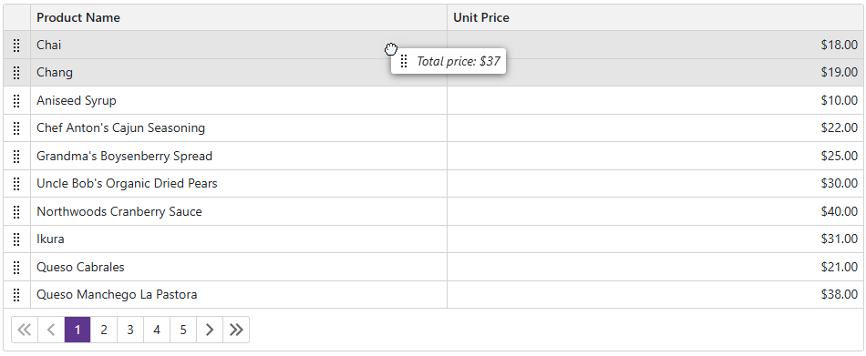
The drag hint displays the row preview if a user drags one row. If a user drags multiple rows, the hint displays the number of dragged rows.

Use the DragHintTextTemplate to define a custom message template for the drag hint. The custom template keeps predefined paddings and the drag handle icon.
The following example displays the total price for the dragged products:
<DxGrid @ref="@InStockGrid"
        Data="InStockProducts"
        AllowSelectRowByClick="true"
        SelectionMode="GridSelectionMode.Multiple"
        AllowDragRows="true"
        ItemsDropped="Grid_ItemsDropped">
    <Columns>
        <DxGridDataColumn FieldName="ProductName" MinWidth="50" />
        <DxGridDataColumn FieldName="UnitPrice" DisplayFormat="c2" />
    </Columns>
    <DragHintTextTemplate>
        @{
            decimal? totalPrice = context.DataItems.Cast<Product>().Sum(x => x.UnitPrice);
        }
        <i>Total price: $@totalPrice</i>
    </DragHintTextTemplate>
</DxGrid>
You can also use DragHint and RowDragAnchorCell element types in the CustomizeElement event handler to apply custom styles and attributes.