Command Column
- 4 minutes to read
End-users can manipulate ASP.NET MVC GridView data via a command column. You can access command column settings via the GridViewSettings.CommandColumn property.
Commands
A command column is represented by the MVCxGridViewCommandColumn class. It provides a set of commands that allows end-users to switch the GridView to edit mode, and update data, delete rows, etc.
A command column allows multiple command items to be displayed within a cell. A single command is represented by a command item. There are eight command items.
Command | Description | Settings | Visibility |
|---|---|---|---|
New | Creates a new data row. | ||
Edit | Switches the GridView to edit mode. | ||
Delete | Deletes the current data row. | ||
Select | Selects/deselects data rows. | ||
Update | Saves all changes made to the current data row and switches the GridView to browse mode. | ||
Cancel | Discards any changes made to the current data row and switches the GridView to browse mode. | ||
Clear | Clears the filter expression applied to the GridView. | ||
Recover | Recovers a deleted data row. |
By default, command items are represented by a link. They can also be represented by a button or image. Use the GridViewCommandColumn.ButtonRenderMode property to specify how the command column renders its command items.
Example
The example below shows how to enable a command column with command buttons. In this example, the “New” button is placed within the column header and is represented as an image.
Partial View code:
@Html.DevExpress().GridView(settings => {
    settings.Name = "GridView";
    settings.CallbackRouteValues = new { Controller = "Home", Action = "GridViewPartial" };

    settings.SettingsEditing.AddNewRowRouteValues = new { Controller = "Home", Action = "GridViewPartialAdd" };
    settings.SettingsEditing.DeleteRowRouteValues = new { Controller = "Home", Action = "GridViewPartialDelete" };
    settings.SettingsEditing.UpdateRowRouteValues = new { Controller = "Home", Action = "GridViewPartialUpdate" };
    // Show the command column, and enable the "Edit" and "Delete" buttons within the command column.
    settings.CommandColumn.Visible = true;
    settings.CommandColumn.ShowEditButton = true;
    settings.CommandColumn.ShowDeleteButton = true;
    // Show the "New" button within the column header.
    settings.CommandColumn.ShowNewButtonInHeader = true;
    // Change the "New" button settings.
    settings.SettingsCommandButton.NewButton.ButtonRenderMode = GridViewCommandButtonType.Image;
    settings.SettingsCommandButton.NewButton.Image.IconID = IconID.ActionsAdditem16x16;

    settings.KeyFieldName = "ID";
    settings.Columns.Add("FirstName");
    settings.Columns.Add("LastName");
    settings.Columns.Add("Age");
}).Bind(Model).GetHtml()
The image below illustrates the result.

Behavior
End-users can move the command column to a different position within the grid (in relation to the other visible columns) or to the Customization Window by dragging its header. This is controlled by the column’s GridViewCommandColumn.AllowDragDrop (via GridViewSettings.CommandColumn.AllowDragDrop) property. If this property is set to Default, the column behavior is controlled by the GridView’s ASPxGridViewBehaviorSettings.AllowDragDrop (via GridViewSettings.SettingsBehavior.AllowDragDrop) option.
Custom Buttons
Command columns can display custom buttons within command cells. You can create your own buttons, and define custom actions for them.
Example
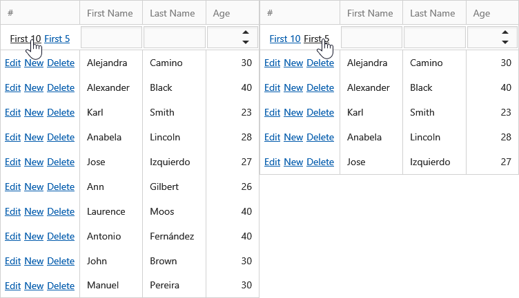
The example below shows how to create custom command buttons and define custom actions for them.
Controller code:
using System;
using System.Collections.Generic;
using System.Web.Mvc;
using MyProject.Models;
namespace MyProject.Controllers
{
    public class HomeController : Controller
    {
        // ...
        // "gridItems()" returns a list of records displayed within a GridView.
        // Handle the custom callback.
        public ActionResult CustomButtonClick(string clickedButton)
        {
            // Show a different number of records depending on the ID of the custom button that was clicked.
            if (clickedButton == "First10") {
                return PartialView("_GridViewPartial", gridItems().GetRange(0, 10));
            }
            else {
                return PartialView("_GridViewPartial", gridItems().GetRange(0, 5) );
            }
        }
    }
}
Partial View code (“_GridViewPartial”):
@Html.DevExpress().GridView(settings => {
    settings.Name = "GridView";
    //...
    settings.CustomActionRouteValues = new { Controller = "Home", Action = "CustomButtonClick" };
    settings.CommandColumn.Visible = true;
    settings.Settings.ShowFilterRow = true;
    // Add two custom command buttons.
    settings.CommandColumn.CustomButtons.Add(new GridViewCommandColumnCustomButton() {
        ID = "First10",
        Text = "First 10",
        Visibility = GridViewCustomButtonVisibility.FilterRow
    });
    settings.CommandColumn.CustomButtons.Add(new GridViewCommandColumnCustomButton() {
        ID = "First5",
        Text = "First 5",
        Visibility = GridViewCustomButtonVisibility.FilterRow
    });
    // When an end-user clicks a custom command button, GridView performs a callback to the server;
    // this callback is handled by Controller and Action, specified via the CustomActionRouteValues property.
    // In this example, GridView passes the ID of the clicked button.
    // Depending on the button that was clicked, the Action applies the required filter.
    settings.ClientSideEvents.CustomButtonClick = "function(s, e){ GridView.PerformCallback( { clickedButton : e.buttonID } ); }";

    settings.KeyFieldName = "ID";
    settings.Columns.Add("FirstName");
    settings.Columns.Add("LastName");
    settings.Columns.Add("Age");
}).Bind(Model).GetHtml()
The image below illustrates the result.
