Panel Header
A dock panel’s header is displayed at the top of the panel and can consist of the header image, header text and close button. A panel’s header can be used to drag the panel within the page (if the ASPxPopupControlBase.AllowDragging property is enabled).
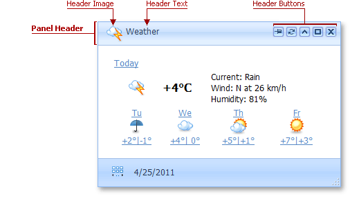
The table below lists the main members that affect element appearance and functionality:
| Characteristics | Members |
|---|---|
| Visibility | ASPxPopupControlBase.ShowHeader |
| Appearance | PopupControlStyles.Header |
| Text Content | ASPxPopupControlBase.HeaderText |
| Image | PopupControlImages.Header |
| Navigation Location | ASPxPopupControlBase.HeaderNavigateUrl |
| Template | ASPxPopupControlBase.HeaderTemplate |