Crosshair Cursor Customization
- 5 minutes to read
This topic describes different ways of customizing crosshair cursor elements and formatting crosshair label content and contains examples of how to do this in applications.
Interaction Customization
Show crosshair axis lines and labels
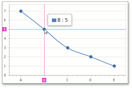
As mentioned in the Overview section, crosshair argument lines and crosshair common labels are visible by default.
To show value lines, argument labels and value labels of the crosshair cursor on a chart, set the CrosshairOptions.ShowValueLine, CrosshairOptions.ShowArgumentLabels and CrosshairOptions.ShowValueLabels properties to true.
A CrosshairOptions object (containing all the settings necessary to customize the crosshair cursor appearance and position on the chart) is accessed from the WebChartControl.CrosshairOptions property.
After the crosshair axis lines and labels are enabled, the chart will be the following.
Specify the crosshair label mode
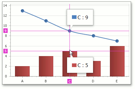
In addition, you can specify the way a crosshair cursor label should be shown for a multiple series chart using the CrosshairOptions.CrosshairLabelMode property.
A common crosshair label can be shown for all series (the default mode in which the group header is displayed on a crosshair label), for each series separately, or for the nearest series only.
The image below demonstrates the second approach.
Note
A crosshair label is automatically displayed with a beak in CrosshairLabelMode.ShowForEachSeries and CrosshairLabelMode.ShowForNearestSeries modes.
Formatting Crosshair Cursor Content
Use a pattern of crosshair axis and crosshair cursor labels
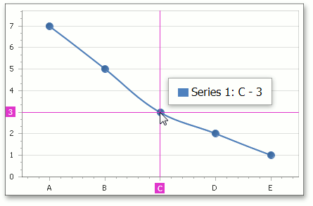
You can change the default format of text displayed within the crosshair labels by specifying a pattern (e.g., only show point values). To accomplish this, use the CrosshairAxisLabelOptions.Pattern, SeriesBase.CrosshairLabelPattern and CrosshairOptions.GroupHeaderPattern properties.
A full list of available placeholders is detailed below.
| Pattern | Description |
|---|---|
| {A} | Displays a series point argument. |
| {V} | Displays series point values. |
| {VP} | Displays series point values as percentages (for a Pie series and Full-Stacked series). |
| {S} | Displays the name of the series. |
| {G} | Displays the name of a stacked group. |
| {W} | Displays the weight (for a Bubble series). |
| {V1} | Displays the first value (for range series). |
| {V2} | Displays the second value (for range series). |
| {VD} | Displays the duration between the first and second data point values (for range series). |
| {HV} | Displays the high value (for a Financial series). |
| {LV} | Displays the low value (for a Financial series). |
| {OV} | Displays the open value (for a Financial series). |
| {CV} | Displays the close value (for a Financial series). |
The Format Specifiers topic explains which standard and custom formats can be used with placeholders to format numeric and date-time values within a crosshair cursor label.
The image below shows the SeriesBase.CrosshairLabelPattern property set to “{S}: {A} - {V}”.
Examples
For real-life examples of how this can be done, see the following tutorial:
Appearance Customization
The following image highlights settings that configure the Crosshair Cursor appearance.
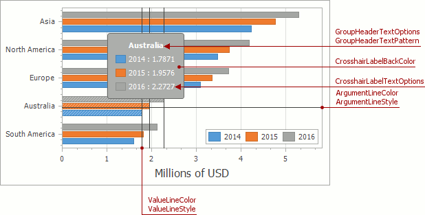
The properties in the table below allow you to customize the common appearance options of the crosshair cursor.
| Member | Description |
|---|---|
| CrosshairOptions.ValueLineColor | Gets or sets the color of crosshair value lines. |
| CrosshairOptions.ValueLineStyle | Gets the value line style settings of the crosshair cursor. |
| CrosshairOptions.ArgumentLineColor | Gets or sets the color of crosshair argument lines. |
| CrosshairOptions.ArgumentLineStyle | Gets the argument line style settings of the crosshair cursor. |
| CrosshairOptions.CrosshairLabelBackColor | Gets or sets the background color of the Crosshair series label. |
| CrosshairOptions.CrosshairLabelTextOptions | Returns text options of the Crosshair series label item. |
| CrosshairOptions.GroupHeaderTextOptions | Returns text options of the Crosshair series label group header. |
If more complex customizations are required, use the WebChartControl.CustomDrawCrosshair event to modify the appearance.
Examples
This example illustrates how to display the “Total” point value in the crosshair cursor panel.
To accomplish this task, handle the client-side ASPxClientWebChartControl.CustomDrawCrosshair event and include the Total value via the LabelElement.footerText property of the last crosshair panel element.
Note
A complete sample project is available at https://github.com/DevExpress-Examples/how-to-display-the-total-point-value-in-the-crosshair-panel-e5099
<%@ Page Language="C#" AutoEventWireup="true" CodeFile="Default.aspx.cs" Inherits="_Default" %>
<%@ Register assembly="DevExpress.XtraCharts.v13.2.Web, Version=13.2.7.0, Culture=neutral, PublicKeyToken=b88d1754d700e49a" namespace="DevExpress.XtraCharts.Web" tagprefix="dxchartsui" %>
<%@ Register assembly="DevExpress.XtraCharts.v13.2, Version=13.2.7.0, Culture=neutral, PublicKeyToken=b88d1754d700e49a" namespace="DevExpress.XtraCharts" tagprefix="cc1" %>
<!DOCTYPE html>
<html xmlns="http://www.w3.org/1999/xhtml">
<head runat="server">
<title></title>
</head>
<body>
<form id="form1" runat="server">
<div>
<dxchartsui:WebChartControl ID="WebChartControl1" runat="server" ClientInstanceName="chartControl" CrosshairEnabled="True" Height="368px" Width="607px">
<diagramserializable>
<cc1:XYDiagram>
<axisx visibleinpanesserializable="-1">
</axisx>
<axisy visibleinpanesserializable="-1">
</axisy>
</cc1:XYDiagram>
</diagramserializable>
<seriesserializable>
<cc1:Series Name="Series 1">
<points>
<cc1:SeriesPoint ArgumentSerializable="A" Values="100">
</cc1:SeriesPoint>
<cc1:SeriesPoint ArgumentSerializable="B" Values="50">
</cc1:SeriesPoint>
</points>
<viewserializable>
<cc1:StackedBarSeriesView>
</cc1:StackedBarSeriesView>
</viewserializable>
</cc1:Series>
<cc1:Series Name="Series 2">
<points>
<cc1:SeriesPoint ArgumentSerializable="A" Values="150">
</cc1:SeriesPoint>
<cc1:SeriesPoint ArgumentSerializable="B" Values="200">
</cc1:SeriesPoint>
</points>
<viewserializable>
<cc1:StackedBarSeriesView>
</cc1:StackedBarSeriesView>
</viewserializable>
</cc1:Series>
</seriesserializable>
<clientsideevents customdrawcrosshair="function(s, e) {
var summary = 0;
for (var i = 0; i < e.crosshairElements.length; i++) {
summary += e.crosshairElements[i].Point.point.values[0];
}
e.crosshairElements[e.crosshairElements.length - 1].LabelElement.footerText = 'Total :' + summary;
}" />
</dxchartsui:WebChartControl>
</div>
</form>
</body>
</html>