ASPxDateEdit Overview
- 4 minutes to read
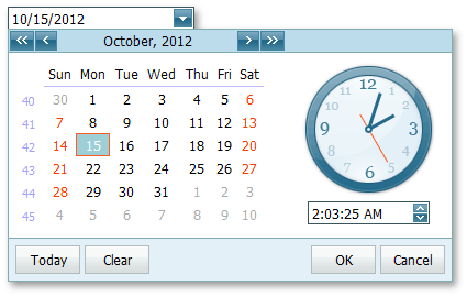
The ASPxDateEdit control is a date editor control that combines the functionality of a single-line text editor, button editor and dropdown calendar with a time editor. The editor’s dropdown window consist of two sections: the calendar section (always visible) and the time section (the visibility is controlled by the DateEditTimeSectionProperties.Visible property).
ASPxDateEdit offers the following features.
Shared Drop-Down Calendar
Using the ASPxDateEdit.PopupCalendarOwnerID property, an individual date editor’s popup calendar (and its settings) can be shared between several date editors, which decreases the size of the HTML code rendered into the web page by date editors.
Null Prompt Text
The prompt text can be displayed if the editor’s value is null and the editor is not focused. The prompt text disappears when the editor receives focus. You can define the prompt text using the ASPxDateEdit.NullText property.
Edit Formatting
You can specify how an editor value is represented within the edit boxes. For display and edit purposes, the edited value can be displayed in the following formats.
View
Affected Properties

EditFormat=”Time”

EditFormat= “Date”

EditFormat=”DateTime”

EditFormat=”Custom”
EditFormatString:=”MMMM dd, yyyy hh:mm tt”
Display Formatting
The editor display value can be formatted for display purposes when the editor is not focused using the DateEditProperties.DisplayFormatString property.
Masked Input
If the DateEditProperties.UseMaskBehavior property is set to true, the ASPxDateEdit editor supports masked input. In this mode, the pattern defined using the ASPxDateEdit.EditFormatString property serves as a mask.
Customizable Minimum and Maximum Dates
You can define the minimum and maximum allowed dates by the ASPxDateEdit.MinDate and ASPxDateEdit.MaxDate properties; this enables end-user input to be limited by the specified range.
Out of Range Warning
If the ASPxDateEdit.ShowOutOfRangeWarning property is set to true, the ASPxDateEdit editor displays a warning message when an end-user types a date that is out of the range specified by the ASPxDateEdit.MinDate and ASPxDateEdit.MaxDate properties.

Easy Date Selection
The ASPxDateEdit allows end-users to edit a date value by selecting it within a drop-down calendar, or by typing a date directly into the editor’s text box, or by using the mouse wheel or keyboard.
Date Range Picker
Two ASPxDateEdit controls can be combined to implement a date range picker functionality.

Month-Year Picker Mode
The Month-year Picker mode allows you to specify which date component an end user can select: a day, a month or a year. You can click the header to change the calendar view (fast navigation). Use the following settings to specify the date selection and restrict the available calendar views:
Property Description ASPxDateEdit.PickerType Specifies a date component an end user can select (a day, month or year). CalendarFastNavProperties.InitialView Specifies the initial calendar view. CalendarFastNavProperties.MaxView Specifies the earliest available calendar view. For example, if the CalendarFastNavProperties.MaxView property is set to “Months”, the picker displays the months of a particular year and January is the earliest available Calendar view item. Customizable Button Collection
The ASPxDateEdit control provides a collection to maintain its custom edit buttons. Each button exposes a set of properties allowing the button’s appearance and behavior to be defined. The settings of the default button, which invokes the dropdown calendar when clicked, can be customized as well.

Built-in Validation
The ASPxDateEdit control allows you to perform data validation both on the client and server side. See the Validation topic to learn more.
Full-Featured Client-Side API
ASPxDateEdit provides you with a comprehensive client-side API. This API is implemented using JavaScript and is exposed using the ASPxClientDateEdit object. The ASPxClientDateEdit object serves as a client-side equivalent of the ASPxDateEdit control.
You can modify the editor behavior using the following methods.
Method Description ASPxClientDateEdit.GetCalendar Returns the calendar of the date editor. ASPxClientDateEdit.GetDate Gets the date that is the editor’s value. ASPxClientDateEdit.GetMaxDate Gets the maximum date of the editor. ASPxClientDateEdit.GetMinDate Gets the minimum date of the editor. ASPxClientDateEdit.SetMaxDate Sets the maximum date of the editor. ASPxClientDateEdit.SetMinDate Sets the minimum date of the editor.