Property Editors
- 8 minutes to read
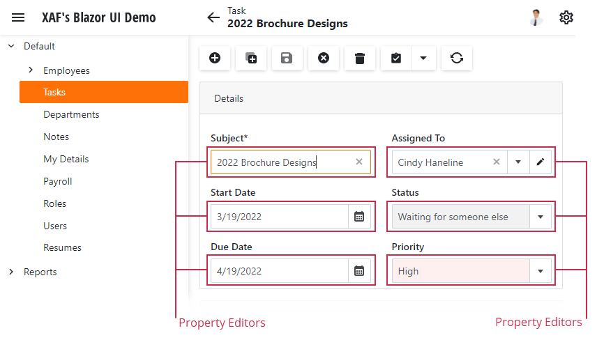
A Detail View represents an object through a set of Property Editors, each of which is bound to a property of the object.

These abstract entities read property settings from the Application Model and create UI controls based on them. To change these settings in a particular DetailView before it is displayed, use properties of the PropertyEditor class and its descendants: Get the ViewItem or Property Editor object. If a DetailView is already shown and its controls are fully initialized, change control settings directly: Access a View Item’s underlying control.
Custom Property Editors
The XAF ships with a set of different Property Editors that cover most of the data management scenarios (see Data Types Supported by built-in Editors). Additionally, the XAF supports the use of custom Property Editors for those situations when the built-in editors do not suit your needs. This topic describes the built-in Property Editors and details how to implement a custom editor. Several custom Property Editors are demonstrated in the Property Editors section of the FeatureCenter Demo, which is supplied with the XAF. This demo is located in the %PUBLIC%\Documents\DevExpress Demos 25.1\Components\XAF\FeatureCenter.NETFramework.XPO folder by default.
Note
To display static information or any control without its binding to a property, implement a View Item instead of a Property Editor. Refer to the Add an Unbound Control (Button) to the Form Layout in an XAF View topic to learn how to do this.
You may consider implementing a custom Property Editor for one of the following reasons:
Customize a built-in Property Editor’s control functionality.
Built-in XAF Property Editors use controls supplied by the XtraEditors and ASPxEditors Suites. These controls support a lot of features and can be easily customized to your taste. One way of adopting these features is accessing a built-in Property Editor control properties and modifying them (see Access the Settings of a Property Editor in a Detail View). However, if you need to reuse a customized control, you should implement a custom Property Editor by inheriting from a built-in one.
Utilize third-party controls.
If you have a control you would like to use for data editing in your application, the only way to do so is to implement a custom Property Editor.
Support management of custom data types.
For instance, if you have a business class’ property of the Coord type, a custom Property Editor should be implemented to display it.
Specific data management situations.
For instance, you may need to implement a custom Property Editor with custom data source access.
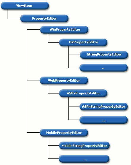
To implement a custom Property Editor, inherit from the PropertyEditor class or one of its multiple descendants.

To learn what class to use as the base class for your Property Editor, see the following table.
| Base class | Description |
|---|---|
| PropertyEditor | Implements platform-independent Property Editor features. Inherit from this class, if you need to develop Property Editors for a platform that is currently not supported internally by XAF. In other cases, use one of the following classes. |
| BlazorPropertyEditorBase, WinPropertyEditor or WebPropertyEditor | To implement a Property Editor using custom controls, inherit from these classes. To create the required control, override the CreateControlCore method. In ASP.NET Core Blazor, you can also override the BlazorPropertyEditorBase.CreateViewComponentCore(System.Object)) method to customize the way the control is displayed in a List View. In ASP.NET Web Forms, you can additionally override the CreateEditModeControlCore and CreateViewModeControlCore methods to create controls for the corresponding DetailView.ViewEditMode descendants. |
| DXPropertyEditor | This class contains the base functionality necessary to work with the XtraEditors controls. You can override two methods: CreateControlCore and CreateRepositoryItem. The former creates an XtraEditors control for use in a Detail View. The latter creates a repository item for an XtraGrid control that represents a list view. The SetupRepositoryItem method can also be overridden to adjust the properties that are common to a repository item bound to a grid column, and an XtraEditors control used in a Detail View. For more information on XtraEditors controls and the Repository Item concept, refer to the XtraEditors. |
| BooleanPropertyEditor, StringPropertyEditor, etc. | These classes are derived from the DXPropertyEditor class to work with particular data types. Inherit from these classes to add the specific capabilities you need. |
| ASPxPropertyEditor | This class contains the base functionality needed to work with editors from the ASPxGridView and Editors library. You can override the CreateEditModeControlCore and CreateViewModeControlCore methods to create the control to be used when a Detail View is in edit and view mode respectively. |
| ASPxBooleanPropertyEditor, ASPxStringPropertyEditor, etc. | These classes are derived from the ASPxPropertyEditor class to work with particular data types. Inherit from these classes to add the specific capabilities you need. |
To use a custom Property Editor in a UI, it must be loaded to the Application Model. A Property Editor should be implemented in a platform-specific module project and decorated with the PropertyEditorAttribute. If your solution does not contain this project, add an editor to an application project. This Property Editor will be loaded into the Application Model. Using the Model Editor, you can select your Property Editor as a value of the Views | <DetailView> | Items | <PropertyEditor> node’s PropertyEditorType property.
In addition, this Property Editor can be selected as a default editor for properties of a particular type using the ViewItems | PropertyEditors | <PropertyEditor> node’s EditorType property.
The PropertyEditor attribute specifies that your Property Editor is designed for only a certain data type. This attribute has several parameters and so, you have the following options.
- You may want your Property Editor to be automatically set for properties of a particular data type. In this instance, pass the required data type as the attribute’s parameter. As a result, the EditorType property will be set to your Property Editor type for the Application Model’s ViewItems | PropertyEditors | <PropertyEditor> node that defines the data type passed as a parameter. Your Property Editor will be used as the default one for properties of that data type. Note that your Property Editor might not be used automatically as a default editor if there is another Property Editor that uses this attribute with the same parameter.
- You implement an extra Property Editor for a particular data type, but you do not want it to be automatically set for properties of this data type. However, you need to be able to set it for the properties when required. In this instance, pass the required data type as the first attribute parameter; and false as the second attribute parameter. In this instance, your Property Editor will be added to the list of editors available for properties of the specified data type.
- If you do not pass any type as the attribute’s parameter, the resulting behavior will be as if you did not apply the attribute at all. This behavior is detailed above.
In certain scenarios you can have objects that should be visualized in Detail Views, not using a set of standard Property Editors, but using a specific control. In this case, create a custom Property Editor based on the control and declare an additional property in the target business class. This property should return its containing object instance. To hide the property from List Views, decorate it with the VisibleInListViewAttribute. Customize the Detail View layout to hide all Property Editors except your custom Property Editor.
public class MyBusinessClass : BaseObject {
    //...
    [VisibleInListView(false)]
    public MyBusinessClass Self {
        get { return this; }
    }
}
This way, your objects will be displayed using a set of properties in List Views and objects in Detail Views will be visualized using the specific control.
The following topics explain different custom Property Editor implementation cases in more detail.
- How to: Customize a Built-in Property Editor (ASP.NET Core Blazor)
- How to: Customize a Built-in Property Editor (WinForms)
- How to: Customize a Built-in Property Editor (ASP.NET Web Forms)
- How to: Implement a Property Editor Based on a Custom Control (ASP.NET Core Blazor)
- How to: Implement a Property Editor Based on a Custom Control (WinForms)
- How to: Implement a Property Editor Based on Custom Controls (ASP.NET Web Forms)
- Supply Predefined Values for the String Property Editor Dynamically
Examples of Custom Property Editors for Popular Scenarios
- XAF - How to Display an Enumeration Property as a Drop-down Box with Check Boxes
- XAF - How to display a collection property as a checked list box
- XAF - How to show a hyper link (URL, email, etc.) for a business class property
- XAF WinForms - How to use a custom Lookup Property Editor control for reference properties
- Multiple File Upload, Tag Box, Lookup, Markup Content Property Editors
Custom Property Editors from the Multi-Tenant Application Demo (Outlook Inspired App)
The application serves as the central data management hub for the fictitious company, overseeing various business entities such as Employees, Products, Orders, Quotes, Customers, and Stores.
- An abstract list editor designed to create simple object-specific variants
- An abstract property editor that serves as a basis for editors such as ProgressPropertyEditor or PdfViewEditor
- A property editor that displays raw text (like the WinForms LabelPropertyEditor)
- An EnumPropertyEditor descendant that only displays an image (like its WinForms counterpart)