NavigationPage.CustomHeaderButtons Property
Provides access to the custom header buttons collection.
Namespace: DevExpress.XtraBars.Navigation
Assembly: DevExpress.XtraBars.v25.1.dll
NuGet Package: DevExpress.Win.Navigation
Declaration
Property Value
| Type | Description |
|---|---|
| DevExpress.XtraBars.Docking2010.ButtonCollection | A DevExpress.XtraBars.Docking2010.ButtonCollection object that stores custom header buttons for this NavigationPage. |
Remarks
Custom header buttons are buttons displayed within the page header and visible only in a NavigationPane container.
To add a custom header button, use the corresponding link within the page smart-tag. Depending on the ButtonStyle property value, a button can be of two types – a simple push button and a check button. Clicking these buttons raises the NavigationPage.CustomButtonClick, NavigationPage.CustomButtonChecked and NavigationPage.CustomButtonUnchecked events, based on the button type.
Buttons of any type have the Caption and Image properties that specify the button’s text and glyph. The UseCaption and UseImage properties specify which part of this content should be used.
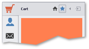
The figure below illustrates an example. The ‘Cart’ page has two custom header buttons with no text: the push ‘Home’ button and the check ‘Bookmark’ button in the checked state.

In the figure above, custom header buttons are aligned before the default ‘Collapse’ and ‘Expand’ buttons. To position custom header buttons after these default buttons, use the VisibleIndex property. The ‘Collapse’ button has the visible index of -1, the ‘Expand’ button - 100. Use these value intervals to place your custom header buttons at the desired position.
Buttons of the check type can be united into groups using the GroupIndex property. Buttons in such groups act as radio buttons - checking one button clears all the remaining buttons within this group.