TablePanelEntityStyle Enum
Enumerates size types for rows and columns in the TablePanel.
Namespace: DevExpress.Utils.Layout
Assembly: DevExpress.Utils.v25.1.dll
NuGet Packages: DevExpress.Utils, DevExpress.Wpf.Core
Declaration
Members
| Name | Description |
|---|---|
AutoSize
|
Rows/columns are automatically resized to match their contents. Width and Height settings of these columns/rows are ignored. The AutoSizeDefaultTableElementLength property specifies the size for empty rows/columns of this type. You can also enable the TablePanel’s AutoSize property to automatically resize the panel to fit its contents. |
Absolute
|
A row/column has a fixed width/height, in pixels. If the last row/column is of the Absolute size type and the TableLayout provides more space than needed, the row/column is stretched to fit this space. |
Relative
|
Rows/columns of this size type divide the available space according to the ratio specified by their sizes. When you enable the TablePanel’s AutoSize setting, Relative mode is equivalent to AutoSize mode. |
Separator
|
Rows and columns of this style serve as visual delimiters between their neighboring rows and columns. Separators cannot be resized and ignore their TablePanelColumn.Width and TablePanelRow.Height properties. |
Related API Members
The following properties accept/return TablePanelEntityStyle values:
Remarks
Use the Style property to specify the size type for a row/column in the TablePanel.
tablePanel1.Rows[1].Style = DevExpress.Utils.Layout.TablePanelEntityStyle.Absolute;
tablePanel1.Rows[1].Height = 50;
The TablePanel may contain rows and columns of different size types simultaneously. In this case, available space is distributed between rows and columns in the following order.
- First, space is allocated for rows/columns of the Absolute type.
- Second, space is allocated for rows/columns of the AutoSize type.
- Finally, the remaining space is distributed among rows/columns of the Relative type.
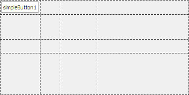
Example
The following code snippet does the following:
- Adds rows and columns to a TablePanel
- Displays a button in the top-left cell.
using DevExpress.Utils.Layout;
using DevExpress.XtraEditors;
using System.Windows.Forms;

namespace DXTablePanelDemo {
    public partial class Form1 : XtraForm
    {
        TablePanel tablePanel1;
        LabelControl labelControl1;
        public Form1()
        {
            InitializeComponent();

            // Create and configure a TablePanel.
            tablePanel1 = new TablePanel()
            {
                Name = "tablePanel1",
                Dock = DockStyle.Fill,
                ShowGrid = DevExpress.Utils.DefaultBoolean.True
            };

            // Add 3 columns.
            tablePanel1.Columns.Add(new TablePanelColumn(TablePanelEntityStyle.AutoSize, 0));   // Adjusts the column width to cell content.
            tablePanel1.Columns.Add(new TablePanelColumn(TablePanelEntityStyle.Relative, 1));   // Takes 1 share of the remaining space.
            tablePanel1.Columns.Add(new TablePanelColumn(TablePanelEntityStyle.Relative, 2));   // Takes 2 shares of the remaining space.

            // Add 3 rows.
            tablePanel1.Rows.Add(new TablePanelRow(TablePanelEntityStyle.AutoSize, 0)); // Adjusts the row height to cell content.
            tablePanel1.Rows.Add(new TablePanelRow(TablePanelEntityStyle.Relative, 1)); // Takes 1 share of the remaining height.
            tablePanel1.Rows.Add(new TablePanelRow(TablePanelEntityStyle.Absolute, 60)); // Fixed height = 60 pixels.

            // Access the third row and modify its height.
            tablePanel1.Rows[0].Height = 80;

            labelControl1 = new LabelControl() { Text = "Cell [0; 0]" };
            tablePanel1.Controls.Add(labelControl1);

            // Display the labelControl1 in the top left cell.
            tablePanel1.SetCell(labelControl1, 0, 0);

            Controls.Add(tablePanel1);
        }
    }
}