TablePanel Class
A panel with a table layout, where each cell can host a control.
Namespace: DevExpress.Utils.Layout
Assembly: DevExpress.Utils.v19.2.dll
Declaration
[Docking(DockingBehavior.Never)]
[ToolboxBitmap(typeof(ToolboxIconsRootNS), "TablePanel")]
public class TablePanel :
    XtraLayoutPanelBase,
    ITablePanel,
IXtraLayoutPanelRemarks
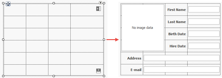
The figure below illustrates the table layout of a sample TablePanel, and the same panel populated with controls.
Columns and Rows
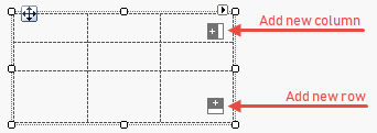
The fastest way to add columns and/or rows to a Table Panel is to click related buttons at design time.
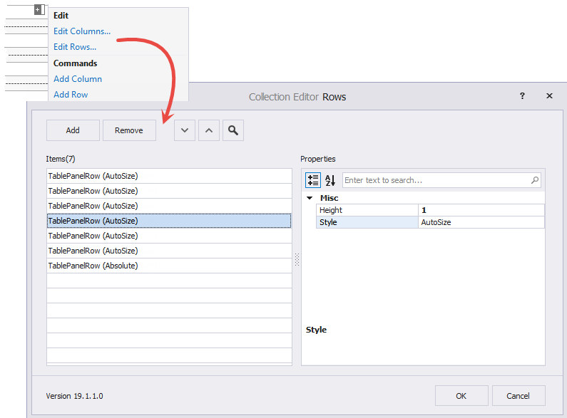
You can also use the panel’s smart tag menu. Two “Edit…” links open the Collection Editor that allows you to customize rows and columns as you add them.
Rows and columns have identical properties: “Width” or “Height”, and “Style” that specifies units for width/height.
- Absolute - Width and Height properties specify the absolute row (column) size in pixels.
- Relative - Width and Height properties store relative values. For example, three columns with relative widths of 1, 1 and 2 split the panel in four equal parts; first two columns have equal widths, and the last column is twice as wide.
- AutoSize - Width and Height settings are ignored, rows and columns resize automatically depending on their content.
The sample below illustrates how to add columns and rows in code.
tablePanel2.Columns.AddRange(new DevExpress.Utils.Layout.TablePanelColumn[] {
    new DevExpress.Utils.Layout.TablePanelColumn(DevExpress.Utils.Layout.TablePanelEntityStyle.Relative, 2F),
    new DevExpress.Utils.Layout.TablePanelColumn(DevExpress.Utils.Layout.TablePanelEntityStyle.Relative, 2F),
    new DevExpress.Utils.Layout.TablePanelColumn(DevExpress.Utils.Layout.TablePanelEntityStyle.Relative, 2F),
    new DevExpress.Utils.Layout.TablePanelColumn(DevExpress.Utils.Layout.TablePanelEntityStyle.Relative, 3F)
});

tablePanel2.Rows.AddRange(new DevExpress.Utils.Layout.TablePanelRow[] {
    new DevExpress.Utils.Layout.TablePanelRow(DevExpress.Utils.Layout.TablePanelEntityStyle.AutoSize, 1F),
    new DevExpress.Utils.Layout.TablePanelRow(DevExpress.Utils.Layout.TablePanelEntityStyle.AutoSize, 1F),
    new DevExpress.Utils.Layout.TablePanelRow(DevExpress.Utils.Layout.TablePanelEntityStyle.AutoSize, 1F),
    new DevExpress.Utils.Layout.TablePanelRow(DevExpress.Utils.Layout.TablePanelEntityStyle.AutoSize, 1F),
    new DevExpress.Utils.Layout.TablePanelRow(DevExpress.Utils.Layout.TablePanelEntityStyle.AutoSize, 1F),
    new DevExpress.Utils.Layout.TablePanelRow(DevExpress.Utils.Layout.TablePanelEntityStyle.AutoSize, 1F)
});
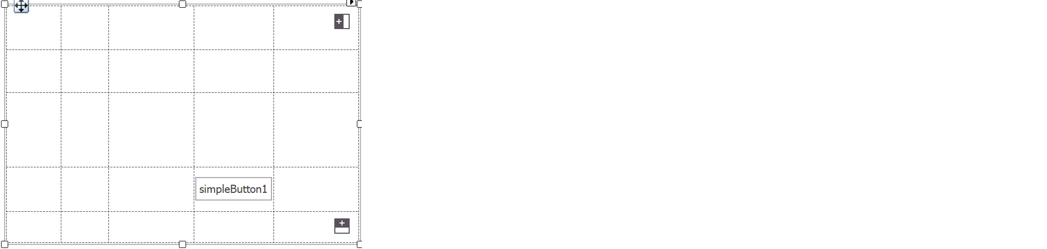
To select a column or row at design time, hover a mouse pointer over it in close proximity to a border. Once a column or row is highlighted, you can drag it to a new position, and right-click it to change the Style.
Add and Arrange Controls
To add a control to a Table Panel, drag it into a table cell. You can drag controls from one cell to another to re-arrange them. Note that you can create a StackPanel, fill it with items, and drag this entire panel into a Table Panel cell.
When a control is added to a panel’s Controls collection, it dispays four extender properties in the Visual Studio Property Grid. These properties specify the cell where the control locates, and the number of rows/columns this column stretches across.
- Row
- Column
- RowSpan
- ColumnSpan
Since the control itself does not have these settings, use related panel methods if you need to arrange controls in code.
- TablePanel.SetCell(Control, Int32, Int32)
- TablePanel.SetRow(Control, Int32)
- TablePanel.SetColumn(Control, Int32)
- TablePanel.SetRowSpan(Control, Int32)
- TablePanel.SetColumnSpan(Control, Int32)
The following sample illustrates how to fill the table created in the previous section with buttons.
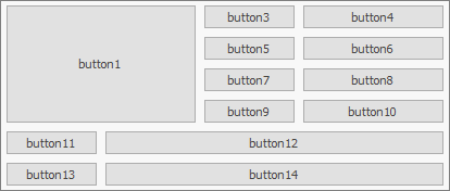
tablePanel2.Controls.AddRange(new Control[] {
    button1, button3, button4, button5, button6,
    button7, button8, button9, button10, button11,
    button12, button13, button14});

tablePanel2.SetCell(button1, 0, 0);
tablePanel2.SetColumnSpan(button1, 2);
tablePanel2.SetRowSpan(button1, 4);
button1.Dock = DockStyle.Fill;

tablePanel2.SetCell(button3, 0, 2);

tablePanel2.SetCell(button4, 0, 3);

tablePanel2.SetCell(button5, 1, 2);

tablePanel2.SetCell(button6, 1, 3);

tablePanel2.SetCell(button7, 2, 2);

tablePanel2.SetCell(button8, 2, 3);

tablePanel2.SetCell(button9, 3, 2);

tablePanel2.SetCell(button10, 3, 3);

tablePanel2.SetCell(button11, 4, 0);

tablePanel2.SetCell(button12, 4, 1);
tablePanel2.SetColumnSpan(button12, 3);

tablePanel2.SetCell(button13, 5, 0);

tablePanel2.SetCell(button14, 5, 1);
tablePanel2.SetColumnSpan(button14, 3);