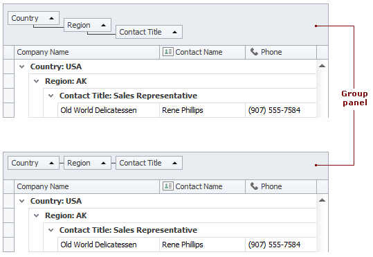
Group Panel
Group panels display headers of columns involved in data grouping. They also serve as drag-and-drop targets allowing end-users to drag column headers onto it. Right-clicking the group panel invokes the group panel context menu, which provides grouping related options.
The table below lists the main properties affecting element appearance.
Appearance | GridViewAppearances.GroupPanel The group panel’s background color cannot be changed using appearance settings in skinning paint styles. To customize the group panel’s background color, create a new skin or skin patch using the Skin Editor tool. In the Skin Editor, the skin element can be found in the following path: The following code accesses the skin element that corresponds to the group panel and modifies its |
Custom Draw Event | |
Text | |
Visibility | |
Column Arrangement |