Rows
- 11 minutes to read
The VGridControl arranges data in rows and columns. If the control is bound to a data source, rows correspond to fields and columns to records.
In the PropertyGridControl, rows correspond to properties and the column to the selected object.
This topic covers general information about rows in the VGridControl and PropertyGridControl. Refer to the following topics for information about specific tasks:
Tip
All DevExpress data-aware controls behave identically and expose similar APIs. Refer to the following topics for information about the same functionality in other data-aware controls:
- Data Grid — Grid Columns
- Tree List — Columns
- Pivot Grid — Fields
Generate Rows Automatically Based on the Data Source
If you assign a data source to the DataSource property, the control generates rows based on the data source fields only if the Rows collection is empty. Otherwise, Vertical Grid uses rows from this collection and does not generate data source-based rows.
If rows are created in the designer, you can access them by name in code or in the Properties window. The control stores rows in the Rows collection. You can also access rows in the collection by index or bound data field name.
For more information on how the control retrieves fields from the data source, see the following topic: Obtaining Fields Available in Data Source.
Row Types
The control supports the following row types:
- EditorRow — a row that displays a single data field in each column.
- MultiEditorRow — a row that displays multiple data fields in each column.
- CategoryRow — a row that group multiple rows.
Row Properties
A row stores its settings in a RowProperties object. You can use this object to specify the row’s visibility, display caption, width, in-place editor, appearance and format settings, and so on. You can use the following properties to access the following objects:
- EditorRow.Properties — returns a RowProperties object that contains a regular row’s settings.
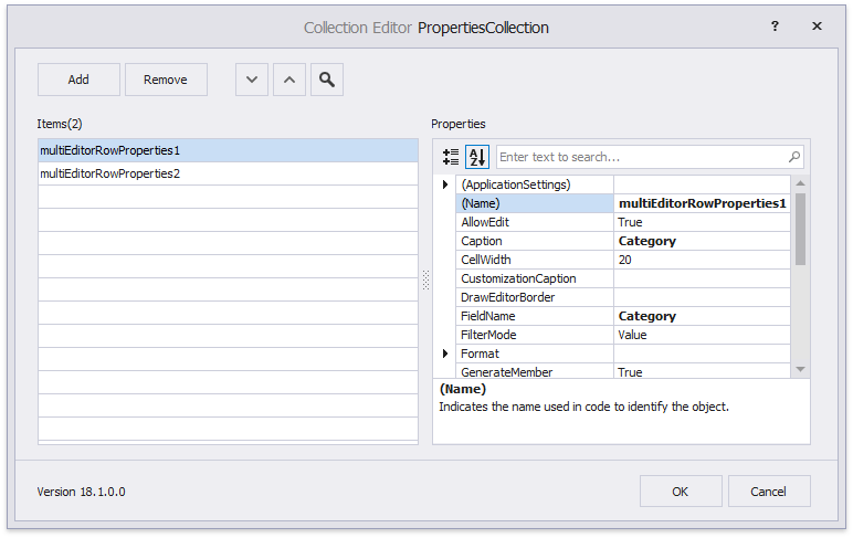
- MultiEditorRow.PropertiesCollection — returns a collection of MultiEditorRowProperties objects that contain a multi-editor row’s settings.
- CategoryRow.Properties — returns a CategoryRowProperties object that contains a category’s settings.
For example, a row’s FieldName property specifies the name of the bound data field. You can use this value to identify a row. For example, you can pass the field name to the control’s GetRowByFieldName(String) method and use a field name to get a row.
Code-First Data Sources
For code-first data sources (for example, Entity Framework models), you can mark a property with the Display attribute and disable its AutoGenerateField parameter to skip row generation for this property. The Display attribute in the code below prevents the control from row generation for the AdditionalInfo data field.
// The control does not create a row for this data field.
[Display(AutoGenerateField = false)]
public string AdditionalInfo { get; set; }
Tip
You can use different attributes to rearrange rows, modify their captions, change default in-place editors, and so on. Refer to the following topic for more information: Data Annotation Attributes.
Change the Data Source
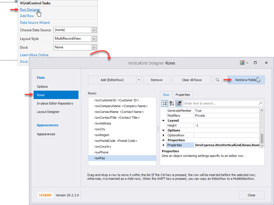
If you replaced the data source in the designer, the control does not automatically regenerate rows. To force the control to regenerate rows, click Retrieve Fields in the designer.
You can also call the RetrieveFields() method in code to regenerate rows. For example, you can call it in a DataSourceChanged event handler that is invoked when the data source is reassigned.
Add and Remove Rows Manually
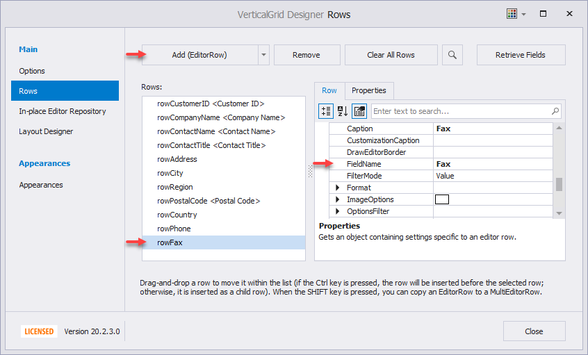
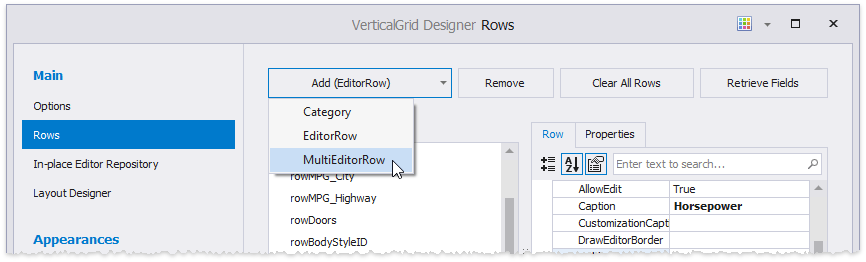
Click Add (EditorRow) in the designer to create a row. To bind the created row to a data field, specify its FieldName property. To remove a row, use the Remove button.
If the data field is not specified, the row is not bound to a data field. You can display calculated or any other values in this row. See the following topic for more information: Unbound Rows.
Create Rows in Code
The example below creates a row. The Rows collection’s Add(BaseRow) method is called to add this row to the control. The row is added as a top-level row or as JobDescription row’s child depending on a condition.
using DevExpress.XtraVerticalGrid;
using DevExpress.XtraVerticalGrid.Rows;

private void AddRow() {
    // Create a row bound to a specific field and specify its caption.
    EditorRow row = new EditorRow("job_lvl");
    row.Properties.Caption = "Job Level";

    if (vGridControl1.Rows["JobDescription"].Visible)
        // Append the row to the JobDescription row's child row collection.
        vGridControl1.Rows["JobDescription"].ChildRows.Add(row);
    else
        // Append the row to the top-level row collection.
        vGridControl1.Rows.Add(row);
}
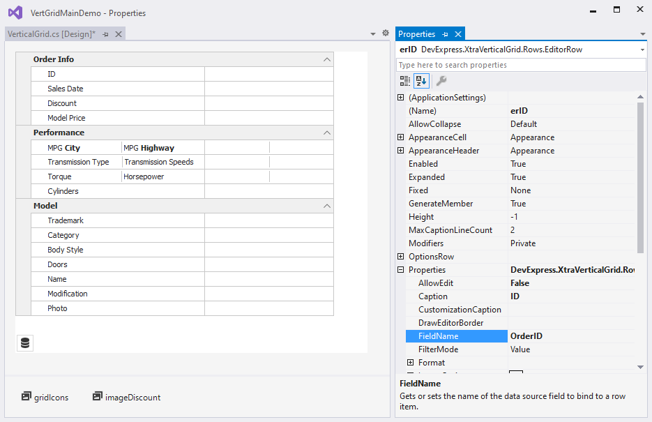
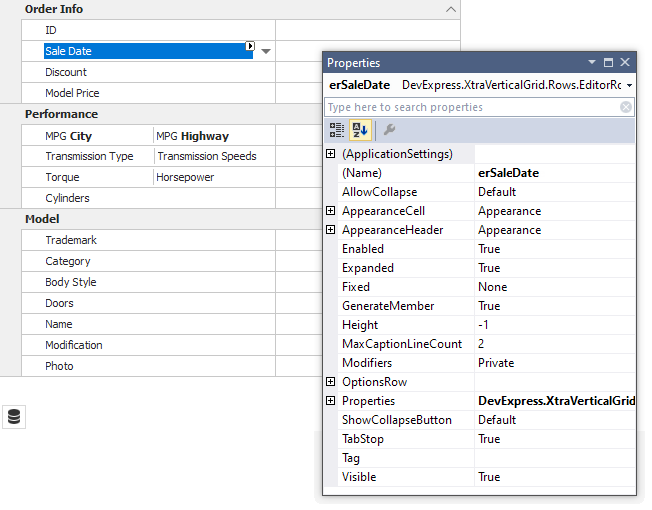
On-Form Access to Rows at Design Time
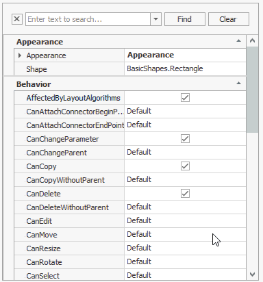
The control supports on-form access to rows at design time. Click a row header to display the row’s settings in the Visual Studio Properties grid:
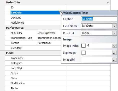
Click the row header’s smart tag to access and customize the row’s main settings:
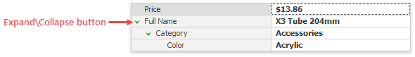
Nested Rows
You can drag one row to another to create a row hierarchy. To move a child row from its parent back to the top level, press Ctrl and drag it.
Use the following properties and methods to customize nested rows:
LevelIndent — specifies a row’s horizontal offset that reflects the tree structure. To remove this offset for root-level rows, disable the ShowRootLevelIndent setting.
Expanded — specifies whether a parent row is collapsed or expanded.
Create Nested Rows in Code
Populate a parent row’s ChildRows collection to add child rows to that row. Use the ParentRow property to get a row’s parent in code. You can also use the control’s MoveRow method to move a row to a new position.
// Existing rows.
vGridControl1.MoveRow(rowModel, rowMain, false);
vGridControl1.MoveRow(rowCategory, rowModel, false);
vGridControl1.MoveRow(rowTrademark, rowModel, true);

// New rows.
EditorRow rowModel = new EditorRow("Model");
rowModel.Properties.Caption = "Model";
rowMain.ChildRows.Add(rowModel);

EditorRow rowCategory = new EditorRow("Category");
rowCategory.Properties.Caption = "Category";
rowModel.ChildRows.Add(rowCategory);

EditorRow rowTrademark = new EditorRow("Trademark");
rowTrademark.Properties.Caption = "Trademark";
rowModel.ChildRows.Add(rowTrademark);
The sample below implements the Shift+Up and Shift+Down hotkeys that make the focused row an upper row’s child or a lower row’s parent.
using DevExpress.XtraVerticalGrid;
using DevExpress.XtraVerticalGrid.Rows;

private void vGridControl1_KeyDown(object sender, KeyEventArgs e) {
    VGridControl vGrid = sender as VGridControl;
    BaseRow row = vGrid.FocusedRow;
    BaseRow prevRow = vGrid.GetPrevVisible(row);
    BaseRow nextRow = vGrid.GetNextVisible(row);
    if ((e.KeyCode == Keys.Up) && (e.Shift)) {
        if ((row == null) || (prevRow == null)) return;
        vGrid.MoveRow(row, prevRow, false);
    }
    if ((e.KeyCode == Keys.Down) && (e.Shift)) {
        if ((row == null) || (nextRow == null)) return;
        vGrid.MoveRow(nextRow, row, false);
    }
}
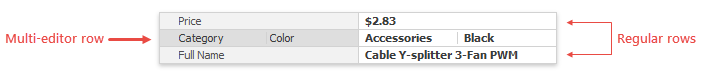
Multi-Editor Rows
MultiEditorRow objects describe rows that allow a user to edit multiple data source fields in a single column.
Click Add (MultiEditorRow) in the designer to create a multi-editor row.
Use the created row’s PropertiesCollection property to populate the row with editors.
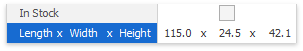
Vertical dashes separate captions in the multi-editor row header and values in cells. You can set SeparatorKind to String and use the SeparatorString property to replace the default dashes with custom characters. In the figure below, an x character separates captions and values.
Create Multi-Editor Rows in Code
The sample below adds a multi-editor row in code. The code specifies the bound data field and the row’s caption.
MultiEditorRow meRow = new MultiEditorRow();
meRow.PropertiesCollection.Add(new MultiEditorRowProperties() { FieldName = "Name", Caption = "Full Name" });
meRow.PropertiesCollection.Add(new MultiEditorRowProperties() { FieldName = "Category", Caption = "Product Category" });
meRow.PropertiesCollection.Add(new MultiEditorRowProperties() { FieldName = "Color", Caption = "Color" });
vGridControl1.Rows.Add(meRow);
Category Rows
CategoryRow objects describe row categories that allow you to organize multiple rows into a group.
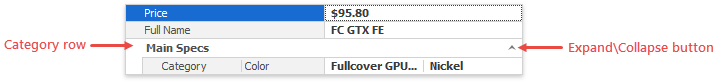
Click Add (CategoryRow) in the designer to create a category. Then drag regular rows to this category to populate it.
Use the following properties to customize a category:
- CategoryLevelIndentStyle — specifies whether categories have a vertical indent that separates them from regular data rows.
- TreeButtonStyle — specifies the expand/collapse button’s style and alignment.
- Expanded — allows you to expand and collapse categories.
Create Categories in Code
The sample below creates a category and populates it with three rows.
CategoryRow cRow = new CategoryRow();
cRow.Properties.Caption = "Main Specs";
cRow.ChildRows.AddRange(new BaseRow[] { row1, row2, row3 });
cRow.Expanded = false;
vGridControl1.Rows.Insert(cRow, propertyGridControl1.Rows.Count - 1);
Hide Grid Lines
Disable the ShowHorzLines and ShowVertLines options to hide horizontal and vertical grid lines. For example, the control in the figure below does not display horizontal lines.
Fixed Rows
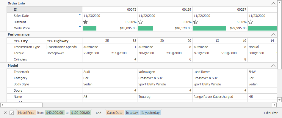
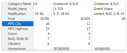
The control displays a vertical scrollbar if its height is not sufficient to display all rows. You can use a row’s Fixed property to anchor this row at the control’s top or bottom. This makes it always visible even a user scrolls through records. You can use the control’s FixedTopRows and FixedBottomRows collections to access fixed rows in code. In the image below, the Appearance category is anchored to the control’s top.
Note
The Fixed property is only in effect for top-tier rows. If a row is nested or belongs to a category, you cannot anchor it. You can only anchor its parent row or category.
Best-Fit Width
The control’s RowHeaderWidth specifies the width of the column that displays row captions. Users can click Best Fit in the context menu to automatically change the width of the column to display all its content.
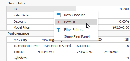
You can call the BestFit() method in code.
Miscellaneous Row Options
You can use a row’s Properties property to access the following options:
Property | Description |
|---|---|
The grid automatically generates rows display captions based on the data source field name. Modify this property to rename a row. You can enable the AllowHtmlText option to format the caption with HTML-inspired tags. | |
Gives access to options that allow you to display images next to row captions. | |
Specifies whether the row can be edited. In this mode, users cannot invoke the cell editor or copy a value. The control’s Editable property disables edit functionality for all rows in the control. | |
Specifies whether the row is read-only. In this mode, users can invoke the cell editor and copy a value, but cannot edit it. | |
Specifies format settings applied to cell values. |
Use a row’s OptionsRow property to access the following options:
Property | Description |
|---|---|
Specifies whether the row can be focused. The control’s FocusedRow property specifies the focused row. | |
Specifies whether users can drag the row to a new position. | |
Specifies whether users can hide and then restore the row. | |
Use these properties to change row height settings. | |
Specifies whether users can change row height. Use the control’s ResizeRowHeaders option to specify this setting for all rows. | |
Specifies whether you can use HTML-inspired tags to format captions. Use the Caption property to specify a row caption. |