HTML Tags
- 11 minutes to read
This topic describes HTML tags supported by DevExpress WinForms controls for HTML and CSS-based UI design.
Sections and Headings
<div> Tag
A container for other elements.
<div class='view'>
    <b>Lorem ipsum</b><br>
    <i>dolor sit amet</i><br>
</div>
<span> Tag
An inline container for other elements.
<div class="container">
    This is an example of the <span class="SpanExample">span tag</span> inside simple text.
</div>
<h1>–<h6> Tags
Headings.
<h1>Header h1</h1>
<p> Tag
A paragraph.
<p><i>Lorem ipsum</i> is the most popular filler text in history.</p>
Attributes
align- The alignment of paragraph text content. Available values include:
left,right,center,justify.
Example: <p align="right">Right-aligned paragraph</p>.
<br> Tag
A line break.
<p>To force<br> line breaks<br>,use the br<br> element.</p>
Links and Images
<a> Tag
A hyperlink.
<a href='devexpress.com'>Hyperlink</a><br>
Attributes
href- The URL of the page to which the link goes.
<img> Tag
An image.
Attributes
src- Specifies the image source. It can be set to the following values:
The name or index of an image in a control’s dedicated image collection. Use the control’s HtmlImages property (for example, HtmlContentControl.HtmlImages or ItemsView.HtmlImages) to assign this collection.
A binding expression that defines a field in a control’s data source that stores image data. This expression has the following syntax:
${FieldName}.<img src="${LargePhoto}" width="100" height="100">
width- The image’s display width, in pixels.
height- The image’s display height, in pixels.
fillAllows you to re-paint an SVG image with the specific color. Note that the color you set applies to all “path” elements of a vector image.
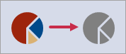
<img style="fill:gray;" src="bo_position_v92">
<!-- Or -->
<img class="gray" src="bo_position_v92">
.gray { fill: Gray; }
Input
<input> Tag
The <input> tag allows you to add an input box or external control to the UI. The tag is supported for the following controls:
- HtmlContentControl
- Use the
<input>tag as a placeholder for external controls and Repository Items (in-place editors) that you want to display within a layout. - Data Grid Views (ItemsView, TileView, and WinExplorerView)
- Use the
<input>tag as a placeholder for Repository Items (in-place editors). It’s not possible to use this tag to display external controls in Data Grid Views.
<!-- Show external controls-->
<input name="textEdit1"/>
<input name="calcEdit1"/>
<!-- Show in-place editors -->
<input class="editor" value="${StringData}" name="repositoryItemTextEdit1"/>
<input class="editor" value="${IntData}" name="repositoryItemSpinEdit1"/>
<input class="editorHigh" value="${ImageData}" name="repositoryItemPictureEdit1"/>
<input class="editor" value="${Rating}" name="repositoryItemRatingControl1"/>
<input class="editor" value="${FloatData}" name="repositoryItemProgressBar1"/>
<!-- Show in-place editors based on the data types of bound fields -->
<input class="editor" value="${OrderDate}"/>
<input class="editor" value="${Photo}"/>
Attributes
nameSpecifies the name of an external control or Repository Item that you want to display instead of the
inputHTML element.The
nameattribute is optional if you bind the<input>tag to a data field (see thevalueattribute). If thenameattribute is not specified, the runtime UI renders a default DevExpress editor instead of the<input>tag. The default editor’s type matches the type of the bound data field. For example, the UI renders a DateEdit editor for the<input value="${BirthDate}"/>element bound to the DateTime “BirthDate” field.value- Specifies the static control value (
value = "5"), or the data source field name bound to this control (value = "${Price}").
Add External Controls
To display an external control within an HtmlContentControl, do the following:
- Place an external control (for example, a TextEdit) onto the HtmlContentControl.
- Define the
inputtag in HTML code. - Set the
nameattribute of theinputtag to the name of the added control.
Add Repository Items
Repository Items (RepositoryItem descendants) are objects used to create in-place editors in container controls. To create Repository Items that can be referenced in your HTML template, open the “In-place Editor Repository” tab of the control’s Designer.
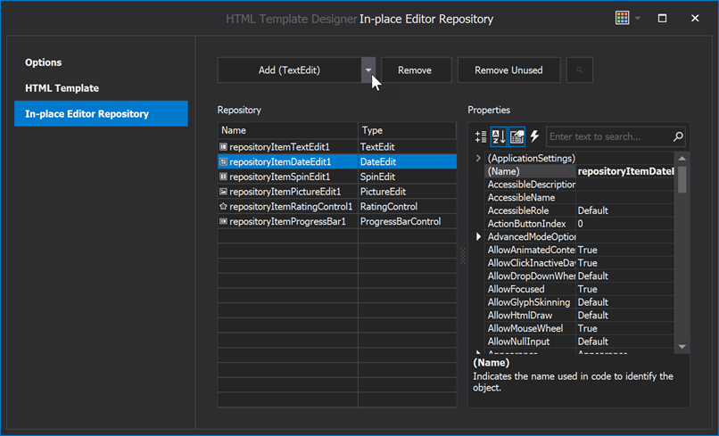
If you create these items in code, remember to add them to the control’s RepositoryItems collection (otherwise, the control is unable to locate a referenced Repository Item). Items created at design time (in the control’s Designer) are placed into this collection automatically.
RepositoryItemTextEdit repoItem = new RepositoryItemTextEdit();
// Specify the Name property to reference this Repository Item in the 'input' tag.
repoItem.Name = "repositoryItemTextEdit1";
repoItem.EditValueChanged += RepoItem_EditValueChanged;
repoItem.ShowNullValuePrompt = DevExpress.XtraEditors.ShowNullValuePromptOptions.EmptyValue;
repoItem.NullValuePrompt = "No value";
htmlContentControl1.RepositoryItems.Add(repoItem);


private void RepoItem_EditValueChanged(object sender, EventArgs e) {
    // Process user input.
}
Formatting
<b> Tag
Bold text.
<b>Bold text</b><br>
<i> Tag
Italicized text.
<i>Italic Text</i><br>
<u> Tag
Text with an underline.
<u>Underline</u><br>
<s> Tag
Strikethrough text.
<s>Strikethrough</s><br>
<ol> Tag
An ordered list.
<ol>
    <li>Item1</li>
    <li>Item2</li>
    <li>Item3</li>
</ol>
Attributes
reversed- Items are displayed in reversed order. Example:
<ol reversed>. start- The start value of an ordered list. Example:
<ol start="10">. typeThe kind of marker to use in the list. Available values include:
1 — Default. Decimal numbers (1, 2, 3, 4).
a — Alphabetically ordered list, lowercase (a, b, c, d).
A — Alphabetically ordered list, uppercase (A, B, C, D).
i — Roman numbers, lowercase (i, ii, iii, iv).
I — Roman numbers, uppercase (I, II, III, IV).
Example:
<ol type="I">.
<ul> Tag
An unordered list.
<ul>
    <li>Item1</li>
    <li>Item2</li>
</ul>
<li> Tag
A list item.
<ol>
    <li>Item1</li>
    <li>Item2</li>
    <li>Item3</li>
</ol>
Attributes
value- Applies to
ollists. Specifies the item’s value. The following list items will increment from that number. Example:<ol> <li value="7">Apple</li> </ol>
Tables
<table> Tag
A table.
<table>
    <thead>
        <tr>
            <th>Company</th>
            <th>Country</th>
        </tr>
    </thead>
    <tbody>
        <tr>
            <td>Alfreds Futterkiste</td>
            <td>Germany</td>
        </tr>
        <tr>
            <td>Centro comercial Moctezuma</td>
            <td>Mexico</td>
        </tr>
    </tbody>
    <tfoot>
        <tr>
            <td>footer cell</td>
            <td>footer cell</td>
        </tr>
    </tfoot>
</table>
<th> Tag
A header cell in a table.
<table>
    <thead>
        <tr>
            <th>Company</th>
            <th>Country</th>
        </tr>
    </thead>
    ...
</table>
Attributes
colspan- The number of columns a cell should span.
rowspan- The number of rows a cell should span.
<tr> Tag
A row in a table.
<table>
    <tbody>
        <tr>
            <td>Alfreds Futterkiste</td>
            <td>Germany</td>
        </tr>
        <tr>
            <td>Centro comercial Moctezuma</td>
            <td>Mexico</td>
        </tr>
    </tbody>
</table>
<td> Tag
A cell in a table.
<table>
    <tbody>
        <tr>
            <td>Alfreds Futterkiste</td>
            <td>Germany</td>
        </tr>
        <tr>
            <td>Centro comercial Moctezuma</td>
            <td>Mexico</td>
        </tr>
    </tbody>
</table>
Attributes
colspan- The number of columns a cell should span.
rowspan- The number of rows a cell should span.
<thead> Tag
Groups the header content in a table.
<table>
    <thead>
        <tr>
            <th>Company</th>
            <th>Contact</th>
            <th>Country</th>
        </tr>
</table>
<tbody> Tag
Groups the body content in a table.
<table>
    <tbody>
        <tr>
            <td>Alfreds Futterkiste</td>
            <td>Maria Anders</td>
        </tr>
        <tr>
            <td>Centro comercial Moctezuma</td>
            <td>Francisco Chang</td>
        </tr>
    </tbody>
</table>
<tfoot> Tag
Groups the footer content in a table.
<table>
    <thead>
        <tr>
            <th>Company</th>
            <th>Country</th>
        </tr>
    </thead>
    <tbody>
        <tr>
            <td>Alfreds Futterkiste</td>
            <td>Germany</td>
        </tr>
        <tr>
            <td>Centro comercial Moctezuma</td>
            <td>Mexico</td>
        </tr>
    </tbody>
    <tfoot>
        <tr>
            <td>footer cell</td>
            <td>footer cell</td>
        </tr>
    </tfoot>
</table>
Tooltips
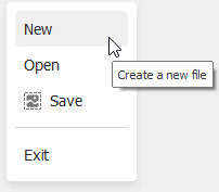
Any HTML tag has the title attribute that allows you to specify a tooltip for the HTML element.
<div id="miNew" class="menuItem" title="Create a new file">New</div>
The Default ToolTipController object (see DefaultToolTipController) initially manages the display settings of tooltips. Set a control’s ToolTipController property (for example, HtmlContentPopup.ToolTipController) to a ToolTipController component to use a custom ToolTipController object instead of the Default ToolTipController to manage tooltips.
See the following topic for more information: Tooltips.
Unique DevExpress Tags
dx-collection
The <dx-collection> tag allows you to visualize item collections.
<template id="item-template">
    <div class="styleForItems"><!-- value --></div>
</template>

<div class="container">
    <div class="card">
        <!-- ... -->
        <dx-collection class="collectionStyle" Items="${FieldName}"
            ItemTemplate="item-template"></dx-collection>
    </div>
</div>
- The
<template>block must be declared before the main control template. - The ID of a
<template>must match the value of theItemTemplateproperty in the<dx-collection>tag. - Replace the
<!--value-->placeholder with a field name (if you visualize a collection of business objects) or the${value}keyword (if you visualize a collection of simple objects: strings, numbers, enumeration values, and so on).
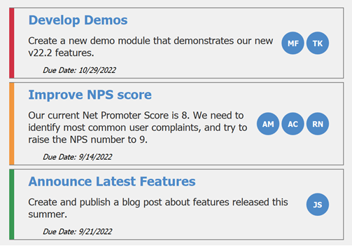
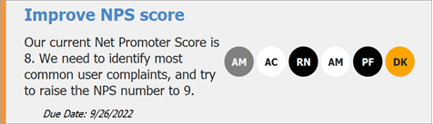
Example 1: A Collection of Business Objects
In this example, a Data Grid displays records of the sample “Task” class. The assigned HTML template visualizes items similar to Kanban boards.
The sample “Task” class:
public class Task {
    public string TaskName { get; set; }
    public string Description { get; set; }
    public Severity TaskSeverity { get; set; }
    public DateTime DueDate { get; set; }
    public List<Employee> AssignedTo { get; set; }
}
The “Task.AssignedTo” property stores a list of “Employee” objects.
public class Employee {
    public string FirstName { get; set; }
    public string LastName { get; set; }
    public bool OnLeave { get; set; }
    public string Initials {
        get {
            return FirstName.Substring(0, 1) + LastName.Substring(0, 1); }
    }
}
To visualize a collection of employees assigned to a card, the <dx-collection> tag is used.
- The tag’s
Itemsproperty points to the data object’s collection (“AssignedTo”). - The tag’s
ItemTemplateproperty points to the ID of the template applied to individual collection items (“assigned-emp”).
<template id="assigned-emp">
    <div class="text circle">${Initials}</div>
</template>

<div class="primary-container">
    <div class="stripe" dx-class="{TaskSeverity}"></div>
    <div class="main-content">
        <div class="text-content">
            <div class="text title">${TaskName}</div>
            <div class="text description">${Description}</div>
            <div class="text date">$Due Date: {DueDate}</div>
        </div>
        <dx-collection class="circles" Items="${AssignedTo}" ItemTemplate="assigned-emp"></dx-collection>
    </div>
</div>
.text{
    margin-top: 5px;
    margin-bottom: 5px;
}

.circle{
    color: @White;
    font-weight: bold;
    background-color: @Blue;
    border-radius: 2000px;
    width: 32px;
    height: 32px;
    display: flex;
    align-items: center;
    justify-content: center;
    margin-left:3px;
}

.circles {
    display: flex;
    flex-direction: row;
    justify-content: flex-end;
    margin-right: 20px;
}
Note that the <div> element that draws a side stripe uses the dx-class property. This property allows a template to select different colors depending on the “TaskSeverity” value.
<div class="stripe" dx-class="{TaskSeverity}"></div>
See this help article to learn more about conditional styling: CSS Style Selector.
Example 2: A Collection of Simple Objects
In this example, the Data Grid displays records of the sample “User” class.
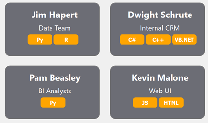
Each User object exposes the “UserLanguages” property of the List<string> type.
public class User {
    public string FullName { get; set; }
    public string PrimaryTeam { get; set; }
    public List<String> UserLanguages { get; set; }
}
To visualize this “UserLanguages” collection, the <dx-collection> tag is used.
- The tag’s
Itemsproperty points to the collection property name (“UserLanguages”). - The tag’s
ItemTemplateproperty points to the ID of the template applied to individual collection items (“member-template”). - Since the visualized collection is a list of strings rather than business objects, and there is no nested property to bind to, the
${value}keyword is used for the item template.
<template id="member-template">
    <div class="badge">${value}</div>
</template>

<div class="card-container">
    <div class="card">
        <div class="text largeText">${FullName}</div>
        <div class="text">${PrimaryTeam}</div>
        <dx-collection class="badges" Items="${UserLanguages}" ItemTemplate="member-template"></dx-collection>
    </div>
</div>
.badge{
    color: @White;
    font-weight: bold;
    background-color: Orange;
    width: 50px;
    height: 20px;
    border-radius: 5px;
    display: flex;
    align-items: center;
    justify-content: center;
    margin-left:3px;
}

.badges {
    display: flex;
    flex-direction: row;
    justify-content: center;
}
Example 3: Conditional Styling in Item Collections
You can add unique conditional styles to templates applied to collection items.
dx-firstanddx-last— applied to the first and last items of a collection. Both styles are ignored if a collection has only one item.dx-oddanddx-even— applied to items with odd and even indexes. The first collection item is even (index is 0).
The code below illustrates the template from the previous example with additional dx-class styles.
<template id="template for items">
    <div class="text circle"
        dx-class="{dx-odd:oddStyle; dx-even:evenStyle; dx-first:firstStyle; dx-last:lastStyle;}">
            ${Initials}
    </div>
</template>
.oddStyle {
    background-color: White;
}
.evenStyle{
    background-color: Black;
}

.firstStyle{
    background-color: Gray;
}

.lastStyle {
    background-color: Orange;
}