Appearance and Conditional Formatting
- 9 minutes to read
Note
Each Appearance object has its own priority. See this help topic for information on how to change the default priority: Application Appearance and Skin Colors.
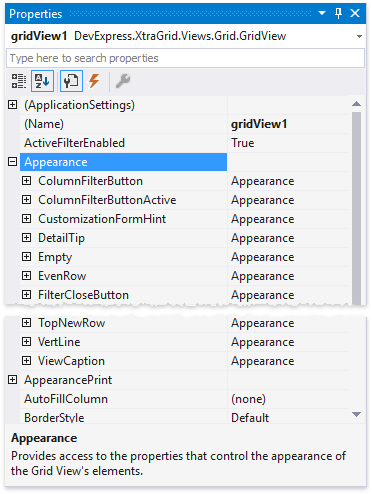
Global Appearance Settings
The GridView.Appearance property provides access to a number of property sections. These sections store appearance properties for even and odd rows, focused cells, column headers, etc.
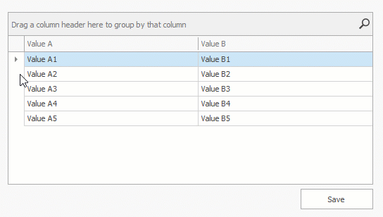
Highlight Cells that Belong to a Specific Column
Every column has its own GridColumn.AppearanceCell property that allows you to override global appearance and text format settings for all cells that belong to this column.
Demo: Appearance of column cells
The following example demonstrates how to center the Name column’s cell values.
using DevExpress.Utils;

gridView1.Columns["Name"].AppearanceCell.TextOptions.HAlignment = HorzAlignment.Center;
gridView1.Columns["Name"].AppearanceCell.Options.UseTextOptions = true;
Highlight an Active Editor
To highlight the currently active editor, handle the ColumnView.ShownEditor event and use the BaseView.ActiveEditor property to access the editor.
gridView.ShownEditor += (s, e) => {
        GridView view = s as GridView;
        gridView.ActiveEditor.BackColor = Color.DodgerBlue;
    };
Demo: Active editor’s background color
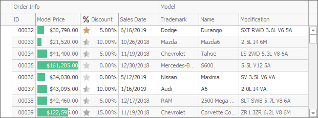
Conditional Formatting
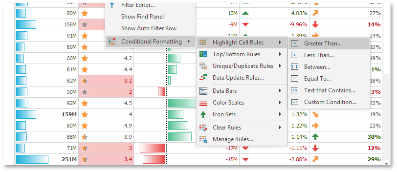
Conditional formatting allows you to customize cell appearance in Grid Views and Banded Grid Views based on cell values:
- Analyze all column cell values and visualize data distribution.
- Highlight specific values and dates.
- Highlight cells with the smallest or largest values.
- Highlight values below or above an average.
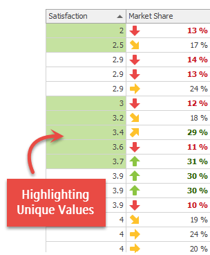
- Highlight unique or duplicate values.
- Use a custom formula to apply a color to specific cells.
- Temporarily highlight cells when their values change.
Tip
- Read the Change Cell and Row Appearances Dynamically section in this topic for information on how to highlight rows/cells in views if predefined or custom format conditions do not meet your requirements.
- To customize row appearances in other Views, handle customization events of these views: CustomCardStyle, ItemCustomize, CustomDrawItem.
The following visual effects are supported:
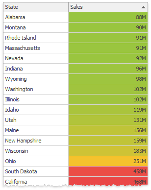
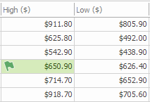
Color scales — The Data Grid compares cell values and fills these cells with solid colors chosen from a palette. Based on your selection, the palette gradually shifts through two or three threshold colors.
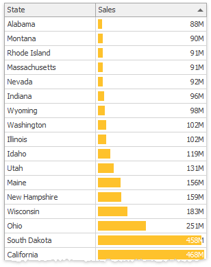
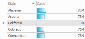
Data bars — Cells are partially filled with the selected color. The fill percentage depends on how small or large the cell value is compared to other values in this column. You can also draw a vertical axis at the zero value. In this instance, data bars for positive and negative values are displayed in opposite directions and are painted with different colors.
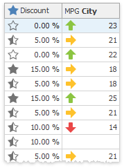
Icons — Icon sets allow you to label each value range with a corresponding icon.
Static appearance settings — Selected font settings and background and foreground colors are applied to cells whose values meet specific criteria (for example, the top 10 values of a column).
Temporarily highlight a cell with an icon or color (when a value changes).
If the GridOptionsMenu.ShowConditionalFormattingItem option is enabled, users can right-click a column header to access the “Conditional Formatting” menu, which allows them to add, modify, and clear format rules.
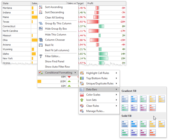
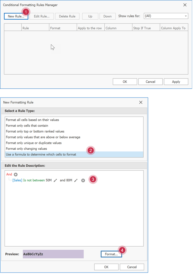
The “Manage Rules…” menu entry allows users to create custom highlight rules. To create a rule, a user must select the “Use a formula to determine which cells to format” rule type, enter a custom condition, and click “Format” to specify appearance settings that should be applied to cells whose values match this condition.
A number of format rules allow you to apply animation effects when a cell value changes. See the following property description for more information: FormatConditionRuleBase.AllowAnimation.
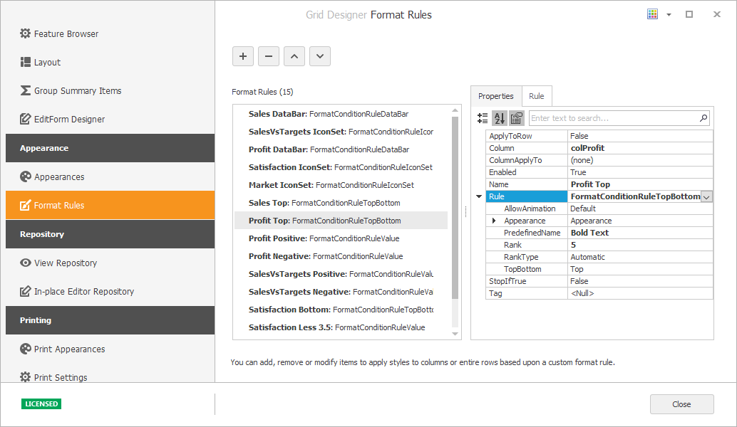
To add a conditional formatting rule at design time, invoke the Grid Designer, switch to the Appearance->Format Rules tab and click the “+” button.
To add a rule in code, do the following:
- Create a new GridFormatRule object and place it in the ColumnView.FormatRules collection.
- Create an object of a class that derives from a parent FormatConditionRuleBase class.
- Assign the rule created in step 2 to the object’s FormatRuleBase.Rule property (created in step 1).
- Change rule properties to customize cutoff values, visualization effects, etc.
To enable or disable this rule, change its Boolean GridFormatRule.Enabled property.
The code below adds a conditional formatting rule that highlights “Shipped Date” column cells for orders shipped prior to the current year.
GridFormatRule formatRule = new GridFormatRule();
FormatConditionRuleDateOccuring dateRule = new FormatConditionRuleDateOccuring();
dateRule.Appearance.BackColor = Color.Lime;
dateRule.DateType = FilterDateType.PriorThisYear;
formatRule.Rule = dateRule;
formatRule.ColumnApplyTo = formatRule.Column = colShippedDate;
gridView1.FormatRules.Add(formatRule);
//or
GridFormatRule formatRule = gridView1.FormatRules.AddDateOccurringRule(colShippedDate, FilterDateType.PriorThisYear,
    new DevExpress.Utils.AppearanceDefault(){ BackColor = Color.Lime});
More Examples
- How to: Apply a Data Bar Format to a Column
- How to: Apply an Icon Set Format to a Column
- How to: Apply a Two-Color Scale Format to a Column
- How to: Apply a Three-Color Scale Format to a Column
- How to: Highlight Column Values that Match a Condition
- How to: Highlight the Top 20% Column Values
- How to: Apply a Format Based on an Expression
- How to: Temporarily Highlight Cells When Their Values Change
Change Cell and Row Appearances Dynamically
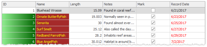
Handle the GridView.RowCellStyle event to change cell appearance dynamically. For example, you can highlight specific cells in response to certain events. The code below changes the background color and content alignment for the “Name” column’s cells based on the Boolean value of the “Mark” column.
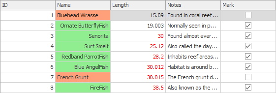
gridView.RowCellStyle += (sender, e) => {
        GridView view = sender as GridView;
        bool _mark = (bool)view.GetRowCellValue(e.RowHandle, "Mark");
        if(e.Column.FieldName == "Name") {
            e.Appearance.BackColor = _mark ? Color.LightGreen : Color.LightSalmon;
            e.Appearance.TextOptions.HAlignment = _mark ? HorzAlignment.Far : HorzAlignment.Near;
        }
    };
You can also handle the GridView.RowStyle event to process and paint rows and group rows individually. For example, the code snippet below highlights focused rows.
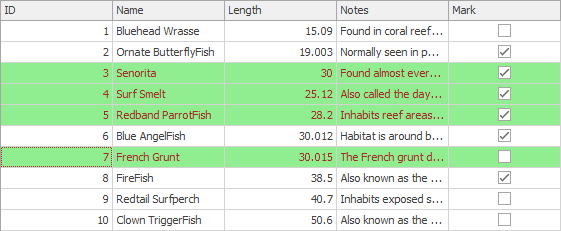
Color foreColor = Color.Brown;
    Color backColor = Color.LightGreen;

    // Change the appearance settings of row cells dynamically.
    gridView.RowStyle += (sender, e) => {
        GridView view = sender as GridView;
        //Change the foreground and background colors of selected rows.
        if(view.IsRowSelected(e.RowHandle)) {
            e.Appearance.ForeColor = foreColor;
            e.Appearance.BackColor = backColor;
            /* This property controls whether settings of the RowStyle event have a higher priority
               than the appearances specified by the GridViewAppearances.EvenRow
               and GridViewAppearances.OddRow properties. */
            e.HighPriority = true;
        }
    };
The GridView.GroupLevelStyle event allows you to paint group rows dynamically and apply unique appearance settings for each group level. In the following example, different group row levels have different appearance settings.
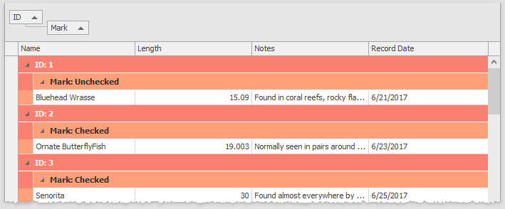
gridView.GroupLevelStyle += (s, e) => {
        if(e.Level == 0) {
            e.LevelAppearance.ForeColor = Color.WhiteSmoke;
            e.LevelAppearance.BackColor = Color.Salmon;
        } else {
            e.LevelAppearance.ForeColor = Color.FromArgb(50, 50, 50);
            e.LevelAppearance.BackColor = Color.LightSalmon;
        }
    };
Demos:
- Appearance of column cells (dynamically)
- Appearance of rows (dynamically)
- Appearance of group levels
Tip
You can also handle ~CustomDraw events to customize row and cell appearances dynamically: CustomDrawCell, CustomDrawGroupRow, CustomDrawGroupRowCell, CustomDrawFooterCell, etc. Refer to the following topic to see these events in action: Custom Painting Demos.
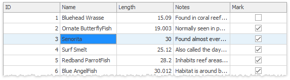
Override Custom Appearances for Selected Cells
Appearance settings of individual cells have lower priority than custom Column.AppearanceCell settings. For this reason, if you allow a user to select individual cells (OptionsSelection.MultiSelectMode = CellSelect) with custom appearances, all cells (selected and unselected) look the same. To adjust this behavior and highlight selected cells, handle the GridView.RowCellStyle event.
private void GridView1_RowCellStyle(object sender, RowCellStyleEventArgs e) {
    GridView view = sender as GridView;
    if(view.IsCellSelected(e.RowHandle, e.Column)) {
        e.Appearance.BackColor = view.PaintAppearance.SelectedRow.BackColor;
        e.Appearance.ForeColor = view.PaintAppearance.SelectedRow.ForeColor;
    }
}
Disable Focused Row/Cell Appearance
To prevent the focused row from being highlighted in the GridView or its descendant, disable the GridOptionsSelection.EnableAppearanceFocusedRow option. The GridOptionsSelection.EnableAppearanceFocusedCell property allows you to disable the coloring of a focused cell.
The following example shows how to disable focused cell appearance settings and keep the focused row appearance when the grid control loses focus:
private void Form1_Load(object sender, EventArgs e) {
    gridView1.OptionsSelection.EnableAppearanceHideSelection = false;
    gridView1.OptionsSelection.EnableAppearanceFocusedCell = false;
}
Tip
To prevent selected/focused rows from being highlighted in a specific manner when the grid control is not focused, use the GridOptionsSelection.EnableAppearanceHideSelection property.
Disable Cells Based on a Condition
You can disable cells in rows that meet a certain condition. Disabled cells are grayed-out according to the skin settings. Users cannot edit disabled cells.
Read the following topic for detailed information and examples: Disabled Cell Behavior.
Word-Wrap Column Captions
Use the HeaderPanel property to access global settings that specify the appearance and text formatting of all column captions. To wrap column caption text, do the following:
- Set the
HeaderPanel.TextOptions.WordWrapproperty toWordWrap.Wrap. - Set the
HeaderPanel.Options.UseTextOptionsproperty totrue. - Enable the ColumnHeaderAutoHeight option to auto-fit column captions or use the ColumnPanelRowHeight property to specify the height of column headers manually.
To override global appearance settings for an individual column, use the column’s AppearanceHeader property.
The following example demonstrates how to wrap the Name column’s caption text. Play the animation below to see the result.
using DevExpress.Utils;

gridView1.Columns["Name"].AppearanceCell.TextOptions.WordWrap = WordWrap.Wrap;
gridView1.Columns["Name"].AppearanceCell.Options.UseTextOptions = true;
gridView1.OptionsView.ColumnHeaderAutoHeight = DefaultBoolean.True;