Form Layout Managers
- 4 minutes to read
This section lists the following types of controls and components included in the DevExpress WinForms installation:
- Layout Managers - allow you to arrange controls across a form or User Control.
- Simple Layout Container - allow you to group controls in a single panel or tab.
Layout Managers
Layout and Data Layout Controls
The traditional pixel-oriented approach to application form design is inefficient. To create an elegant and easy-to-use UI, you must spend countless hours to arrange presentation controls on forms, align them correctly, position labels where appropriate, address form resolution issues and when specifications change, start the process over again.
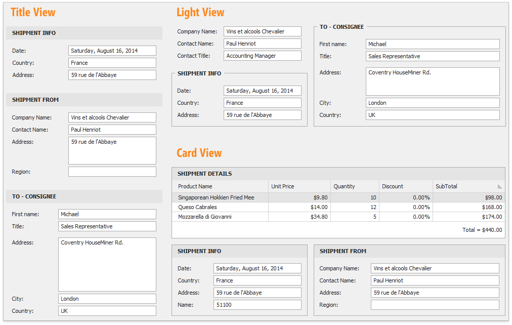
The Layout Control (LayoutControl) was designed to be different – designed to bring sanity and consistency to application form design. It dramatically reduces the number of UI modifications you need to make over time and thus the number of costly rebuilds. It is the only suite in the market that allows runtime layout customization so that end-users can re-design the contents of a form using simple drag and drop operations.
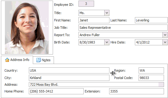
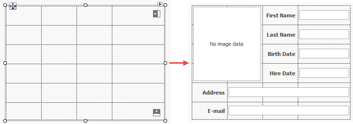
The Data Layout Control (DataLayoutControl) is the data-aware version of the Layout Control. With this component, you don’t have to place individual labels and editors onto the form and then carefully align them to one another. You do not have to bind each individual editor to data and provide proper label captions corresponding to field names. With the Data Layout Control, all this is done automatically. You simply bind the control to a data source and specify which fields are to be displayed.
Learn more: Layout and Data Layout Controls.
Tabbed MDI Manager
The Tabbed MDI Manager, represented by the XtraTabbedMdiManager component, is a light version of the Application UI Manager that renders your child forms as tabs or floating MDI windows. It has all the basic functionality required for simple forms.
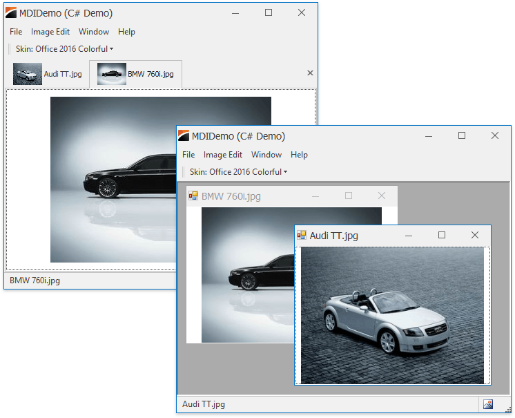
Tabbed MDI Manager’s features include:
- accessing the tab pages and modifying their display options (for instance, the caption and icon);
- changing the tab headers orientation and location;
- ability to display the Next and Prev buttons used to scroll through tab pages;
- ability to display the Close button in individual pages;
- support for a multi-line tab headers arrangement.
Learn more: Tabbed MDI Manager
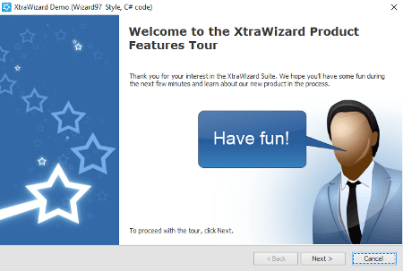
Wizard Control
Whether designed to break-down complex data entry forms or to provide step-by-step guidance for the end-user, wizards have become an indispensable UI solution for software developers. With the DevExpress Wizard control (WizardControl), you drop the control and instantly turn your form into a multi-page wizard. All you need to worry about is actual page content and implementing your own navigation logic, if necessary.
Tip
If you need more customization options, use the NavigationFrame control to create a custom wizard.
Learn more: Wizard Control
Workspace Manager
Many DevExpress controls that support runtime customization provide the ability to save the modified layout (e.g., to a local storage) so it can be re-applied later. And if your end-users wish to customize more than one such control, the tedious save-load routine comes. The WorkspaceManager provides the centralized way for your end-users to manage the layout of the entire application. After being dropped on the form, the Workspace Manager automatically detects all supported DevExpress controls and is ready to take the snapshot of your current layout.
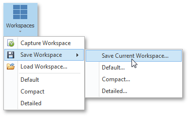
The related bar item, available for the Bars or Ribbon Control, grants your end-users the ability to save, load and apply desired layouts. If needed, you can limit their options to only a few layout version created by you.
Learn more: Workspace Manager
Simple Layout Containers
Stack and Table Panels
Two panels for simple scenarios when you do not need the huge feature set of Layout and Data Layout Controls.
The StackPanel arranges all of its controls in a single line. The TablePanel allows you to arrange controls into a grid.
Learn more: StackPanel | TablePanel
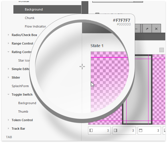
Side Panel
Side Panel allows you to break down your form or user control into multiple regions divided by one-pixel splitters. The figure below is a close-up of the Skin Editor tool, whose UI is built on side panels.
Learn more: SidePanel
Group and Panel Controls
Group Control is a panel that supports a header and three View styles. Panel Control is the most basic panel variation.
Learn more: PanelControl | GroupControl
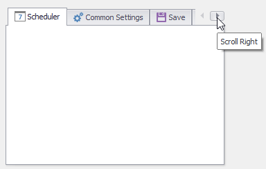
Tab Control
The simplest tool to create tabs. Unlike the Tabbed MDI Manager or Application UI Manager components, the Tab Control does not manage separate forms, converting them to MDI windows. This tool is used only when you need tabbed layout within one form.