Ribbon And Toolbar Items
- 2 minutes to read
This article provides the information about items that can be used in our Windows 10 Apps Ribbon and Toolbar controls. Items in different controls have different names, but provide a similar functionality.
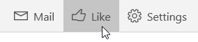
Button
A regular button. Specify the icon displayed within the button using Icon property.
| In RibbonControl | In RibbonToolbarControl | In ToolbarControl | In ContextToolbarControl |
|---|---|---|---|
| RibbonButton | RibbonToolbarButton | ToolbarButton | ContextToolbarButton |
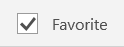
Check Box
A check box button that allows users to select between two (checked and unchecked) states. Set the IsThreeState property to true to enable the third (indeterminate) check state.
| In RibbonControl | In RibbonToolbarControl | In ToolbarControl | In ContextToolbarControl |
|---|---|---|---|
| RibbonCheckBox | RibbonToolbarCheckBox | - | - |
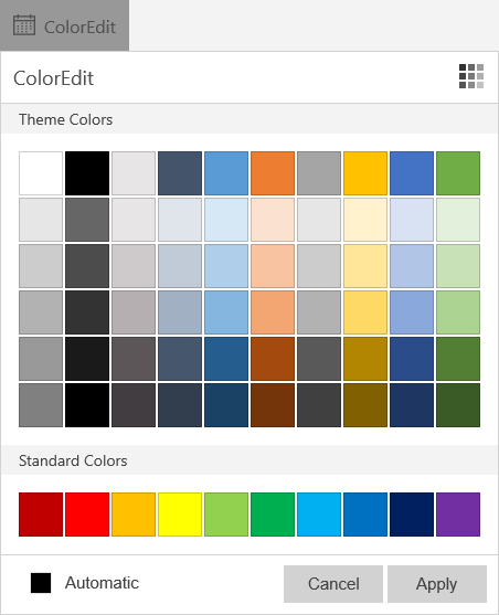
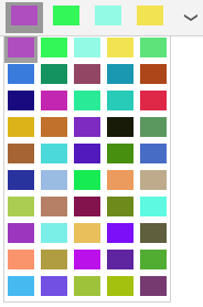
Color Edit
Enables end-users to select a predefined color or pick any color using the RGB color model.
| In RibbonControl | In RibbonToolbarControl | In ToolbarControl | In ContextToolbarControl |
|---|---|---|---|
| RibbonColorEdit | RibbonToolbarColorEdit | - | - |
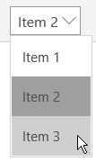
Combo Box
Allows end-users to select predefined items from a dropdown list.
| In RibbonControl | In RibbonToolbarControl | In ToolbarControl | In ContextToolbarControl |
|---|---|---|---|
| RibbonComboBox | RibbonToolbarComboBox | - | - |
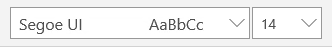
Font Edit
Allows end-users to specify the font settings.
| In RibbonControl | In RibbonToolbarControl | In ToolbarControl | In ContextToolbarControl |
|---|---|---|---|
| RibbonFontEdit | RibbonToolbarFontEdit | - | - |
Gallery
Displays a list of gallery items within a Ribbon or in a dropdown and provides menu functionality.
| In RibbonControl | In RibbonToolbarControl | In ToolbarControl | In ContextToolbarControl |
|---|---|---|---|
| RibbonGallery | RibbonToolbarGallery | - | - |
Radio Button
Represents a button that can be selected by the end-user. Paired with other radio buttons, enables end-users to select a single option from a group of choices.
| In RibbonControl | In RibbonToolbarControl | In ToolbarControl | In ContextToolbarControl |
|---|---|---|---|
| RibbonRadioButton | RibbonToolbarRadioButton | ToolbarRadioButton | ContextToolbarRadioButton |
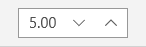
Spin Edit
Enables your end-users to edit numeric values by typing and using spin buttons.
| In RibbonControl | In RibbonToolbarControl | In ToolbarControl | In ContextToolbarControl |
|---|---|---|---|
| RibbonSpinEdit | RibbonToolbarSpinEdit | - | - |
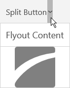
Split Button
Consists of two buttons – a regular button and a dropdown button that invokes a flyout.
| In RibbonControl | In RibbonToolbarControl | In ToolbarControl | In ContextToolbarControl |
|---|---|---|---|
| RibbonSplitButton | RibbonToolbarSplitButton | ToolbarSplitButton | ContextToolbarSplitButton |
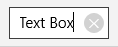
Text Box
A regular text editor.
| In RibbonControl | In RibbonToolbarControl | In ToolbarControl | In ContextToolbarControl |
|---|---|---|---|
| RibbonTextBox | RibbonToolbarTextBox | - | - |
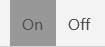
Toggle Button
Allows end-users to switch between two states. Set the IsThreeState property to true to enable the third (indeterminate) state.
| In RibbonControl | In RibbonToolbarControl | In ToolbarControl | In ContextToolbarControl |
|---|---|---|---|
| RibbonToggleButton | RibbonToolbarToggleButton | ToolbarToggleButton | ContextToolbarToggleButton |