Lesson 2 - Create a Linear Gauge
- 4 minutes to read
This is the second tutorial in the Gauges Getting Started series. It will guide you through the process of creating a Linear Gauge and adjusting its common settings.
This tutorial consists of the following steps:
- Step 1. Create a New Project and Add a Linear Gauge Control
- Step 2. Add a Scale
- Step 3. Add Value Indicators
- Step 4. Add Ranges
- Result
Step 1. Create a New Project and Add a Circular Gauge Control
Run MS Visual Studio 2017, create a new Universal Windows Platform application. Switch to the MainPage.xaml design view and add the LinearGauge control to the main page by dragging and dropping the LinearGauge item from the DX.19.2: Visualization toolbox tab.
Note
The following SDK extensions will be added to the References list in your project: DevExpress.Core and DevExpress.Visualization.
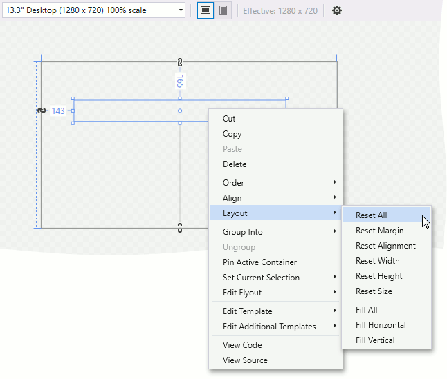
Right-click the LinearGauge object and choose the Reset Layout | All option in the context menu. This will stretch the gauge to fill the entire window.
Your XAML should look like the following. If it doesn’t, you can overwrite your code as follows:
<Page
    xmlns="http://schemas.microsoft.com/winfx/2006/xaml/presentation"
    xmlns:x="http://schemas.microsoft.com/winfx/2006/xaml"
    xmlns:Gauges="using:DevExpress.UI.Xaml.Gauges"
    x:Class="CircularGaugeLesson.MainPage">

    <Grid Background="{ThemeResource ApplicationPageBackgroundThemeBrush}">
        <Gauges:LinearGauge/>
    </Grid>
</Page>
Step 2. Add a Scale
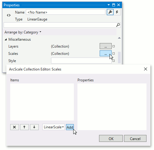
Scales are the main elements of a Gauge control because they contain all other visual elements. The Linear Gauge control can consist of multiple scales, each with an independent set of elements and options, and all scales are stored in the LinearGauge.Scales collection.
In this lesson, you only need to add one scale for demonstration purposes.
To add a scale, locate the LinearGauge.Scales property in the Properties window and click the ellipsis button to invoke the Scales collection editor. In this editor, add a new LinearScale object using the Add button.
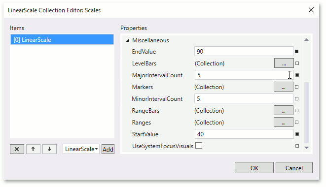
Set Scale.StartValue to 40 and Scale.EndValue to 90.
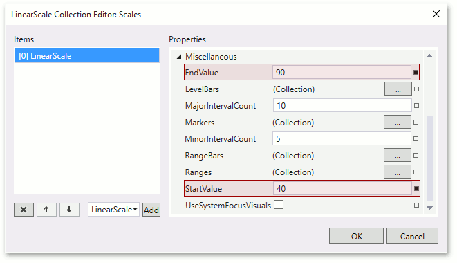
Set Scale.MajorIntervalCount to 5.
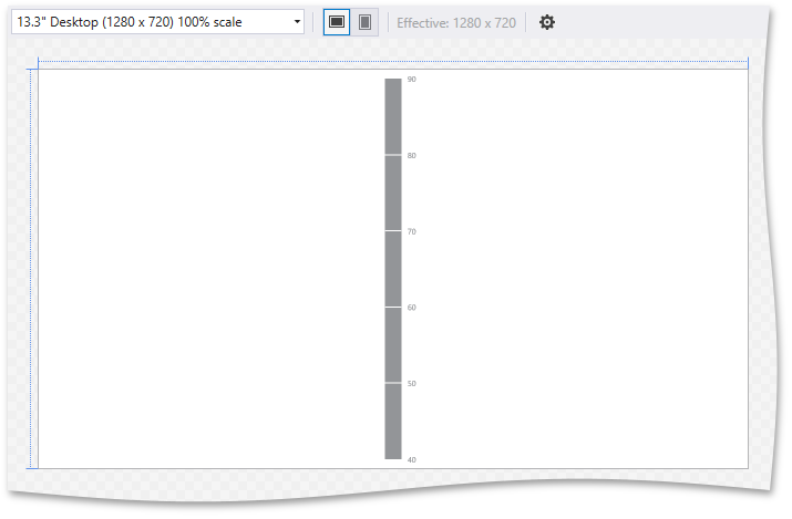
After performing these actions, the gauge should look like the image below.
Step 3. Add Value Indicators
In this step, you can add basic elements that visually represent current values on a Linear scale. In most cases, Linear scales support three indicator types: Level bars, Markers and Range bars.
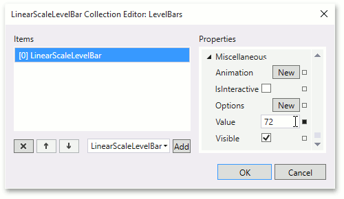
Add a Level Bar element that will indicate the current measurement value.
To do this, locate the LinearScale.LevelBars property of the linear scale that was added in the previous step, invoke the Level bar collection editor and click Add.
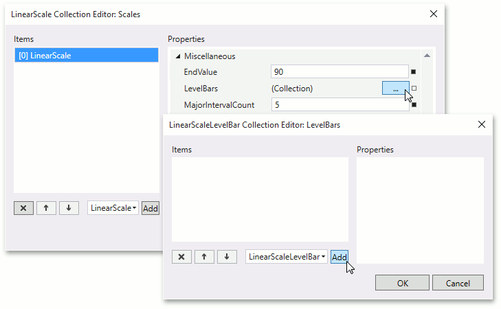
Then, set the ValueIndicatorBase.Value property of the newly created LinearScaleLevelBar object to 72.
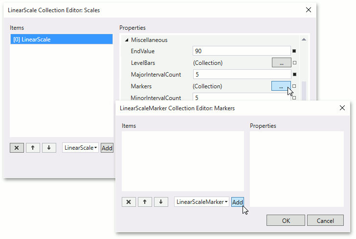
Add a Marker that will indicate any “fixed” value on a scale.
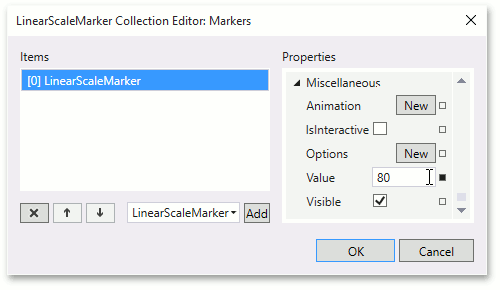
To do this, locate the LinearScale.Markers property, invoke the Markers collection editor and click Add.
Then, set the ValueIndicatorBase.Value property of the newly created LinearScaleMarker object to 80.
Step 4. Add Ranges
Ranges are intended to visually identify different intervals on a scale.
To add a range, locate the ArcScale.Ranges property, invoke the Ranges collection editor and click Add.
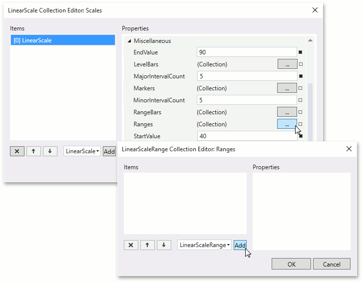
Set the RangeBase.StartValue property to 40 and the RangeBase.EndValue property to 60.
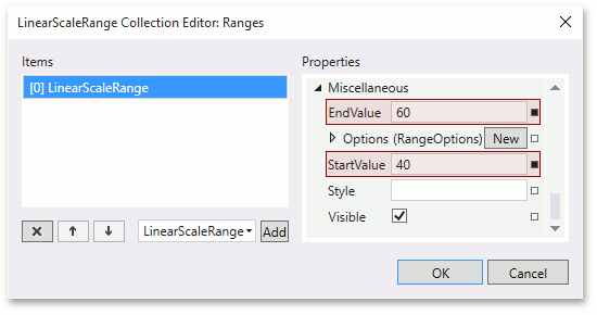
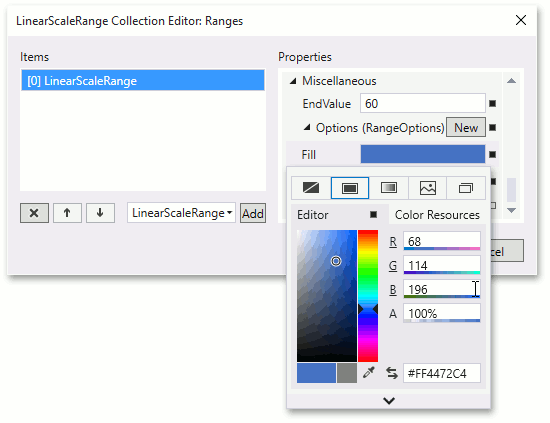
Specify the color of the range. To do this, set the GaugeOptionsBase.Fill property of an RangeOptions object stored in the RangeBase.Options property. Set the Fill property to (R=68, G=114, B=196).
Repeat these actions to add two ranges with the following parameters.
Start value End value Fill color 60 80 (R=112, G=173, B=71) 80 90 (R=204, G=33, B=14)
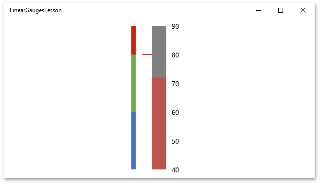
Result
The application is done and the XAML should look like the following.
<Page
    xmlns="http://schemas.microsoft.com/winfx/2006/xaml/presentation"
    xmlns:x="http://schemas.microsoft.com/winfx/2006/xaml"
    xmlns:Gauges="using:DevExpress.UI.Xaml.Gauges"
    x:Class="LinearGaugesLesson.MainPage">

    <Grid
        Background="{ThemeResource ApplicationPageBackgroundThemeBrush}">
        <Gauges:LinearGauge>
            <Gauges:LinearScale
                Margin="16"
                StartValue="40"
                EndValue="90"
                MajorIntervalCount="5">
                <Gauges:LinearScale.Ranges>
                    <Gauges:LinearScaleRange
                        StartValue="40"
                        EndValue="60">
                        <Gauges:LinearScaleRange.Options>
                            <Gauges:RangeOptions
                                Fill="#FF4472C4"/>
                        </Gauges:LinearScaleRange.Options>
                    </Gauges:LinearScaleRange>
                    <Gauges:LinearScaleRange
                        StartValue="60"
                        EndValue="80">
                        <Gauges:LinearScaleRange.Options>
                            <Gauges:RangeOptions
                                Fill="#FF70AD47"/>
                        </Gauges:LinearScaleRange.Options>
                    </Gauges:LinearScaleRange>
                    <Gauges:LinearScaleRange
                        StartValue="80"
                        EndValue="90">
                        <Gauges:LinearScaleRange.Options>
                            <Gauges:RangeOptions
                                Fill="#FFCC210E"/>
                        </Gauges:LinearScaleRange.Options>
                    </Gauges:LinearScaleRange>
                </Gauges:LinearScale.Ranges>
                <Gauges:LinearScale.LevelBars>
                    <Gauges:LinearScaleLevelBar
                        Value="72"/>
                </Gauges:LinearScale.LevelBars>
                <Gauges:LinearScale.Markers>
                    <Gauges:LinearScaleMarker
                        Value="80"/>
                </Gauges:LinearScale.Markers>
            </Gauges:LinearScale>
        </Gauges:LinearGauge>
    </Grid>
</Page>
using System;
using System.Collections.Generic;
using System.IO;
using System.Linq;
using System.Runtime.InteropServices.WindowsRuntime;
using Windows.Foundation;
using Windows.Foundation.Collections;
using Windows.UI.ViewManagement;
using Windows.UI.Xaml;
using Windows.UI.Xaml.Controls;
using Windows.UI.Xaml.Controls.Primitives;
using Windows.UI.Xaml.Data;
using Windows.UI.Xaml.Input;
using Windows.UI.Xaml.Media;
using Windows.UI.Xaml.Navigation;

namespace LinearGaugesLesson {
    public sealed partial class MainPage : Page
    {
        public MainPage()
        {
            this.InitializeComponent();
            ApplicationView.PreferredLaunchViewSize = new Size(638, 327);
            ApplicationView.PreferredLaunchWindowingMode = ApplicationViewWindowingMode.PreferredLaunchViewSize;
        }
    }
}
Run the project. The following image illustrates the resulting gauge at runtime.