SchedulerControl.FlyoutContentTemplate Property
Gets or sets the data template used to display the appointment flyout. This is a dependency property.
Namespace: DevExpress.Xpf.Scheduling
Assembly: DevExpress.Xpf.Scheduling.v19.2.dll
Declaration
Property Value
| Type | Description |
|---|---|
| DataTemplate | A DataTemplate object that defines the flyout appearance. |
Remarks
Use the FlyoutContentTemplate property to specify how the appointment flyout content is displayed.
Note
This property is in use only when SchedulerControl.ToolTipMode is set to Flyout.
Example
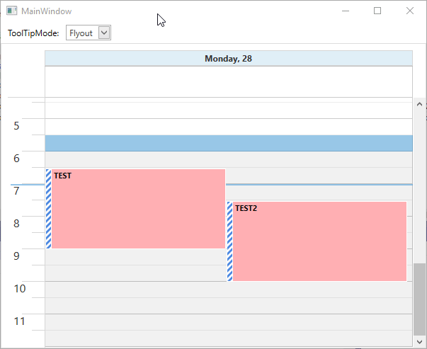
SchedulerControl can display additional information for appointments when the mouse pointer hovers over them. For this, it uses either the corresponding FlyoutControl or ToolTip elements. To define which element should be used for this purpose, use the ToolTipMode property.
To customize the appearance of this FlyoutControl or ToolTip element, define a custom DataTemplte in the FlyoutContentTemplate or ToolTipContentTemplate property respectively. This example illustrates how to do this.
Note
A complete sample project is available at https://github.com/DevExpress-Examples/how-to-customize-the-appointment-flyout-t584389.
<Window
    x:Class="CustomAppointmentFlyoutExample.MainWindow"
    xmlns="http://schemas.microsoft.com/winfx/2006/xaml/presentation"
    xmlns:dx="http://schemas.devexpress.com/winfx/2008/xaml/core"
    xmlns:dxe="http://schemas.devexpress.com/winfx/2008/xaml/editors"
    xmlns:dxlc="http://schemas.devexpress.com/winfx/2008/xaml/layoutcontrol"
    xmlns:dxsch="http://schemas.devexpress.com/winfx/2008/xaml/scheduling"
    xmlns:dxscht="http://schemas.devexpress.com/winfx/2008/xaml/scheduling/themekeys"
    xmlns:dxschv="http://schemas.devexpress.com/winfx/2008/xaml/scheduling/visual"
    xmlns:d="http://schemas.microsoft.com/expression/blend/2008"
    xmlns:x="http://schemas.microsoft.com/winfx/2006/xaml"
    xmlns:mc="http://schemas.openxmlformats.org/markup-compatibility/2006"
    Height="500"
    Width="900"
    mc:Ignorable="d"
    Title="MainWindow">

    <Window.Resources>
        <DataTemplate x:Key="FlyoutTemplate">
            <dxlc:LayoutControl Width="250" MinHeight="150" IsHitTestVisible="False" Orientation="Vertical" Padding="11">
                <StackPanel Orientation="Vertical">
                    <Border Height="5" Margin="1,0,1,-1" Panel.ZIndex="1" VerticalAlignment="Top" Background="{Binding StatusBrush}"/>
                    <dxschv:DayAppointmentControl MinHeight="35"
                        Panel.ZIndex="0"
                        VerticalAlignment="Top"
                        Content="{Binding}"
                        ShowRecurrenceImage="True"
                        ShowReminderImage="True"
                        ShowStatus="False"
                        Style="{DynamicResource {dxscht:SchedulerFlyoutThemeKey ResourceKey=Appointment}}" />
                </StackPanel>
                <dxlc:LayoutControl Margin="0,5,0,0" VerticalAlignment="Top" Orientation="Vertical" Padding="0">
                    <dxlc:LayoutItem Style="{DynamicResource {dxscht:SchedulerFlyoutThemeKey ResourceKey=LayoutItem_Start}}" />
                    <dxlc:LayoutItem Style="{DynamicResource {dxscht:SchedulerFlyoutThemeKey ResourceKey=LayoutItem_End}}" />
                </dxlc:LayoutControl>
                <Image VerticalAlignment="Bottom"
                    HorizontalAlignment="Right"
                    Source="{dx:DXImage Image=Apply_32x32.png}"
                    Stretch="None" />
            </dxlc:LayoutControl>
        </DataTemplate>

        <DataTemplate x:Key="TooltipTemplate">
            <dxlc:LayoutControl IsHitTestVisible="False" Orientation="Vertical" Padding="11">
                <TextBlock Text="{Binding Appointment.Subject}" FontWeight="Bold" FontSize="17" />
                <dxlc:LayoutControl Margin="0,5,0,0" VerticalAlignment="Top" Orientation="Vertical" Padding="0">
                    <dxlc:LayoutItem Style="{DynamicResource {dxscht:SchedulerFlyoutThemeKey ResourceKey=LayoutItem_Start}}" />
                    <dxlc:LayoutItem Style="{DynamicResource {dxscht:SchedulerFlyoutThemeKey ResourceKey=LayoutItem_End}}" />
                </dxlc:LayoutControl>
            </dxlc:LayoutControl>
        </DataTemplate>
    </Window.Resources>

    <Grid>
        <Grid.RowDefinitions>
            <RowDefinition Height="30"/>
            <RowDefinition/>
        </Grid.RowDefinitions>
        <StackPanel Orientation="Horizontal" VerticalAlignment="Center">
            <TextBlock Text="ToolTipMode:" Margin="10,0" VerticalAlignment="Center"/>
            <dxe:ComboBoxEdit VerticalAlignment="Center"
                              ItemsSource="{dxe:EnumItemsSource EnumType=dxsch:ToolTipMode}"
                              EditValue="{Binding ElementName=scheduler, Path=ToolTipMode, Mode=TwoWay, UpdateSourceTrigger=PropertyChanged}"/>
        </StackPanel>

        <dxsch:SchedulerControl x:Name="scheduler"
                                ToolTipContentTemplate="{StaticResource TooltipTemplate}"
                                FlyoutContentTemplate="{StaticResource  FlyoutTemplate}" Grid.Row="1"/>
    </Grid>

</Window>
Related GitHub Examples
The following code snippet (auto-collected from DevExpress Examples) contains a reference to the FlyoutContentTemplate property.
Note
The algorithm used to collect these code examples remains a work in progress. Accordingly, the links and snippets below may produce inaccurate results. If you encounter an issue with code examples below, please use the feedback form on this page to report the issue.