ScaleCustomLabel Class
A scale custom label.
Namespace: DevExpress.Xpf.Gauges
Assembly: DevExpress.Xpf.Gauges.v22.2.dll
NuGet Package: DevExpress.Wpf.Gauges
Declaration
Remarks
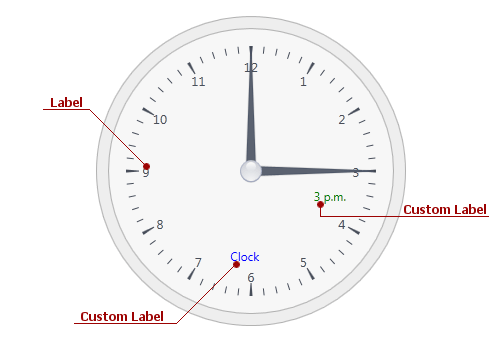
A custom label is used to display a custom text and arrange it at any position on a scale. An instance of a custom label is represented by the ScaleCustomLabel object. It can be accessed as an item of the ScaleCustomLabelCollection object returned by the Scale.CustomLabels property.
The image below illustrates a custom label for the circular scale:
For more information on custom labels, refer to the Custom Labels (Circular Scale) and Custom Labels (Linear Scale) documents.
Example
This example illustrates how to create a LinearGaugeControl instance with two LinearScale objects.
<Window x:Class="DXGauges_Linear.MainWindow"
        xmlns="http://schemas.microsoft.com/winfx/2006/xaml/presentation"
        xmlns:x="http://schemas.microsoft.com/winfx/2006/xaml"
        xmlns:dxga="http://schemas.devexpress.com/winfx/2008/xaml/gauges"
        Title="MainWindow" Height="450" Width="525">
    <Grid>
        <dxga:LinearGaugeControl  Name="linearGaugeControl1" Margin="0,24,0,20">
            <dxga:LinearGaugeControl.Model>
                <dxga:LinearRedThermometerModel/>
            </dxga:LinearGaugeControl.Model>
            <dxga:LinearGaugeControl.Scales>
                <dxga:LinearScale StartValue="-40" EndValue="120"
                                  MajorIntervalCount="8"  Width="60">
                    <dxga:LinearScale.Ranges>
                        <dxga:LinearScaleRange EndValue="32" StartValue="-40">
                            <dxga:LinearScaleRange.Presentation>
                                <dxga:DefaultLinearScaleRangePresentation Fill="LightBlue" />
                            </dxga:LinearScaleRange.Presentation>
                        </dxga:LinearScaleRange>
                        <dxga:LinearScaleRange EndValue="120" StartValue="32">
                            <dxga:LinearScaleRange.Presentation>
                                <dxga:DefaultLinearScaleRangePresentation Fill="Tomato" />
                            </dxga:LinearScaleRange.Presentation>
                        </dxga:LinearScaleRange>
                    </dxga:LinearScale.Ranges>
                    <dxga:LinearScale.CustomLabels>
                        <dxga:ScaleCustomLabel Content="°F" Offset="-45" Value="-45" />
                    </dxga:LinearScale.CustomLabels>
                    <dxga:LinearScale.Layers>
                        <dxga:LinearScaleLayer/>
                    </dxga:LinearScale.Layers>
                    <dxga:LinearScale.LevelBars>
                        <dxga:LinearScaleLevelBar Value="59" />
                    </dxga:LinearScale.LevelBars>
                </dxga:LinearScale>
                <dxga:LinearScale StartValue="-40" EndValue="120"
                                  MajorIntervalCount="8" Margin="68,0,0,0" >
                    <dxga:LinearScale.Ranges>
                        <dxga:LinearScaleRange StartValue="-40" EndValue="32" >
                            <dxga:LinearScaleRange.Presentation>
                                <dxga:DefaultLinearScaleRangePresentation Fill="LightBlue" />
                            </dxga:LinearScaleRange.Presentation>
                        </dxga:LinearScaleRange>
                        <dxga:LinearScaleRange StartValue="32" EndValue="120" >
                            <dxga:LinearScaleRange.Presentation>
                                <dxga:DefaultLinearScaleRangePresentation Fill="Tomato" />
                            </dxga:LinearScaleRange.Presentation>
                        </dxga:LinearScaleRange>
                    </dxga:LinearScale.Ranges>
                    <dxga:LinearScale.Markers>
                        <dxga:LinearScaleMarker Value="68" />
                    </dxga:LinearScale.Markers>
                    <dxga:LinearScale.CustomLabels>
                        <dxga:ScaleCustomLabel Content="°F" Offset="-7" Value="-45" />
                    </dxga:LinearScale.CustomLabels>
                    <dxga:LinearScale.LabelOptions>
                        <dxga:LinearScaleLabelOptions Offset="3" />
                    </dxga:LinearScale.LabelOptions>
                    <dxga:LinearScale.MinorTickmarkOptions>
                        <dxga:MinorTickmarkOptions Offset="-16" />
                    </dxga:LinearScale.MinorTickmarkOptions>
                </dxga:LinearScale>
            </dxga:LinearGaugeControl.Scales>
        </dxga:LinearGaugeControl>
    </Grid>
</Window>
Related GitHub Examples
The following code snippet (auto-collected from DevExpress Examples) contains a reference to the ScaleCustomLabel class.
Note
The algorithm used to collect these code examples remains a work in progress. Accordingly, the links and snippets below may produce inaccurate results. If you encounter an issue with code examples below, please use the feedback form on this page to report the issue.