Print Data
- 5 minutes to read
Print Data in Code
To print the GridControl‘s data, call one of the following methods:
| Method | Description |
|---|---|
| DataViewBase.Print | Invokes the standard Print dialog that allows an end user to print the grid. |
| DataViewBase.PrintDirect | Uses the default printer to print the grid. |
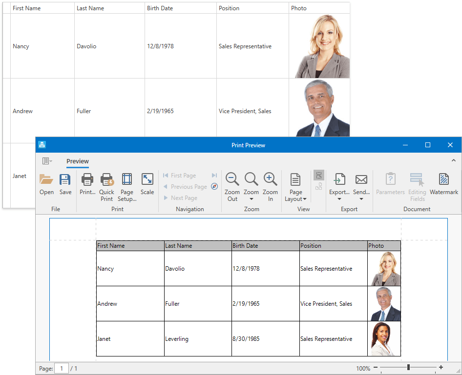
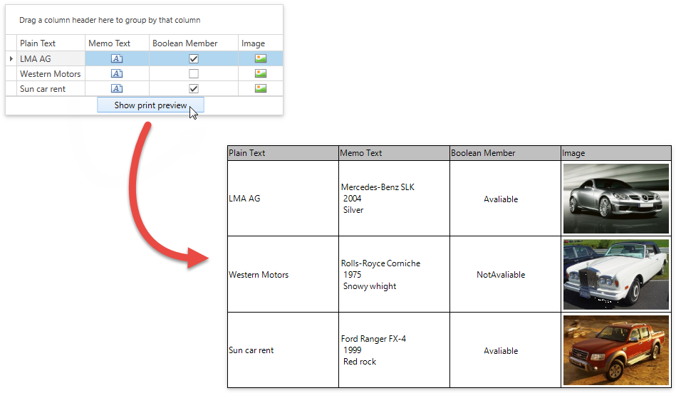
Print Data with Print Preview
The Print Preview window allows end users to print document and export it to a file in the required format.
To invoke the Print Preview window, call one of the following methods:
| Method | Description |
|---|---|
| DataViewBase.ShowPrintPreview | Creates the print document from the View and displays the document’s Print Preview. |
| DataViewBase.ShowPrintPreviewDialog | Creates the print document from the View and displays the document’s modal Print Preview. |
| DataViewBase.ShowRibbonPrintPreview | Creates the print document from the View and displays the document’s Print Preview with the Ribbon. |
| DataViewBase.ShowRibbonPrintPreviewDialog | Creates the print document from the View and displays the document’s modal Print Preview with the Ribbon. |
Add the Print Preview to a Project
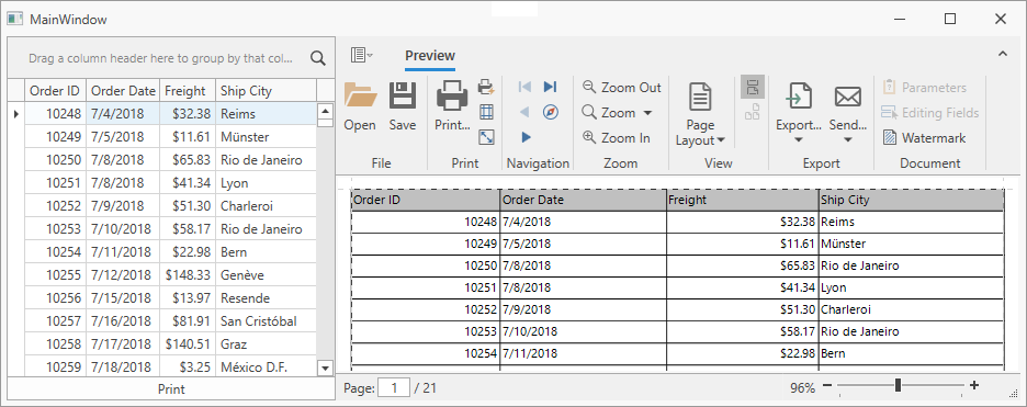
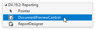
Add the DocumentPreviewControl to the window.
Specify the DocumentPreviewControl‘s name and position:
<Window
...
xmlns:dxg="http://schemas.devexpress.com/winfx/2008/xaml/grid"
xmlns:dxp="http://schemas.devexpress.com/winfx/2008/xaml/printing">

<Grid>
    <Grid.ColumnDefinitions>
        <ColumnDefinition Width="300"/>
        <ColumnDefinition />
    </Grid.ColumnDefinitions>

    <dxg:GridControl Grid.Column="0" .../>

    <Button Grid.Column="0" Content="Print"
            VerticalAlignment="Bottom"
            Click="Button_Click_Print"/>

    <dxp:DocumentPreviewControl Grid.Column="1" x:Name="documentPreview1"/>
</Grid>
Use the PrintableControlLink to show the GridControl in the Print Preview window:
Customize Appearance
Note
The printed GridControl ignores the DataViewBase.CellTemplate and regular Template/Style properties. Refer to the Format Cell Values topic for information on what properties affect the print mode.
The GridControl‘s Views have styles and templates that define the appearance of the printed GridControl.
Example: Change Column Header Appearance
<Window
xmlns:dxgt="http://schemas.devexpress.com/winfx/2008/xaml/grid/themekeys">
<Window.Resources>
    <Style x:Key="customPrintColumnHeaderStyle"
            TargetType="dxe:BaseEdit"
            BasedOn="{StaticResource {dxgt:TableViewThemeKey ResourceKey=DefaultPrintHeaderStyle}}">
        <Setter Property="Background" Value="White" />
        <Setter Property="FontWeight" Value="Bold" />
    </Style>
</Window.Resources>

<dxg:GridControl.View>
    <dxg:TableView PrintColumnHeaderStyle="{StaticResource customPrintColumnHeaderStyle}"/>
</dxg:GridControl.View>
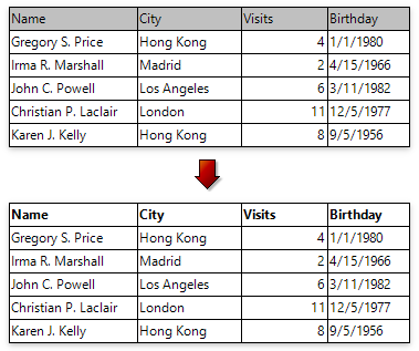
Example: Render Images within Data Cells with a PopupImageEdit
<Style x:Key="ImageColumnPrintingStyle"
       TargetType="{x:Type dxe:PopupImageEdit}"
       BasedOn="{StaticResource {dxgt:TableViewThemeKey ResourceKey=DefaultPrintCellStyle}}">

   <Setter Property="dxp:ExportSettings.TargetType" Value="Panel"/>
   <Setter Property="DisplayTemplate">
       <Setter.Value>
           <ControlTemplate TargetType="dxe:PopupImageEdit">
               <dxe:ImageEdit Source="{Binding Path=Value}"
                              IsPrintingMode="True"/>
           </ControlTemplate>
       </Setter.Value>
   </Setter>
</Style>
To additionally customize your document, use Printing Links. For example:
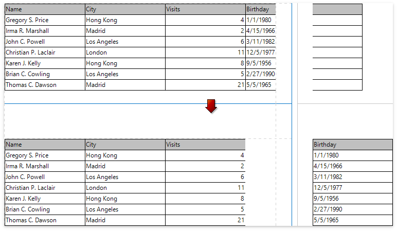
To display visible columns fully on the page, use the PrintableControlLink and specify the LinkBase.VerticalContentSplitting property:
To export multiple controls to the same document, use the CompositeLink.
| Property | Description |
|---|---|
| TemplatedLink.PageHeaderData / TemplatedLink.PageHeaderTemplate | Allows you to customize a page header in the output document. |
| TemplatedLink.ReportHeaderData / TemplatedLink.ReportHeaderTemplate | Allows you to customize a report header in the output document. |
| TemplatedLink.PageFooterData / TemplatedLink.PageFooterTemplate | Allows you to customize a page footer in the output document. |
| TemplatedLink.ReportFooterData / TemplatedLink.ReportFooterTemplate | Allows you to customize a report footer in the output document. |
Printing Options
Table View Options
| Property | Description |
|---|---|
| DataViewBase.PrintTotalSummary | Specifies whether the Summary Panel is printed. |
| DataViewBase.PrintFixedTotalSummary | Specifies whether the Fixed Summary Panel is printed. |
| GridViewBase.PrintAllGroups | Specifies whether the grid is printed with all group rows expanded. |
| TableView.PrintAutoWidth | Specifies whether printed columns’ widths are automatically changed so that the grid fits the width of the report page. |
| TableView.PrintColumnHeaders | Specifies whether column headers are printed. |
| TableView.PrintGroupFooters | Specifies whether group footers are printed. |
| BaseColumn.AllowPrinting | Allows hiding specific columns when printing or exporting the grid. |
Card View Options
| Property | Description |
|---|---|
| DataViewBase.PrintTotalSummary | Specifies whether the Summary Panel is printed. |
| DataViewBase.PrintFixedTotalSummary | Specifies whether the Fixed Summary Panel is printed. |
| GridViewBase.PrintAllGroups | Specifies whether the grid is printed with all group rows expanded. |
| CardView.PrintAutoCardWidth | Specifies whether cards in the print/export output are automatically resized horizontally to fit the report page width. |
| CardView.PrintCardMargin | Specifies the thickness of a frame around a card. |
| CardView.PrintMaximumCardColumns | Specifies the maximum number of card columns for printing/exporting. |
| BaseColumn.AllowPrinting | Allows hiding specific columns when printing or exporting the grid. |
TreeList View Options
| Property | Description |
|---|---|
| DataViewBase.PrintTotalSummary | Specifies whether the Summary Panel is printed. |
| DataViewBase.PrintFixedTotalSummary | Specifies whether the Fixed Summary Panel is printed. |
| TreeListView.PrintAllNodes | Specifies whether the grid is printed with all nodes expanded. |
| TreeListView.PrintAutoWidth | Specifies whether printed columns’ widths are automatically changed so that the grid fits the width of the report page. |
| TreeListView.PrintColumnHeaders | Specifies whether column headers are printed. |
| BaseColumn.AllowPrinting | Allows hiding specific columns when printing or exporting the grid. |
Master-Detail Options
| Property | Description |
|---|---|
| TableView.AllowPrintDetails | Specifies whether View details are printed. |
| TableView.AllowPrintEmptyDetails | Specifies whether View details that don’t contain any data are printed. |
| TableView.PrintDetailTopIndent | Specifies the top print detail indent separating the details. |
| TableView.PrintDetailBottomIndent | Specifies the bottom print detail indent separating the details. |