Collection Definitions
- 7 minutes to read
Overview
Collection definitions represent the collection properties of a bound object and specify their appearance within the property grid. Each collection definition is linked to one or multiple collection properties of a bound object. Collection definitions are represented by the CollectionDefinition objects that are stored within the PropertyGridControl.PropertyDefinitions collection.
Linking Collection Properties to Definitions
You can link a collection property of a bound object to a collection definition using an association criteria. Different criteria and combinations of criteria have different priorities. When an object property matches multiple definitions, the PropertyGrid control links it to the definition that has the highest priority.
Criteria | Priority | Description |
|---|---|---|
Collection property path | High | Use the PropertyDefinitionBase.Path property to specify the direct path to the associated property. |
Parent property path | Medium | Use the PropertyDefinition.Scope property to specify the path to the parent property. |
Collection property type | Low | Use the PropertyDefinition.Type property to specify the type of the associated collection property. The PropertyDefinition.TypeMatchMode property specifies the rules of type matching. See TypeMatchMode to learn more. |
Note
Collection definitions generally have higher priority than property definitions when linking to collection properties, except when a property definition specifies the path to the collection property.
The following example demonstrates a declaration of a collection definition.
<dxprg:CollectionDefinition Path="Suppliers">
    <dxprg:PropertyDefinition Path="*.Name"/>
    <dxprg:PropertyDefinition Path="*.Phone"/>
</dxprg:CollectionDefinition>
Displaying Collections Within the PropertyGrid Control
If the PropertyGridControl.ShowProperties property is set to WithPropertyDefinitions, you need to initialize the properties of the collection items manually. To hide the properties of collection items within a property grid, set the PropertyDefinitionBase.ShowChildren (using CollectionDefinition.ShowChildren) property to false.
The following example demonstrates a property grid that is configured in the following way.
- The property grid displays all public properties of the bound object.
- Only string properties are displayed within the collection items.
<Window.DataContext>
    <local:ViewModel/>
</Window.DataContext>
...
<dxprg:PropertyGridControl SelectedObject="{Binding DemoProduct}" ShowProperties="WithPropertyDefinitions">

    <dxprg:CollectionDefinition Path="Suppliers">
        <!--Associated with the String properties of Supplier objects-->
        <dxprg:PropertyDefinition Type="sys:String"/>
    </dxprg:CollectionDefinition>

    <!--Links to all public properties of the Product object-->
    <dxprg:PropertyDefinition Path="*"/>

</dxprg:PropertyGridControl>
Collection Editing
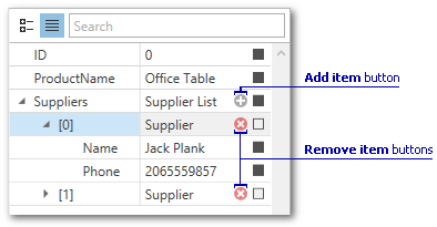
The PropertyGrid control features the built-in collection editor. The collection editor allows users to perform the following operations:
- View and edit collection items.
- Add items to the collection.
- Remove items from the collection.
The collection editor displays the Add Item and Remove Item collection buttons:
The following properties specify whether the collection editor is used. Set these properties to false to display the collection definition as a property definition. In this case, the PropertyGridControl does not display expand and Add/Remove buttons.
| Property name | Property description |
|---|---|
| PropertyGridControl.UseCollectionEditor | Toggles collection editing for the entire property grid. |
| CollectionDefinition.UseCollectionEditor | Toggles collection editing for individual collections. |
Customize Collection Button Visibility
The PropertyGridControl displays the Add Item and Remove Item buttons for collections that support both add and remove operations.
To display Remove buttons for a collection that supports remove operations only (collection items do not have the default public constructor or New Item Initializer), set the CollectionDefinition.AllowRemoveItemsWithoutNewItemInitializer property to true.
The CollectionDefinition.AllowAddItems and CollectionDefinition.AllowRemoveItems properties allow you to hide Add and Remove buttons.
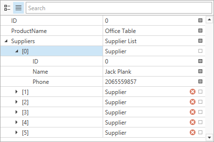
You can implement custom logic to show and hide collection buttons. To do this, handle the PropertyGridControl.CollectionButtonsVisibility event. The following code sample hides the Add button if the collection contains more then 5 items and hides the Remove button for the collection item whose ID is 0:
<dxprg:PropertyGridControl SelectedObject="{Binding DemoProduct}"
                           CollectionButtonsVisibility="OnCollectionButtonsVisibility"/>
using DevExpress.Xpf.PropertyGrid;
// ...

void OnCollectionButtonsVisibility(object sender, CollectionButtonsVisibilityEventArgs e) {
    if (e.ButtonKind == CollectionButtonKind.Add) {
        var collection = (SupplierList)e.Value;
        e.IsVisible = collection.Count <= 5;
    }
    if (e.ButtonKind == CollectionButtonKind.Remove) {
        var supplier = e.Value as Supplier;
        if (supplier != null && supplier.ID == 0)
            e.IsVisible = false;
    }
}
Customize Collection Button Behavior
Handle the PropertyGridControl.CollectionButtonClick event to execute a custom action when a user clicks a collection button. For example, you can add a new item whose values depend on the other item’s values.
The following code sample adds a new item with the specified ID property when a user clicks the Add Item button:
<dxprg:PropertyGridControl SelectedObject="{Binding DemoProduct}"
                           CollectionButtonClick="OnCollectionButtonClick"/>
using DevExpress.Xpf.PropertyGrid;
// ...

void OnCollectionButtonClick(object sender, CollectionButtonClickEventArgs e) {
    if (e.ButtonKind == CollectionButtonKind.Add) {
        var collection = (SupplierList)e.Value;
        e.DefaultAction(new Supplier() { ID = collection.Count == 0 ? 0 : collection.Max(x => x.ID) + 1, Name = "", Phone = "" });
        e.Handled = true;
    }
}
New Item Initializers
You can use the item initializers to create new collection items. A new item initializer is an object that implements the DevExpress.Mvvm.Native.IInstanceInitializer interface.
New item initializers allow you to do the following.
- Specify the default property values.
- Create objects without the default constructor.
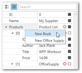
- Configure the new item menu, The new item menu allows users to add objects of different types to a collection.
The following example demonstrates a PropertyGrid control bound to a Supplier object. The Supplier.Products collection property stores objects of various types. The new item initializer allows users to choose the type of object that is added to the collection.
<Window.Resources>
    <ResourceDictionary>
        <local:ProductItemInitializer x:Key="productItemInitializer" />
    </ResourceDictionary>
</Window.Resources>
<Window.DataContext>
    <local:ViewModel/>
</Window.DataContext>
...
<dxprg:PropertyGridControl SelectedObject="{Binding DemoSupplier}" ShowProperties="WithPropertyDefinitions">
    <dxprg:CollectionDefinition Path="Products" AllowNewItemInitializer="True" NewItemInitializer="{StaticResource productItemInitializer}">
        <dxprg:PropertyDefinition Scope="*"/>
    </dxprg:CollectionDefinition>
    <dxprg:PropertyDefinition/>
</dxprg:PropertyGridControl>