LookUpEdit
- 3 minutes to read
The lookup editor’s StyleSettings property allows you to fine-tune the editor. This property allows you to alter the appearance and behavior of a lookup editor, for example, by adding a search and selecting multiple items. To apply specific settings, assign the lookup’s StyleSettings property to one of the objects listed in the table below:
LookUpEdit mode | Corresponding settings object | Description |
|---|---|---|
Editor’s dropdown displays a grid. This is a default setting. | ||
Editor’s dropdown displays a grid and a search box. | ||
Editor’s dropdown displays a grid that allows you to select multiple items. | ||
Editor’s dropdown displays a grid that allows you to select multiple items. Selected items appear as tokens. | ||
Editor’s dropdown displays a grid and a search box. Allows multiple item selection. Selected items appear as tokens. |
Each of the settings objects has properties you can use to enable or disable the following grid features:
- Filtering (LookUpEditStyleSettings.AllowColumnFiltering)
- Grouping (LookUpEditStyleSettings.AllowGrouping)
- Sorting (LookUpEditStyleSettings.AllowSorting)
The code example below shows a lookup editor in SearchLookUp mode with the grouping feature disabled:
<dxg:LookUpEdit>
    <dxg:LookUpEdit.StyleSettings>
        <dxg:SearchLookUpEditStyleSettings AllowGrouping="False"/>
    </dxg:LookUpEdit.StyleSettings>
</dxg:LookUpEdit>
The following sections describe different LookUpEdit control settings:
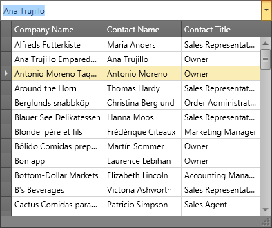
LookUpEdit
LookUpEdit is the default mode.
The editor’s dropdown displays a fully-functional grid that supports the following features:
- Single item selection
- Data filtering
- Data grouping
- Data sorting
The following example adds a LookUpEdit to an app form:
<Window ...
        xmlns:x="http://schemas.microsoft.com/winfx/2006/xaml"
        xmlns:dxg="http://schemas.devexpress.com/winfx/2008/xaml/grid"
        ...>
    <Grid VerticalAlignment="Center">
        <dxg:LookUpEdit ItemsSource="{x:Static local:Helper.Data}"
                        DisplayMember="Name"
                        IsTextEditable="False"
                        SeparatorString="; ">
            <dxg:LookUpEdit.StyleSettings>
                <dxg:LookUpEditStyleSettings AllowGrouping="False"/>
            </dxg:LookUpEdit.StyleSettings>
        </dxg:LookUpEdit>
    </Grid>
</Window>
Tip
For more information and examples, refer to the following help topics:
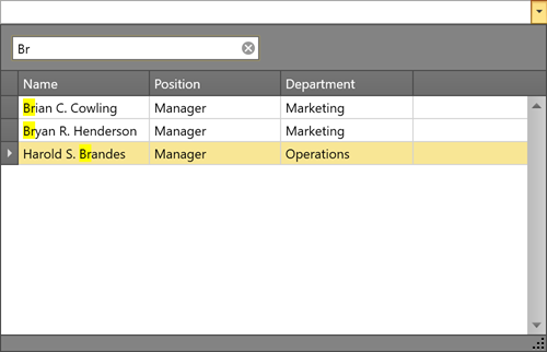
SearchLookUpEdit
In addition to LookUpEdit features, SearchLookUpEdit displays the embedded GridControl’s search panel. This panel allows users to find information within the data grid.
Tip
For more information and examples, refer to the following help topic: SearchLookUpEditStyleSettings.
MultiSelectLookUpEdit
In addition to LookUpEdit features, MultiSelectLookUpEdit supports multiple item selection.
Tip
For more information and examples, refer to the following help topic: MultiSelectLookUpEditStyleSettings.
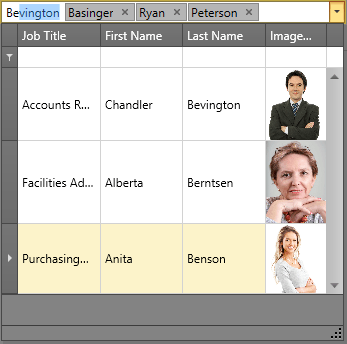
TokenLookUpEdit
TokenLookupEdit mode is inspired by modern mail clients.
In addition to LookUpEdit features, TokenLookupEdit supports the following:
- Multiple item selection
- Selected items appear as tokens
Tip
For more information and examples, refer to the following help topic: TokenLookUpEditStyleSettings.
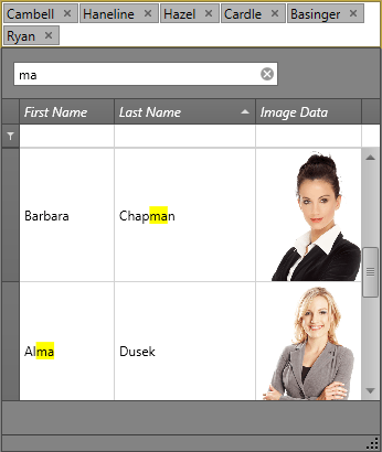
SearchTokenLookUpEdit
SearchTokenLookupEdit mode is inspired by modern mail clients.
In addition to LookUpEdit features, SearchTokenLookupEdit supports the following:
- Data search
- Multiple item selection
- Selected items appear as tokens
Tip
For more information and examples, refer to the following help topic: SearchTokenLookUpEditStyleSettings.
LookUpEdit Modes Comparison
The table below compares the features of different LookUpEdit operation modes:
| Grouping | Filtering | Sorting | Single Item Selection | Multiple Item Selection[1] | Search | Tokens | Text Editing | |
|---|---|---|---|---|---|---|---|---|
| LookUpEdit |  |
|
|
|
 |
|
|
|
| SearchLookUpEdit | |
|
|
|
|
|
|
|
| MultiselectLookUpEdit | |
|
|
|
|
|
|
|
| TokenLookUpEdit | |
|
|
|
|
|
|
|
| SearchTokenLookUpEdit | |
|
|
|
|
|
|
|
More Examples
- Enable Multiple Selection Mode
- Customize the Embedded Data Grid
- Display a TreeList as Popup Content
- Filter by Multiple Columns
- Display CheckBoxes for Multiple Selection Mode
- Process New Values
-
Refer to the following help topic for more information: Multiple Selection in ComboBoxEdit, LookUpEdit, and ListBoxEdit.